Carousel Chaos: Are These Practices Ruining Your Content?
So, you know those swipeable carousels on social media? They’re pretty popular for showcasing multiple images or content pieces. But here’s the thing, not all carousels are created equal. In this blog post, we’re gonna dive into the worst practices in social media carousels and give you some tips on how to avoid them for a more engaging and effective social media presence.
#1 – Lack Of Structure
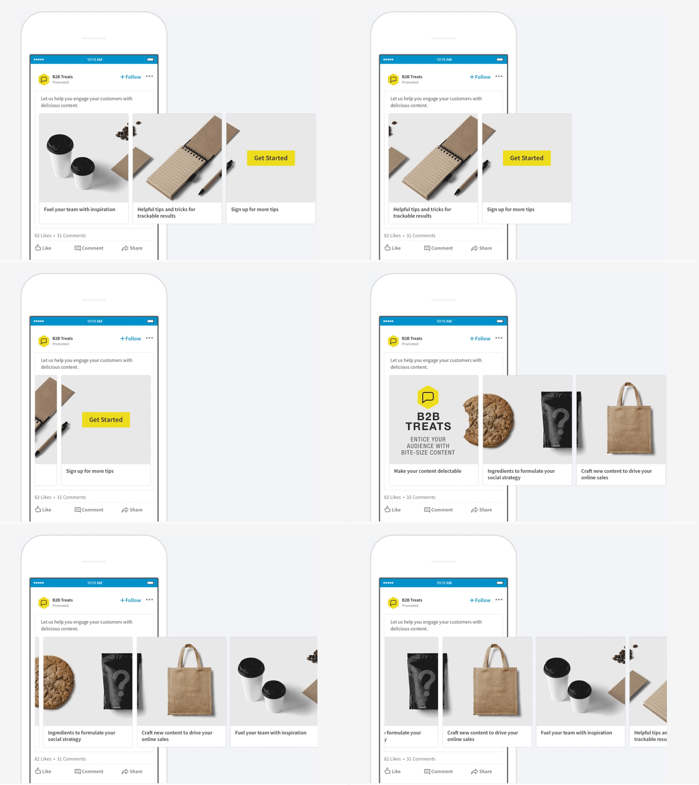
Randomly grouping images without a clear narrative? That’s a recipe for confusion and disengagement. Plan your carousel with a purposeful flow, so each slide tells a part of your story or conveys a specific message.
#2 – Slide Overload!
Attention spans on social media are short, so bombarding users with too many slides? Not a good idea. Keep it concise and impactful by selecting only the most relevant and engaging content.
#3 – Slide Design
Each slide should be a visual treat on its own. Ignoring image quality, inconsistent branding, or a messy visual hierarchy? That’s a surefire way to appear unprofessional. Pay attention to those details and make each slide stand out.
![How to Use Image Carousels the Right Way [2023]? | VWO](https://static.wingify.com/gcp/uploads/sites/3/2013/08/Feature-image_How-to-Use-Image-Carousels-the-Right-Way.png)
#4 – CTA Consistency
Mixing up CTAs can confuse users and dilute the action you want them to take. Keep it clear, visually distinguishable, and aligned with your marketing goals.

#5 – Thumbnail Matters
Your carousel’s thumbnail is the face of your content. Choosing a dull or uninteresting thumbnail? That’s like asking users to swipe past without a second thought. Grab their attention with a captivating and representative thumbnail.

#6 – Mobile-friendly Only
Social media is all about mobile usage, so ignoring mobile optimization? That’s a big no-no. Make sure your carousel looks great and functions properly on different screen sizes. Nobody likes cropped content or distorted images.

Bottom Line
By avoiding these worst practices, you’ll create social media carousels that truly captivate your audience. Establish a clear storytelling structure, keep it concise, focus on individual slide design, maintain consistent CTAs, choose eye-catching thumbnails, prioritise mobile-friendly design, and incorporate interactive elements.
But of course, design experts come in handy when it comes to carousels that really catch attention. Create dazzling carousels today with our design team at 55 Knots!
