TOP TIPS TO FEEL PRIDE WITH YOUR GOOGLE SLIDES
We often get asked to elevate Google Slide presentations for our clients – and there are a few basic tricks we’ve learnt over the years that can bring some pride to that google slide.
Custom Line Heights
If you’re like me and you like tight line-heights, it would seem at first glance Google Slides only provides four options: Single, 1.15, 1.5 & double. However, you’d be wrong – if you go the bottom of the line-height tool, you’ll notice a custom spacing option.
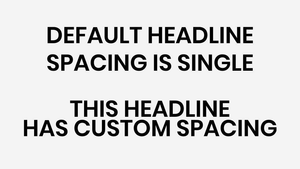
Within this model box, you can insert customing spacing, to either tighten or loosen the spacing between lines. If you want tight line-height anything below 1.0 will do the trick, and vice versa.
Image Shape Crops
Squares and rectangles are nice, but they aren’t always that interesting. If you want to add some form and excitement to your slide, start by inserting a new image, click on the image of choice and select the crop tool dropdown from the top navigation. Here you’ll notice a variety of different crop options from shapes to arrows, click on the shape of preference and feel the love.
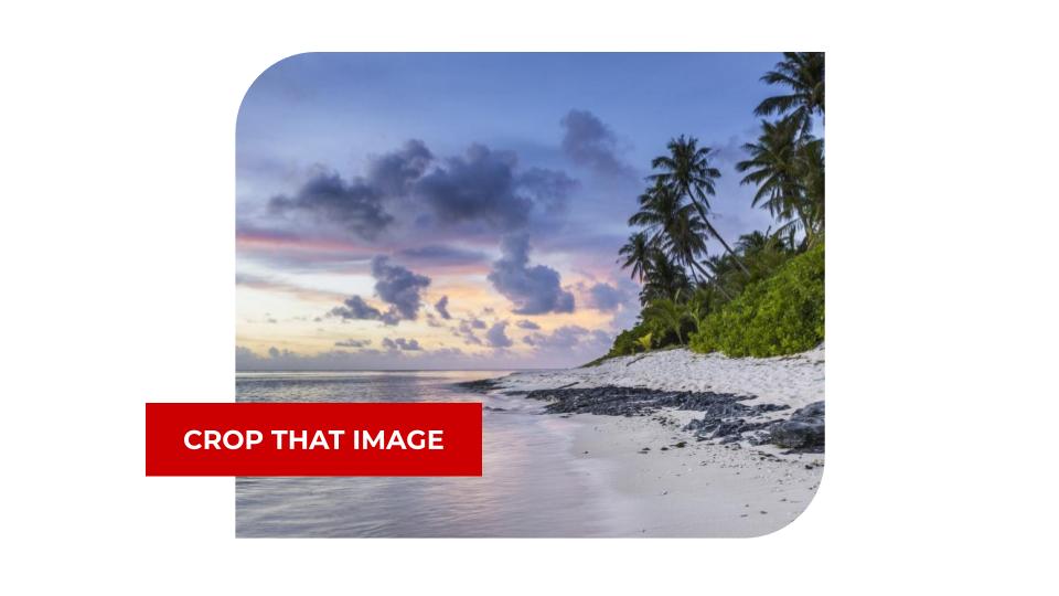
Bonus Tip: If your image doesn’t crop into the right ratio, don’t drag the image anchor points or you’ll stretch/compress the image – double click on the image to bring up the crop points and then adjust these to make sure your vision stays intact.
Colour Transparency
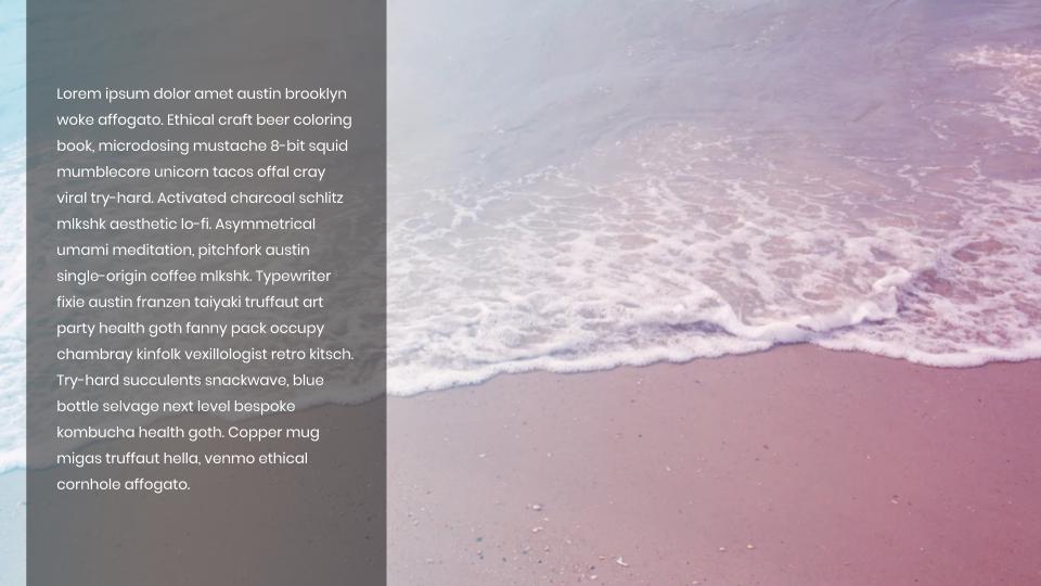
So you have a beautiful photo you want to be an artistic background image. However, your copy is hard to read when placed directly on top of image. To fix this, a simple trick is to add a coloured overlay on top of your photo with a transparent background to improve your overall accessibility.
Start by inserting your image on the slide, then drawing a shape over the top of it to completely cover the image or the part you want to overlay with text – in my example below I’ve opted for one-third of the picture.

I want to use white text on the image, so I need to overlay a dark colour with some transparency so I can still see the photo behind it. (If you want dark text invert this theory) Start by clicking on the shape and select the paint bucket tool and click on the headline that says ‘Custom’ from here I am going to choose black and then I am going to drag the transparency slider to the left about halfway across.
This adds about 50% transparent to the colour block. Now you can either add text on top or you can double click on the coloured shape to insert your text directly into the shape block. And voila you have a beautiful transparent overlay that improves your text legibility.
Padding & Text Alignment
I find that the default padding in slides for objects lacks a little white space, and any designer worth their salt will tell you, that’s not a good thing. Whether you’re in a shape or a table, click on the formating option tab on the main navigation to adjust the objects padding or indentation.
On the right-hand navigation, click on the Text Fitting tab to find a list of options, in here you can add indentation to your text or overall padding for the element itself. In my example, I am going to add 0.3in of padding to the left and right to make sure this looks good from both sides – now doesn’t that white space make you feel good?
I hope you found these essential tips useful and if you’re still not enjoying the process of designing your own Google Slide – we’re always happy to help.