Is your logo a winner or should it walk the plank? Does it grab the attention and understanding of your customers in seconds? Not sure?
Check your logo against these 6 logo no-no’s to make sure your brand stays afloat amongst a sea of competitors.
These days you’ve got a matter of seconds to capture the attention, interest and consideration of a potential customer. A smart striking logo gives an instant feeling of confidence, clarity and trust towards your brand.
We can all recall that chaotic, slapdash logo we came across once…you know the one…a collage of fonts, icons, images and colours that made no sense at all.
At 55 KNOTS we want your design to stand out for the right reasons. Here are the top logo no-no’s from our in-house logo experts.
1. Your logo doesn’t explain what you do.
A logo is often the first point of contact a customer has with your business. No matter what industry you are in, your logo should in some way represent what service you offer. A great example is the Nike logo tick or ‘swoosh’ which symbolises speed, fluidity and movement. This aligns clearly with Nike’s offering of sneakers and sporty accessories – nailed it.
2. Your logo doesn’t align with your brand identity.
Your brand identity is basically the personality of your brand. It’s made up of defined colours, fonts, symbols and tone of voice which represent your brand’s values. When designing your logo, think about what you want customers to ‘feel’ when they see your logo.
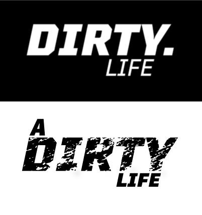
At 55 KNOTS we revamped ‘A Dirty Life’ logo to better represent the muddy, tough and adventurous lifestyle brand. Below, if you compare before and after you can see that the new logo really captures that aspirational rough ‘n’ tumble lifestyle with the use of larger bold font plus ‘dirt-like’ gritty text detail and overlay. We want people to feel excited, pumped and ready for adventure!
3. Your logo is too complicated and detailed.
As they say, a picture speaks a thousand words, which is exactly the same when it comes to logos. Simplicity and clarity are key with great logo design. Be very intentional with your choice of shapes, symbols, colours and more.
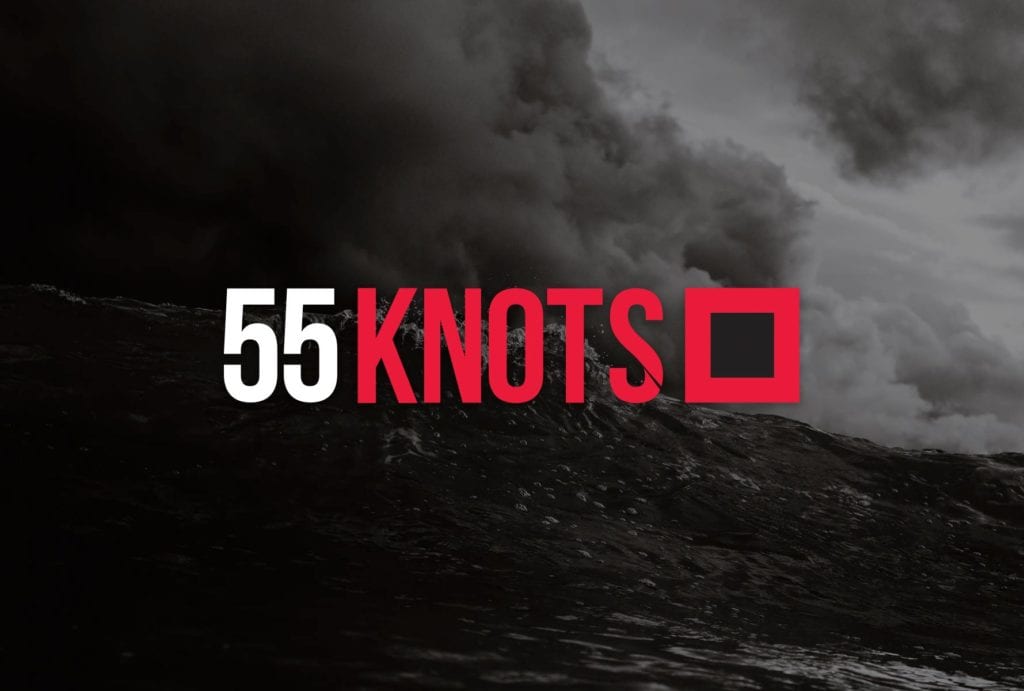
At 55 KNOTS our logo is a representation of the storm flag – a flag that is raised when winds hit 55 KNOTS and above. This includes a simple square red flag with a square black center displayed to indicate the approach of a storm. This represents the high level of creative impact that we approach all our design work with.
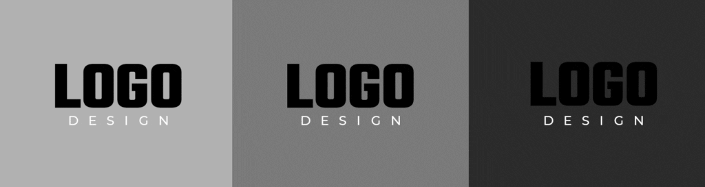
4. Your logo isn’t versatile.
Many businesses forget to consider where their finished logo will actually appear. Functionality is key so make sure your logo is scalable and can look strong on both light and dark backgrounds. Ask your designer to build your logo in vector format and make sure you check the logo across multiple backgrounds before you sign off on the final design!
5. Your logo is too similar to your competitors.
When you start a business, competitor research is essential and logo comparison is a great place to start. Even if you’re clear on the uniqueness of your offering you need to make sure it’s crystal clear for your customers. Savvy?
Avoid mimicking competitor design elements and instead try and lean in on those unique elements of your brand. Are you more affordable, more premium, more experienced than your competitor? Show this through the logo design choices you make.
6. Your logo just isn’t eye-catching.
The best way to find out if your logo is a winner is to test it on friends or even better – on your target customers! What does the logo tell them about your business? Ask them what they feel when they see the logo. Do they feel happy, sad, excited or confused and overwhelmed? What do they like/dislike and why?
Get super clear on your brand guidelines and style so you can nail your logo first go.
Want some tips on building your brand style guide? Read our post on Why Design Consistency Matters – A Lot.
Need help with logo design or an affordable and consistent graphic designer? Check out the 55 KNOTS Subscription Packages.