A wide variety of brands pop up over time, and so does the creativity with which they approach their customers. We live in an age of digital branding where ads appear on paper and on-screen, and organisations are constantly on the grind to get their message across through effective marketing.
Banner advertisements are a cost-effective strategy many companies adopt to deliver a crisp and succinct idea across with as few words as possible.
That is the point behind banner ads. To drive successful sales, they convey the intent through images peppered with minimal content, although relevant.
To formulate a perfect banner ad: the ingredients are – to be eye-catching, have a gripping and tempting CTA (Call-To-Action), relevant information without any cramping, and simple and interactive elements that are understandable to everyone.
OUTSTANDING BANNER ADVERTISEMENT EXAMPLES
Let’s study nine creatively crafted banner advertisements examples that have succeeded in making an outstanding campaign for brands and businesses across the globe.
1. Apple
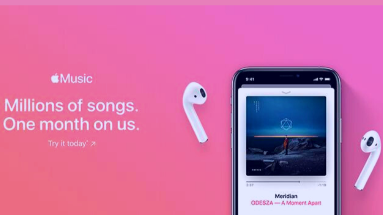
When it comes to sleek yet on-point advertising, Apple is at the forefront. The face behind some of the most iconic campaigns emerging during the age of smartphones, Apple has not disappointed audiences and banner experts in recent years of marketing masterpieces.
Having been outrageously hyped since its inception and turning into a household name over time, Apple has given some top-notch banner ad examples to learn from.
Creators of the Emmy Winning ‘Think Different’ logo, Apple ads have always followed a subtle yet strong layout. Their ads follow a setup of pastel or neutral tones in the background paired with a concise and captivating copy to match.
The banner in the picture shows a pastel pink backdrop with the Apple music logo, paired with the right amount of info and the iTunes app booted on Apple mobile phones.
Why does it work?
The elements and graphics behind this ad are to the point without any out-of-touch components. The message reads to convey that millions of songs on Apple Music offer a demo period for users to try out, thus providing a CTA.
This reels in interested people with the prospect of trying the application out before spending an extra dollar on a product they have no clue about. Furthermore, there’s also an excellent additional product placement of Apple’s AirPods that peaks curiosities and earns a fast and easy CTR.
2. Spotify
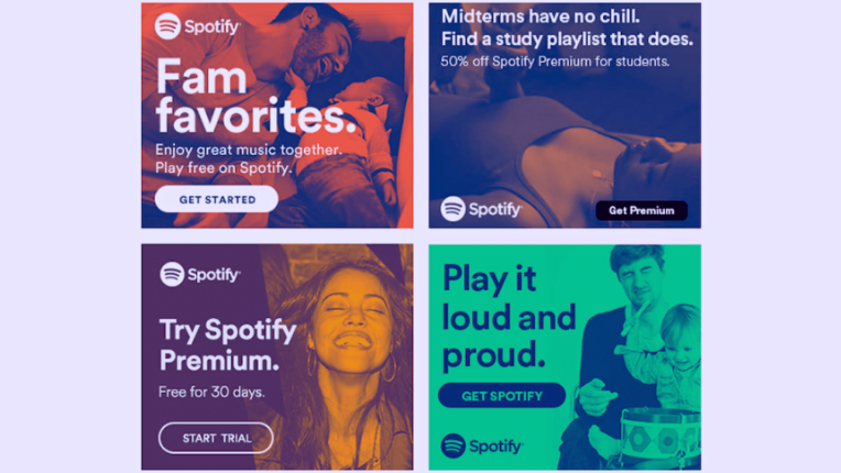
For any music lover, Spotify has become the ideal platform to access a vast library of songs from worldwide artists.
Interested users who wish not to see ads and pay an extra buck can upgrade to the premium version, while the free version runs ads that are yet pretty creative. Spotify ads are known for their creative dialogue and banter that quickly grabs the attention of listeners.
Let’s look at some of Spotify’s banner ad examples.
Why does it work?
These ads use a simple image with playful and vibrant colours to match the experience of subscribing to Spotify premium. Not to forget the CTA options, included as Start Trial, Get Started, Get Spotify, or Get Premium.
Relevant imagery is another factor to consider in this display ad as the banner is designed for different subscription options giving room to cater to a specific demographic of customers across varying sectors of their target audience.
For instance, the first advert focuses on the family plan with an image of the family to match and the necessary elements of the warm colour coding and apt pictorial representation. Likewise, student plan banners follow a similar suit with the added benefits and a noticeable Get Premium button to direct the customer.
Another design trait to note is the colour contrast between the neon hues and primary colours for the text used to make it pop out.
3. Zara
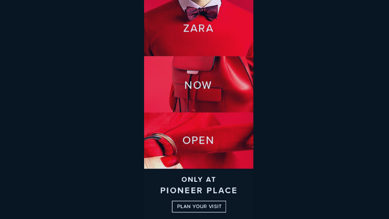
The colour scheme is just as crucial as selecting the text or the call-to-action button design. Choosing the suitable colour scheme lies in the intent behind the project or campaign.
If your campaign is centred around being empowering, then a palette of bright, bold colours like yellow or red are some effective choices to set the tone right.
The purpose behind finding the colour that resonates well with your movement the most is to attract people. Bright colours have always had a positive impact while getting that high-value CTR because it’s attractive at a glance.
People scroll through the web for hours on end every day, and a bright splash of colour within their digital space is a great way to catch their attention and call them forward to take action.
Why does it work?
In the following example, the usage of red colour is a fast way to catch the eye of the scroller. The ‘Open Now’ in white complements and blends the message well with the stark backdrop.
Additionally, the contrast of black against red is another fantastic way to get the user to click on the ‘Plan Your Visit’ button, which ultimately redirects to Zara’s website, where they can peruse or plan their visit to a local Zara store.
Bonus Read:
4. Samsung
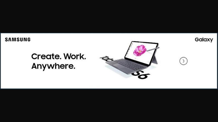
Simplicity can speak volumes, which is what Samsung achieves with its Samsung Tab S6 banner ad. All in all, this ad oozes Samsung’s brand elegance and combines a tagline that inspires confidence and positive behaviour towards the extent of their products’ usability.
Appealing and on the dot with the visuals, Samsung does a fine job creating value and hype for their product. Being a tech giant with competitors like Microsoft, Samsung ditches the traditional primary colours and settles for a neutral white that makes their product stand out.
Why does it work?
Boisterous colours can pull the onlookers in, but neutral tones add a touch of elegance and chicness to the product on display, just like Samsung does for their Tab S6.
As discussed, a good banner ad cuts to the chase with a clear-cut design and limited text. This ad is an excellent example of an inspiring banner with a minimalist design.
Above this, the CTA in this image is designed with an equally simplistic style in mind, as a small arrow inside the circle. This is a valuable strategy to pique interest by providing required information on the utility and versatility as well as calling buyers to further investigate the suitability of the product to their preferences.
Observe how the output of subtle design takes the crown and leverages the knowledge of banner ad design experts.
5. Squarespace
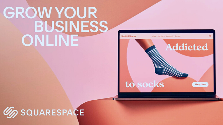
A platform for website hosting and building, Squarespace has been behind the reimagined Super Bowl ad starring Zendaya. The storyline is based on the century-old tongue twister narrating, “She sells seashells”.
What does this have to do with Squarespace? Well, through Squarespace, Sally could sell her seashells and become a ‘seashell star’. Subsequently, the cut scene displays the tagline ‘everything to sell anything’, which portrays the essence of Squarespace, a place to build your website and sell any products or services through the essence of premium design.
In the same vein, Squarespace has also used some equally witty and charming ad creation strategies to create a simple banner ad that emphasises the purpose of their platform in a handful of words.
Why does it work?
Information is readily available on the internet, and people are swimming in the digital sphere daily and constantly look at blogs, news, or social media. An occasional display ad alongside their content can get their attention. Marketing weapons like creatively thought-out banner ads are here to bag their focus and succeed in getting the job done.
In the ad, Squarespace does a fine job of presenting a sultry and serious situation with the main object in the picture resonating with the ad copy. As for the ad copy, it’s highly concise and to the point and gives the user all the information they require in a glance.
The CTA calls to try the service for free, which is another lovely addition to generating a desirable CTR of prospects to customers.
6. Vimeo
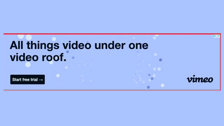
With the massive amount of advertisements surrounding every corner of the internet, people can start to ignore them at one point. This poses a challenge for advertisers to develop user-friendly marketing strategies that will bring target audiences to their websites.
The answer to the question of effective banner design lies in its simplicity. Minimal ads with a touch of genuine design relevance can be fruitful in gaining that sweet CTR despite contrary beliefs.
No longer are bright colours the standard because while they have their place in specific projects, minimalistic designs are in the same fashion relevant for different kinds of activity.
Why does it work?
The Vimeo ad in the picture is as simple in design as it is easy to understand. The calming pastel background is complemented well by the bold black letters of the ad copy. Going basic is not so bad, as the ad is still appealing because of the lack of an obnoxious or overtly glaring element.
That is the objective behind this ad, to keep it short and brisk by describing the aim behind their business in a single sentence. It informs users of the various feature Vimeo has to offer, such as editing, recording, quality live streaming, ample storage space, etc. This clarity is what makes it a memorable banner ad example.
Bonus Read:
7. Audible
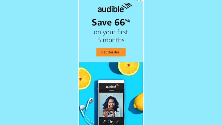
Audible is an audiobook and podcast service having a massive collection of stories and audio content. In the fast-paced culture of today’s world, reading books isn’t everybody’s cup of tea. That’s the reason why auditory content has made an impressive turnover.
Content that is heard is easy to digest and can be accessed while multitasking. This flexibility is what makes it a popular choice.
You need a banner ad to make a successful outreach program informing people about new features or other promotions or introducing your brand to your future customers.
Why does it work?
Let’s look at a remarkable banner ad example by Audible. A combination of light and vibrant blue for the background, topped with a compelling ad copy, makes this banner easy to decipher with a glance.
The contrasting colour choice used for the CTA button pops it out and makes it look tempting to navigate over. Another thing to note is the bolded “Save 66%” discount, which uses a noteworthy design mindset to pique the purchaser’s interest.
8. Ridge
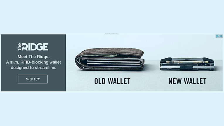
The idea behind effective marketing lies in how thriving brands communicate their concept. Witty one-liner taglines or punchlines are a reliable way to embed the brand into the consumer’s mind.
Another trick is to use design tools, as seen in Ridge’s banner ad.
Why does it work?
The ad focuses on killing two birds with one stone. How? By juxtaposing the problem of the old-fashion wallet and the solution, the Ridge wallet.
It calls on users to act to ditch their previous wallets and go for something with utility the same as the old one. Even better, the evident bonus factors are the sleeker look, compactness, and significantly reduced storage space requirements.
On the other hand, the colour palette is a classy choice that enhances the elegance and simplicity of the ad. Observe how the left half of the banner manages to convince viewers to distribute their attention between both ends of this marketing material.
9. Adobe
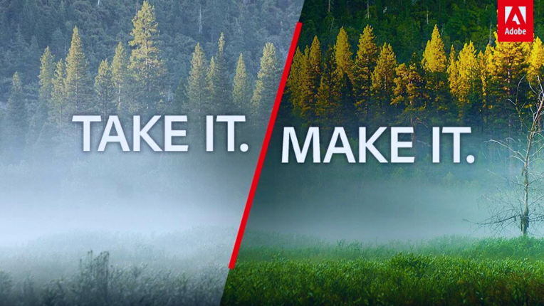
When it comes to using top-quality visuals, Adobe is first in line. This is why Adobe’s banner ads do a top-notch job at making their advertisements click-worthy.
Why does it work?
High-quality images paired with complementary text that fits beautifully with the pictorial description make any ad extremely attractive.
Adobe does well in showcasing the software’s editing features for photographers, editors or videographers by comparing the two images in an after and before fashion.
One image shows the original copy, while the other shows the edited version after the artist is done working on it.
This effectively describes how pre-footage or pictures can be worked on with great precision to look the best.
Bonus Read:
Verdict
To sum up, banner ads provide a route for customers to connect with your brand through creatively brief adverts catered to their probable or proven interests.
Whether you just started or have dipped your toes in this scene previously, there’s no denying that a well-articulated display advertisement can have a tremendous conversion rate and high click-through rate.
Not to forget, identifying a top-notch banner ad example lies in recognising your audience and bringing value to their experience with your product.