No matter how much “Don’t judge a book by its cover” is preached, it’s human nature to gravitate towards what catches the eye. You need a striking cover to seize your audience and invite them to purchase the book – be it an ebook, physical copy, or audiobook. Ideally, a cover should set the text’s tone, the graphics, and the art, to show the audience what they can expect from it, story-wise.
Cover Design Ideas for Inspiration
Here are a few top-notch book cover design ideas to help you in your quest for creative perfection!
1. Play with Contrast
Simply put, contrast is when two things appear opposites. Black versus white, tall versus short, and light versus dark are simple examples.
Putting these contrasts up against each other is a clear shot way to grab the viewer’s attention as it makes the cover more engaging to indulge in visually.
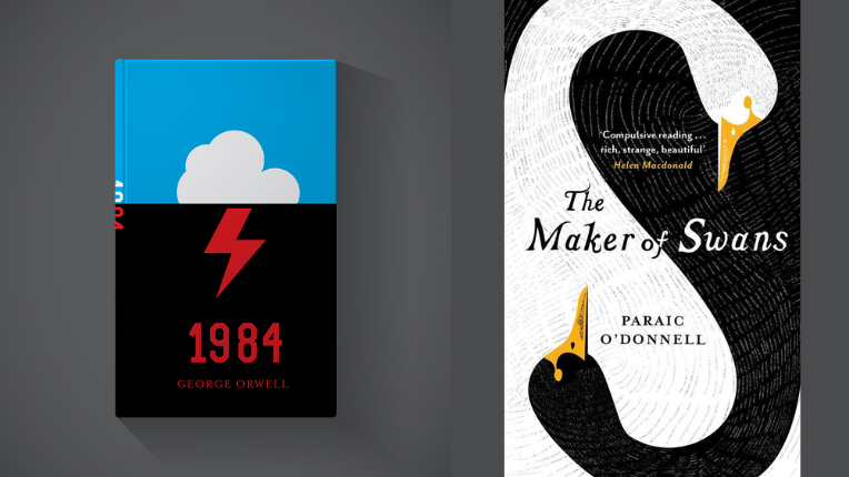
The first example quickly catches your attention. Why?
It’s merely because of the evident contrast of the blue on black. On top of that, the white cloud and red lightning bolt further highlight the disparity. This goes to show that contrast doesn’t necessarily have to be just two opposing elements. Graphic designers can creatively manipulate it as their design acumen sees fit.
However, when you have only one contrasting pair, you can try adding in an accent element! The second cover shows a great example of this. The body is all black and white except for the colour yellow, which pulls in the viewer’s focus.
2. Use Unique Typography
Typography, or the style and appearance of text, is crucial to set your cover apart. Using new fonts and innovative styling will help your book’s cover become memorable, giving it the aesthetics needed to establish a high recall rate amongst readers.
That being said, it’s essential to keep the book’s visual tonality consistent, especially on the exterior. You can’t be using Comic Sans for a solemn non-fiction book. Actually, it’s best to avoid using pre-installed MS Word fonts as it will make the cover look homemade and unprofessional, radiating bleakness and a not-so-interesting body.
Try to use your text to create a context for the book. In the first example of ‘Against Happiness’, we see the book title and author’s name in a downturned curve, symbolising a frown. We can comfortably call that witty and creative design blossoming with simplicity.
There’s only one element on the cover, yet it makes such a profound impact. It’s an ingenious cover with a yellow background that embodies happiness and typography, which is striking to the eyes.
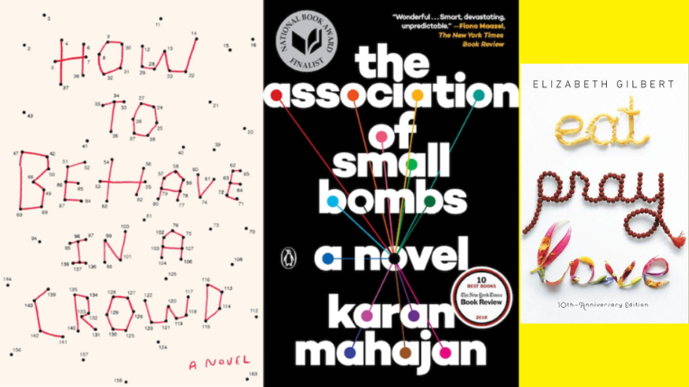
We see another innovative designer at work on the ‘Eat, Pray, Love’ book cover. Each word is illustrated by using specific yet emphatic elements. These details enforce the meaning in the viewer’s minds, foreshadowing the story and helping you appreciate it more. There’s no doubt this is one of the most iconic typography book covers, which makes an extraordinary impact from a design perspective.
Stories including the first-person point of view, diary entries, or letters – all stand to benefit from handwritten typography. It will provide an intimate connection between the reader and the narrator, maximising the outcome of the graphic designer’s efforts when playing around with the typography.
3. Add Striking Photography
3
Using images on your covers can be a great way to convey the book’s intent. High-quality, self-explanatory, and thought-provoking photographs will add life to the book cover while giving the readers a sneak peek into the story.
However, the image chosen must be relevant to the story at hand. No matter how attractive, a random picture will set the book up for failure as people may feel deceived by the cover.
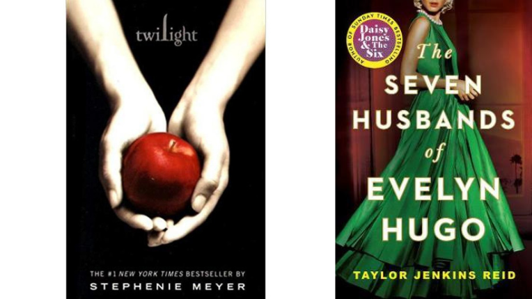
The image used can create a sense of mystery for the novel if an image related to a minor role is chosen. For instance, the iconic cover of ‘Twilight’ has a picture of a hand holding an apple, which is factually a short scene in the book. This way, when readers come to that part in the story, they’ll close the book to examine the cover again, eventually appreciating the graphic design on the exteriors.
4. Utilise Graphics
Using graphics as an option for imagery works incredibly well for creating modern and minimal designs. Graphics are also easier to manipulate through size variations and colour combinations to match their appearance with the book’s theme.
Above this, graphics are relatively wiser to include, so you are sure to get the exact reference of the significant happening as mentioned in the book. Don’t take it the wrong way. Although graphics make it easy to go the minimalist route, intricate pairing of elements can make for a remarkable composition. There is no mistaking what the imagery implies.
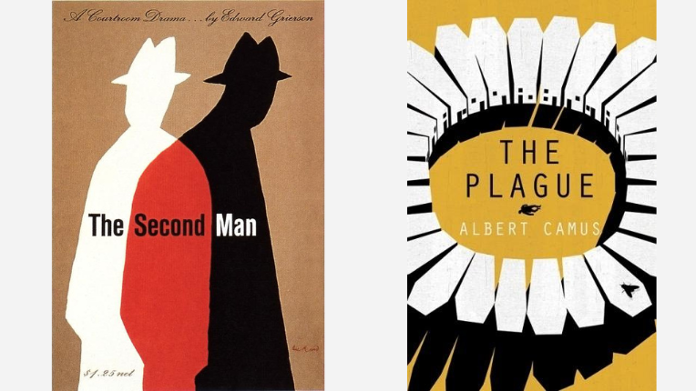
Take, for instance, the cover for ‘The Plague’. The design professionals ensure to strike the viewer’s mind with the coffin-shaped houses, the silhouette of a man lying down, and a fly.
Moving on to the other example, ‘The Second Man’ uses graphic imagery to illustrate the title. The designer manages to reserve the plot’s mystery with the illustration while keeping it minimalistic. In a nutshell, such well-thought-out graphics with contrasting colours make for an outstanding cover design for any book genre.
5. Have a Focal Point
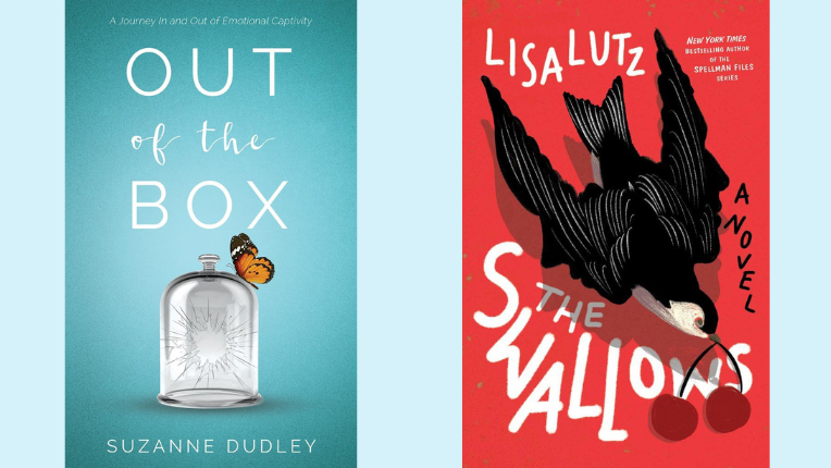
To ensure your cover isn’t getting too muddled up with additional elements, it’s wise to keep the focus on one object. This can act as a premise for your story or work as a foreshadowing element.
Think about what image can encompass the events in the story or something pivotal to the plot while deciding the focus of the cover.
We have ‘Out of the Box’ as a benchmark for the first tip, which showcases a broken cloche with a butterfly perched on top. The book tells the story of the author maturing and healing after an abusive marriage and rebuilding her life. This is captured by the focal image perfectly, the cloche representing her struggles and the butterfly illustrating her breaking free.
The other cover, ‘The Swallows’, displays a swallow bird flying with two cherries in its mouth. Taking the title literally, the focal point in this cover is a swallow. However, the designer has taken care to add more elements tied to the storyline. The cherries play a part in bringing the design together.
6. Employ a Face
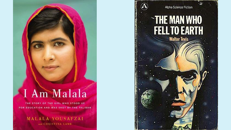
The power of a face is undeniable. One cannot help but gravitate towards faces with deep emotions written on them.
Although it’s difficult for an author to find a perfect person for a fictional character, it’s a phenomenal option for non-fictional books. What better way to showcase the core subject than a gorgeous photograph on the cover of biographies?
To illustrate, ‘I Am Malala’ only has Malala on the cover, staring into the camera with a soft smile. Even so, it makes for a downright striking cover. Her eyes pierce you and make you pick the book up. Add in the strategic placement of the text on her pink clothing, and you can see how the cover designer has guaranteed that readers glance through the descriptive text at least once.
On the other hand, if your fiction story has a strong lead, you can simply add eyes to enrapture your audience. If not, having the entire face illustrated instead of hiring a model is also a viable option. Imagine the diversity a graphic designer can bring to your fictional lead character’s impression through facial and background modification.
To demonstrate, we have the exterior of ‘The Man Who Fell to Earth’. Here, the face is illustrated, yet the eyes still hold a premium quality, inviting the readers to lift the book.
Further, the cover shows the book’s genre, making it easy to understand for the audience to expect science fiction.
7. Keep it Minimalistic
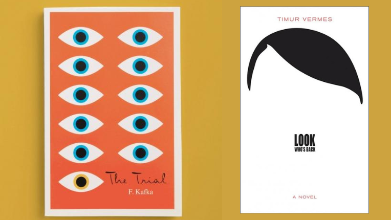
Minimalistic and simple designs are all the craze right now, topping the list of modern graphic design. With clean, to-the-point illustrations, it’s easier for the reader to understand the nuances added by the designer.
Timur Vermes’s ‘Look Who’s Back’ is a book with the answer to what would happen if Hitler woke up in this day and age. The cover uses just the illustration of his hair, while the title takes the form of his moustache. It’s so effortless to view, yet it’s enough for us to recognise the dictator. Even though such a simplistic design, the designer successfully gives the plot’s premise to the readers.
The second cover leaves you with an unsettling feeling, the colours bringing focus to the eyes. The book follows a wrongly accused man who has to defend himself in court against a crime he doesn’t know the details about.
Following the character’s emotions of fear and being constantly under watch, the illustration sets the book’s tension.
Do you see how wisely the book cover designers used dilated pupils? Well caught!
8. Add Imaginative Textures
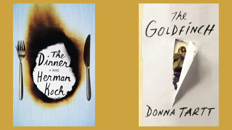
Another popular trend is adding textures and details inspired by real life. Readers often see gorgeous illustrations in novels, but they aren’t used to seeing textures or 3D-styled covers.
The unique look of these books is sure to persuade the target audience to move deeper down a book’s sales funnel.
‘The Dinner’ by Herman Koch follows a family debating to turn in their sons for a crime they committed over a single luxurious dinner. The cover does an exceptional job expressing the family’s condition with the charred tablecloth displaying the title and author’s name in handwritten letters. As visible, the realistic appearance of the elements sells the design.
The second cover also does an artistic job of using textures to elevate the design. ‘The Goldfinch’, the painting from 1654 by Carel Fabritius, plays a role in the novel with its name.
To keep the novel’s mood while showcasing the painting, the designer used the texture of the ripped paper that reveals the piece. Initially, the author had forbidden the designer to use the painting on the cover. But after seeing such a genius presentation of the art, the author readily agreed.
Check Our Design Portfolio
9. Come Up with Innovative Ideas
Covers don’t have to depend on designs alone. If innovative ideas are applied to them, the book can turn into something insanely fascinating. This boils down to heightened collaboration between authors and graphic designers when choosing a cover. Allowing the author to articulate their message and intention of writing the book may educate the visual design expert on various cover ideas.
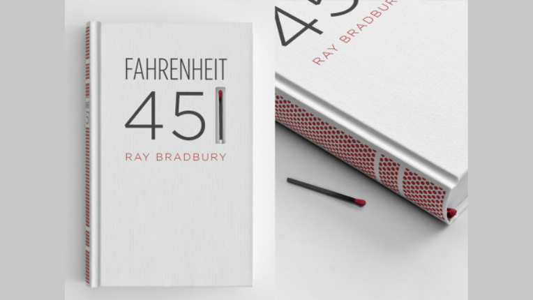
Take, for example, this edition of ‘Fahrenheit 451’ by Ray Bradbury. The book’s spine is screen-printed with a match striking paper, so if the book inspires you to burn it, it can conveniently be done by the reader.
To give you context, the novel is set in a dystopian society with books burnt to control dangerous ideas and unhappy concepts. The book follows the lead character, a fireman whose job is to destroy knowledge.
Above this, the cover design is ingenious because of its relevance to the story. While the cover designer invites readers to test the ideologies of the book’s world for themselves, it’s a neat design, giving life to the words in a powerful way.
Like this, innovative book cover design ideas can be created for any book as long as you think out of the box and keep relevancy.
Verdict
Remember, a reader will only take a glance at your cover. It’s your job to grab their attention and keep it on the book through the design.
For a novel to be successful, the publishing house or author cannot compromise on the exterior design’s flawlessness. Pulling in customers and providing value to the story are the two objectives you should never lose sight of while working on a cover.