Did you know — 2.2 billion people worldwide have a vision impairment?
Have you considered how these statistics might affect your website & marketing?
What is colour accessibility?
When following colour accessibility guidelines, you’re looking to maximize the contrast of content and backgrounds so that all text is legible for people with low vision and colour deficiencies.
What does your marketing score?
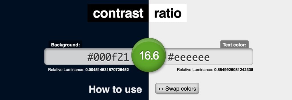
With the use of online tools, like www.contrast-ratio.com you can find out where your brand and marketing currently sit on the scale of accessibility.
There are equations provided by the WCAG that determine two values.
- Score
- Ratio
By using online WCAG colour testing tools, you can input your brand colour combination to get a ratio score from 0 to 21.
This number indicates the level of contrast between your colours – 0 being low contrast and 21 being high.
There are a variety of conformance scores when looking at your colour combinations, which have been created based on the restrain they put on design.
- Score: FAIL No impact
- Score: A Low impact
- Score: AA Medium impact
- Score: AAA Heavy impact
With more restraint comes higher legibility but comes at the cost of creative flexibility.
Let’s Look at an Example:
Let’s look at the following classic blue and white colour combination found on a client website, and input their colour values into the contrast ratio checker: They receive a AAA score!
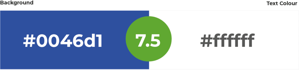
What this score means is that the colour contrast is sharp enough that text is legible for both large and small text and that these colours meet the optimal standards for people with low vision and colour deficiencies.
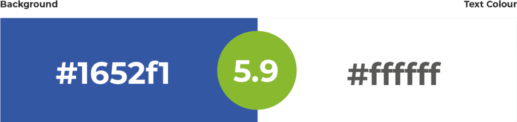
Now if we look at the same colours again, but make the background slightly lighter, this drops the contrast to 5.98 or a AA (AAA Large Text) rating which is still an excellent combination of colours and will suit most users.
How to Improve Your Score
In most cases, brands only require a small tweak to their colour
combinations and its something that can be done gradually over time.
If your brand sits within a AA rating, then you’re doing an excellent job.
If you want to move from an A to AA to an optimal AAA rating, some quick
wins could be:
- Increase your font size – a AA rating can quickly jump into a AAA rating by increasing the font size
- Add some tint (lighten) or shade (darken) to your colours – adding some tinting or shading to your background colour o text colour until the contrast ratio is vast enough to move you into the next score
Most businesses should be aiming for a AA rating;
However, If all of your marketing sits in the FAIL or A rating, it’s might be time to consider how you tackle your brand and making necessary changes to overhaul your choice in colours to better serve your customers with low vision.
We thank you.