Logos are an essential part of marketing. It’s similar to an address. Just as an address gives you an idea about an individual’s apparent background, logos tell similar stories about a particular company, institution, or organisation.
For instance, consider the logo for Amazon. It has a smile that stretches from the letter ‘a’ to ‘z’ in the word ‘Amazon’. This simple yet aesthetically pleasing stunt tells their customer that Amazon can serve them from ‘A’ to ‘Z’. This will inevitably bring a smile of satisfaction.
Therefore, graphic designers take into account various aspects before designing a logo. Since it’s a part of your brand’s part identity, it delivers your objective, philosophy, and your priorities.
Then, why do virtual games need logos? How are they important?
We have already discussed how important logos are for a company. Similarly, gaming companies need suitable logos which are perfectly designed to make a memorable impression and improve brand recall rates. Experts graphically ideate and develop them to attract potential customers.
An effective brand logo is as essential as a signature. Such tailor-made logos are hard to come by. If you are out of options, 55 Knots brings you their innovative designs with a team of expert graphic designers.
What Makes Gaming Logos Important?
Gaming logos are important because they can disclose a particular game’s core aspects and genre. It provides the player with an idea of what to expect.
Every logo is designed by experts concerning certain essential factors. They are as follows:
- Colour: Colours are known to evoke varied emotions in the player. Hence, experts carefully use the right shade while designing. This is because a wrong or irrelevant design shade can lead to violent or strong emotions. It can go against your intention.
- Style: Logos are target oriented. The style of the logo ensures that. It depends upon your target audience or player. According to their age group and additional demographics, the style is chosen. The style and indulging aesthetics attract players and encourage them to play the game.
- Different: Being distinctive is what will make your logo stand out. Your logo must have the uniqueness that should carry your unique selling point.
An efficient graphic designer shall consider all the above factors while presenting excellent renditions of gaming logos. If you are on the lookout for creative, dependable, and adept graphic designers, drop your anchor here.
7 Coolest Gaming Logos
Since the advent of video games, logos have played a crucial role. They have been the face of the game and the company. The following seven gaming logos have inspired graphic designers to create more extraordinary versions of emblems for gaming brands:
1. Pac-Man
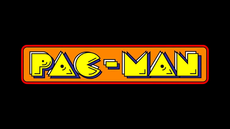
Pac-Man was stylised as per its target audience and gaming niche. In 1980, Puck-Man was developed by Namco. Later on, the game was renamed Pac-Man to avoid misappropriation of the name.
Namco focused on teenage girls as their target audience. In Japan, food is one of the regular conversations among teenage girls. Likewise, Namco designed a game where a pizza was animated to gobble small dots. The ‘C’ in the title logo was styled in a cartoon-based font which was ready to eat small dots.
What makes it unique?
Pac-Man broke through the stereotypical gaming culture by designing a logo that was often associated with the ‘cute’ culture. This was initiated to make space for girls in male-dominated gaming arcades. Eventually, it attracted both teenage girls and boys, and couples too.
Bonus: If you consider contacting a graphic designing agency, check our design portfolio.
2. Sonic The Hedgehog
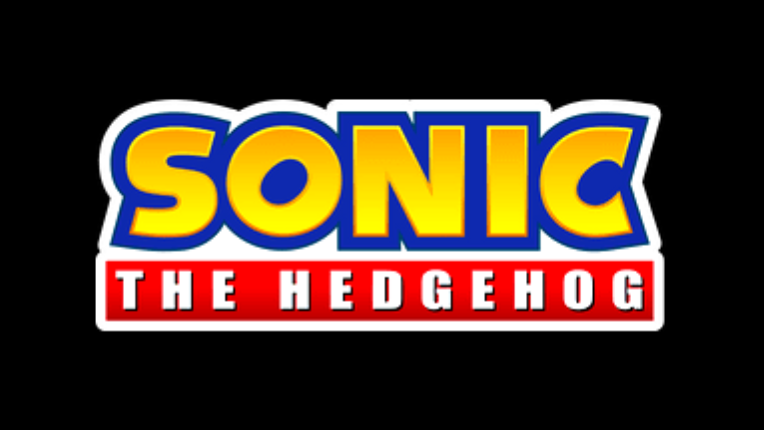
Sonic the Hedgehog dates back to 1991 in Japan, created by Sega as a contender to Nintendo’s Mario. This game follows a blue hedgehog named Sonic, who rapidly rolls on a ball through a winding tube.
This game readily became a worldwide favourite. The bipedal hedgehog was made blue and looked like a combination of Mickey Mouse and Felix the Cat. His red boots are a tribute to Michael Jackson’s boots.
The logo has been revised repeatedly over the years. The present logo, which is a favourite among users, is simple. It has Sonic written in yellow along with its usual blue border, depicting a tinge of the key character’s personality. Underneath it, ‘The Hedgehog’ is written in a red box.
What makes this special?
The logo has been kept close to its roots. The blue border and the hedgehog come from Sega’s icon. The red is inspired by Santa Claus’ clothes.
If you look closely, you shall notice the ‘O’ and ‘C’ has slanted insides. This will remind you of Sonic’s ‘spin dash’ move. The designer has left a touch of the actual gaming experience on the logo.
3. Minecraft
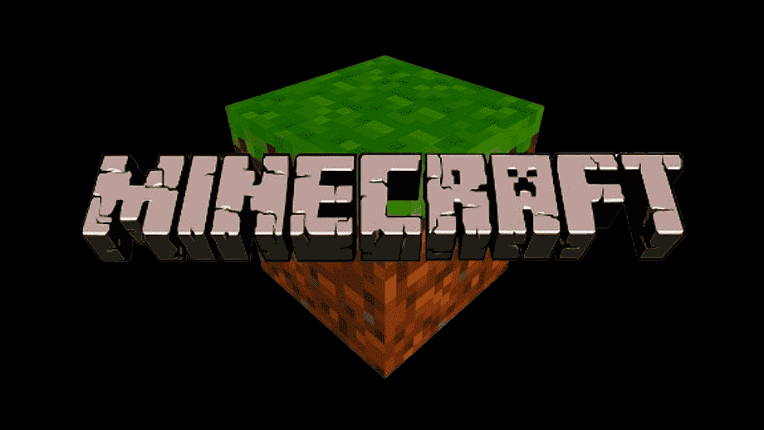
Minecraft is comparatively a new video game that dates back to 2009. Marcus Persson, the creator, formerly called it the ‘Cave Game’. It was specially developed for PCs but eventually upgraded for various consoles.
Persson’s updated game was called Minecraft. This game allows you to build anything in a fictional universe. Soon the game became a favourite in the gaming community.
The logo, formerly, had round-edged letters. They were filled with blue skies and green grass. However, the logo changed multiple times before reaching a standstill in 2012.
What is special about the latest logo?
It is designed in pixels along with the smoothened edges of the letters. The 3D image continues to stylise ‘A’ as the immortal Creeper monster, first introduced in 2011.
The latest logo continues to have cracks on the letters, indicating them as building blocks carved out of stones. Most importantly, the logo is designed for low-resolution consoles.
Bonus: Scan through and begin brainstorming by studying the 11 new interior and modern creative design logos.
4. Gears of War
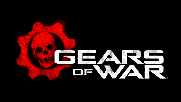
Gears of War is a 2006 US-made video game. It concerns war strategies as players fight Reptilians of the island. The player is to join Marcus Felix, the protagonist, who runs a small squad and fights enemies.
The logo has undergone many updates. It consists of a red skull in a cogwheel. It’s accompanied by the word badge Gears of War, written in black.
Throughout its evolution, the logo had various dark shades of colour like red, black, purple, and metallic ash. These colours denote a military ambience.
What is so special about it?
The human skull is a symbol from the game called Crimson Omen. It appears when a player dies in the game. This indicates the violence, profanity, and bloody Warfield.
The logo reflects the mysterious, gloomy, and dangerous state of the game. The geometric pattern of the lettering and stencil inscription emphasises the cruelty of war.
5. Doom
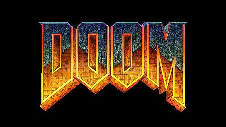
Doom first appeared in 1993. It concerns one marine operative fighting against hoards of demons and monsters. It is one of the first-person shooter categories that paved the way for aggressive and bloody games.
The logo has the word ‘Doom’ written in two different features. The upper part is blue and has mechanical parts in it. The lower part is brown with an organic appearance.
What is catchy about the Doom gaming logo?
The duality of mechanical and organic features in the logo reflects the inner characteristics of the game. This artistic concept talks about Phobos, Deimos, and Hell. They are completely technological, half technical, and fully demonish, respectively.
The designer has adeptly reflected the content in the logo.
6. World of Warcraft
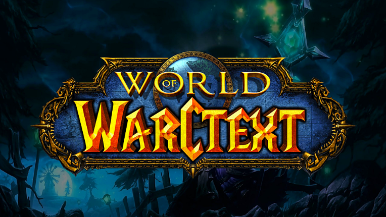
World of Warcraft was developed in the year 2004. Considering how the in-game aesthetics resemble a setting similar to that of Lord of the Rings, it rapidly gained popularity.
The logo of this role-playing game has stood the test of time. It has remained constant with few adjustments in colour codes.
The logo contains a blue badge with the words ‘World of Warcraft,’ written in golden. The lettering reflects medieval art, which is typical of the fantasy genre.
How does this gaming logo stand out?
The upper part of the word badge has the word ‘World’ against a globe. While the lower part has ‘Warcraft’ written on sharp edges. This artistic concept adds volume and importance to the gaming logo’s essence.
The logo, therefore, evokes a sense of mystery and fantasy. What’s best, it discloses the core tenet of the game without exposing much.
7. Super Mario
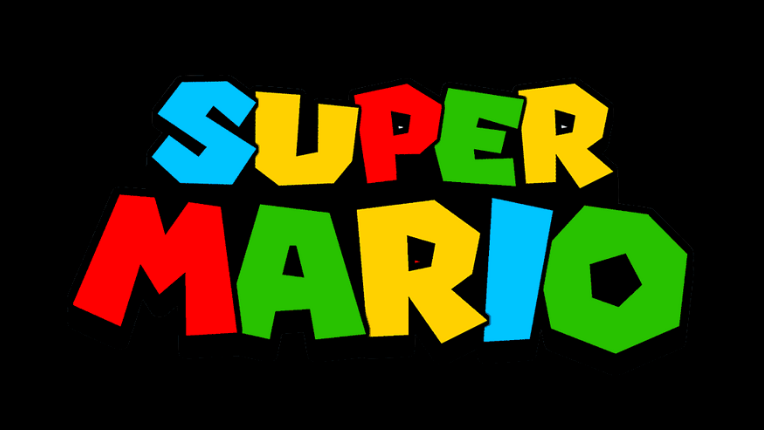
Super Mario first debuted in the game Donkey King. It was 1985 when Super Mario had his gaming platform, developed by Nintendo Entertainment System.
Super Mario is about the red-capped main character who can jump over high obstacles. He can tackle his enemies and also break bricks – all with a retro personality. He aims to save the princess from the tortoise-like monster.
Now imagine all these elements combined on the logo through subtle cues making gamers remember the game at a mere sight of the logo.
The red-caped man has become the endeared mascot of Nintendo and a well-known cultural entity.
What is so different about it?
The letters are given geometric shapes. A closer look will tell you they are not symmetrical. The ‘O’ is octagonal, but the ‘U’ lacks proportion.
The logo exposes chaotic, bold energy and endless entertainment offered by the game.
Verdict
Gaming logos tell their definite stories. It is the signature of the brand and the game itself. Hence, they must be full of meaningful imagery. They should be designed with the correct shades of colour, precision, and style.
Being the harbinger of desirable brand recall rates, they are inevitably effective marketing strategies that attract your audiences, be they spectators, followers, or players.
There are zillions of video games. The right logo will help you stand out. Thus, you need graphic designers who understand your story and cater to the design vision you have charted out.
Bonus Read: Treat yourself to the luxurious and sophisticated ambience of restaurant designs.