7 BEST FOOD AD DESIGN EXAMPLES [+WHAT MAKES THEM GREAT]
Creating highly catchy and hunger-inducing designs for advertisements related to eateries and food types is an experience as enjoyable as feasting itself.
There is a possibility of presenting varying ingredients on a plate in an eye-catching manner. With the scope to bring in multiple colour shades through fruits, vegetables, and different bread varieties, design for food ads have no limit for creativity.
You can introduce any background setting you like, be it on a table, stand, or a tropical backdrop. Even better, you can choose any sonic elements you wish and throw in a copy that resonates with the other components of the food ad.
Designers can easily make a mere dish like a burger or mutton steak into an exciting food ad that narrates a story, sparks a desire to try the dish, and inspires customers to stay informed of the brand’s latest offerings.
At 55knots, we believe in designing high-quality food ads that help food businesses generate 100x more revenue from the advertisement as compared to their spending in creating it. For this purpose, we resort to curating food ads that display a creative mix of videos, enchanting images lifting your gastronomical desires, and mouth-watering graphic design. Above this, we add a dash of the latest trends in the food marketing domain.
What’s more, we collaborate with marketing teams to implement strategies that can lead to higher CTR (clickthrough) rates on digital ads and increase the conversation rates of viewers to regular customers. Look at our portfolio for a sneak peek into our design diversity.
We’re aware that in the digital sphere, food is first tasted through the eyes. Thus, we deploy premium food advertising techniques and shift gears in marketing styles to get your taste buds drooling.
Best Food Ad Design Examples
Let’s look at 7 epic food ad design examples and things that offer them an influential position in the food marketing industry.
1. Five Guys
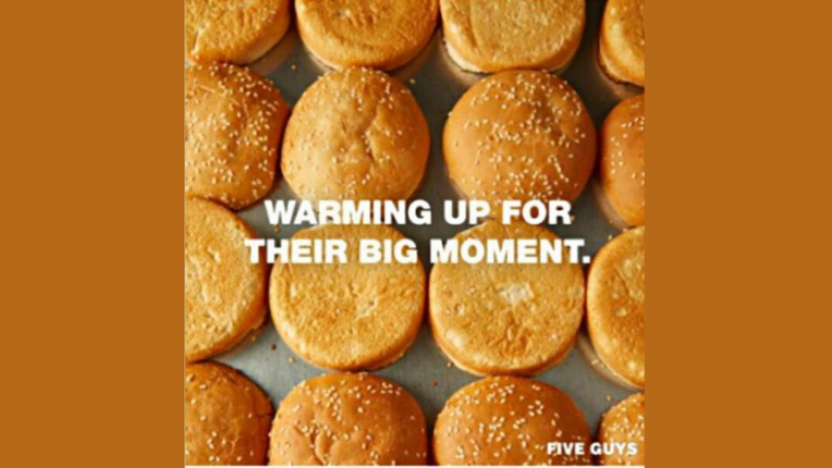
Being a fast-casual restaurant chain in the USA focusing mainly on everyday favourites like hot dogs, fries, milkshakes, and burgers, Five Guys is well aware of its target audience. Further on, their products are quite tasty and appealing to both young and elderly customers. This makes it easier to leverage their reputed brand identity and create food ads that rope in hungry audiences.
Look at the softness and gentle texture of these burger buns!
Five Guys has combined the traits of food design, images of freshly prepared buns, and a perfect kitchen counter-like surface to offer a feeling of burger buns coming straight out of the oven and into your hand.
Since the burgers are pretty much the USP at Five Guys, the visuals of this food ad focus solely on the freshness of the buns. Almost like they’re waiting for you to pick them up.
They’ve maximised their design efficiency by incorporating a tagline “Warming up for their big moment” – giving customers a push to make an order. Even better, such text establishes an inviting tonality for on-lookers.
Our favourite design element is the intelligently-placed CTA which directly diverts viewers to the nearest Five Guys outlet in their vicinity. Any food brand with several franchises can use this strategy to ensure their ads continually bring customers to their doors while the ad is live.
Bonus Read: Here is a listicle on 11 highly inspiring healthcare ads which successfully put the message forward.
2. Heinz
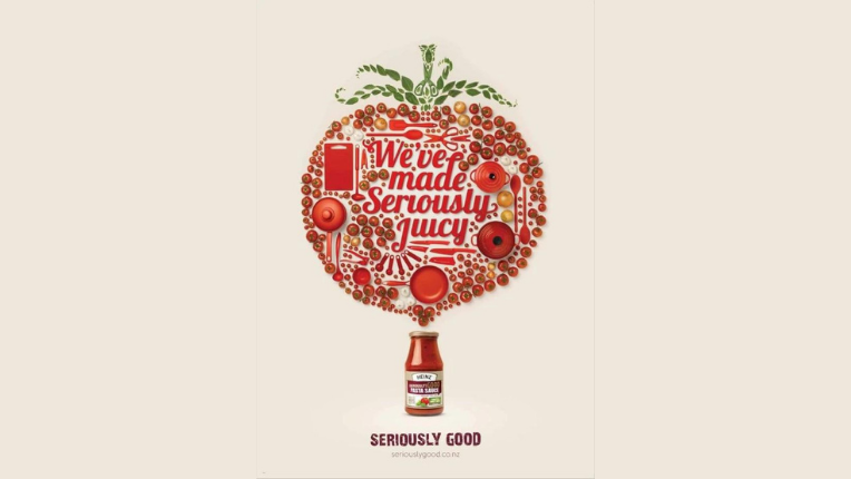
Talk about enticing food ads and Heinz’s attempt at luring in their sauce-loving customers. While the image itself has enough wonders to keep a viewer’s attention intact, Heinz has done a phenomenal job sustaining the red colour throughout the ad.
Right from the borders, cutlery, text, and the numerous tomatoes – Heinz displays their brand identity through and through. Design experts have repeatedly praised this decade-old food advertisement for the potential it has placed for increasing the time spent on the ad by viewers.
Look at how the entire concept of designing a large-size tomato is summed up with the equipment in the collage. Almost all the equipment displayed in the big red tomato is actually used to prepare the world-renowned Heinz tomato ketchup.
Furthermore, hats off to the overall conceptualisation of showing how all of the equipment and items in the main image eventually result in a sleek, compact, and tempting bottle of Heinz’s sauce.
The food ad design experts who’ve designed this masterpiece are based in New Zealand. There’s no doubt they’ve got their way with quirky copywriting as well.
As it reads, “We’ve Made Seriously Juicy” describes precisely what the sauce intends to offer – be it for pasta, burgers, fries, or any side dish you complement with Heinz.
3. Pizza Hut
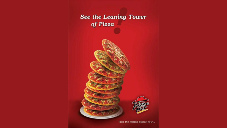
What part of the world pops in your mind when you think of Pizza? Straight up Italy, right?
Pizza Hut has capitalised on this well-known fact and smartly brought in the charm of this romantic European location to their ad. They’ve created a pictorial representation of the famous Leaning Tower of Pisa in Piazza Del Duomo in Italy. But instead of showing the tower itself, they’ve designed a tower of tasty-looking pizzas that gradually tilt to the right.
The mindset applied while designing this food ad revolves around reminding pizza lovers of the origin of this dish by giving them a visual cue of a globally-known structure. Not to forget, the exclamation very wisely shows a minor tilt as well, making the ad seem aligned despite the intentionally placed bend in the tower.
Such food ad design ideas teach us how incorporating cultural references can alert viewers to the story behind your in-ketchup setup, the source of inspiration for ingredients used, and the overall vibe you try to induce through your ad’s presentability.
The ocean of possibilities is endless. Think about some tea brands that install images of the Taj Mahal and other monuments which people can instantly recall in a sighting.
4. Nutella
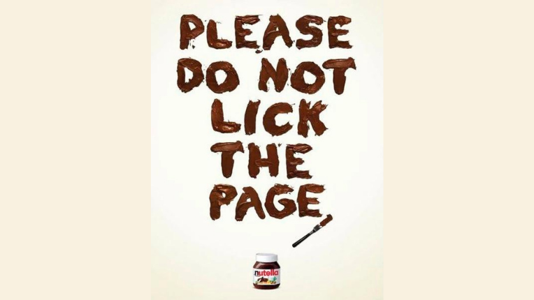
Who said looking at designs can’t have you drooling in a moment? Considering the silkiness and genuinely soothing texture Nutella has on your tongue, this ad only intensifies the joy of relishing a Nutella jar.
Simplicity at its finest and with a display of nothing but Nutella beautifully spread out, this ad makes for a truly clickbaity affair. Present this on food delivery platforms and grocery selling stores, and you’re almost sure to have a large number of people purchase at least a jar or two.
The ad plays the seasoned designer’s role by kickstarting with a word denoting a request, please. As you read the following 5 words, you see the humour Nutella uses while trying to trick you into believing the page can actually be tasted.
Owing to using a design tactic that generates temptation within the user, the ad has proven successful in sky-rocketing Nutella’s sales in whichever region or medium it was published.
Above all, Nutella plays the reverse psychology mentality on its customers. This fits well with the playful approach they maintain. You’ll be left wishing the page was really lick-able!
Another well-implemented design element is the use of a butter knife at the end of the ad text.
There’s so much this ad has to offer in terms of food ad design expertise; we can’t wait to throw in our in-house suggestions!
5. Godiva
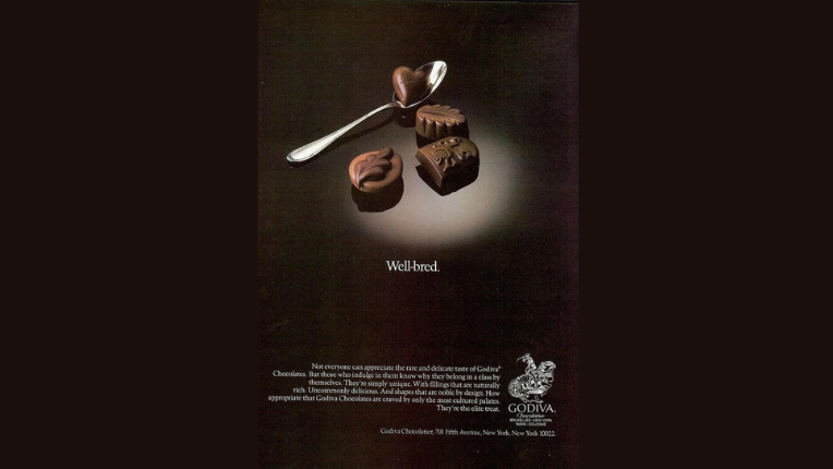
Speak of the classic food ads from the 1980s, and we can’t resist mentioning how Godiva took the advertisement industry by storm. They proved it’s possible to exhibit elegance, refined finesse, and royalty for something as regular as gourmet chocolate.
Remember that they intended to design a masterpiece blessed by the benefit of timelessness. This would make it suitable for display for years to come while continuing to grab the attentiveness of chocolate lovers.
The central point of focus remains to be the four unique chocolate pieces Godiva offers. With the one indicating fondness and love placed on the steel spoon at an elevated height. What’s best, these designers managed to position a dimly lit white surface beneath the chocolates, giving them a feeling of premium classiness.
And what’s better than the fusion of minimalistic visual elements and carefully chosen text which defines the authenticity of these gourmet chocolates.
When viewers skim past the hefty 6-liner paragraph beside the logo on the right-bottom, some phrases and terminologies do a fabulous job cementing a keen interest within their taste buds. For example, phrases like “uncommonly delicious”, “most cultured palates”, “the elite treat”, and “fillings that are naturally rich” are placed in positions that readers have a high probability of coming across.
6. Wendy’s
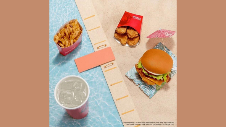
Wendy’s has taken the food ad design game up a notch by introducing coupon strategies and presenting exciting deals. Let’s look at how they’ve marketed their insanely cheap deal of 3+1 delicious foods and drinks for a mere $4.
They’ve done a remarkable task at setting up the food items in an almost equidistant manner, allowing viewers sufficient space to witness and let the wholesomeness of each dish sink in. It’s more of an attempt to narrate a story through a thoughtfully planned image. Kudos to their proficiency at merging design and storytelling without bringing in any unnatural elements.
Look carefully; they’ve unleashed a barrel of tropical creativity and used nothing more than cardboard, paper, and the food items. The goal was to create an on-screen atmosphere that seems to be an inviting break from the sweltering heat of the warm summer months in the target region.
Notice the blue surface under the fries and cold beverage. It represents a relaxing and cool swimming pool. Next, observe the cozy spot under the pink umbrella and the mat-like paper on which the burger awaits your hands.
Finally, notice how the springboard acts as a bridge of relief from the heavy nuggets and burgers. It takes you to the side of easy-eating fries and comfort drinks to beat the heat.
Hats off to Wendy’s marketing department. They’ve managed to capture the right emotion and successfully market their product offerings during the summer season.
Our Design Case Study On Shredders Nutrition
7. KFC: Oh FCK!
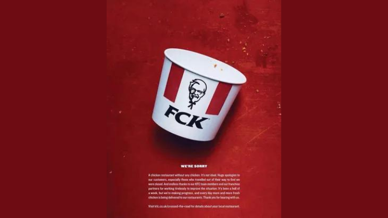
Who said all food ads need to promote the brand’s latest products, upcoming packages, or raving customer reviews? Marketing wizards have also used food ads to convey apologies for any inconvenience to customers. For example, look at how KFC in the UK preyed on their brand’s initials to stir up an apology that impresses customers more than worries them.
Since a UK branch had to temporarily shut down because of a shortage of chicken, they had no option but to opt for a comical manner of acknowledging their error.
The result? All the hungry fried-chicken lovers were left giggling as opposed to flocking to KFC’s competitors!
All they did was mix up the letters in their brand name KFC and create a non-dictionary word, FCK, which is well-known amongst the youth as a curse. Watch how the ad is super clean and yet shows tiny fried crumbles spread outside an empty, fallen KFC bucket. This explains their shortage in chicken supply, and the initials FCK indicate the concern the brand expresses.
At the bottom, they’ve positioned an apologetic message ensuring their customers that fresh chicken is on-the-way. This is a brilliant example of transparency with customers. The brand also successfully expresses the itch they feel for having to stop supplying their customers, even if it’s only for a week.
Verdict
The popularity of globally acknowledged brands like Domino’s, Pizza Hut, McDonald’s, Taco Bell, and other food giants like Dr Pepper and Dunkin Donuts gives them a significant edge over competing players. They top it up by investing in an experienced design team capable of adapting to any brand’s tone of voice and communication guidelines.
Let’s get in touch today to better understand what type of ad your food brand requires to make a mark amongst its customers.
Bonus Read: Glance through 11 stunning Twitch banner ideas and designs of 2022.