A dashboard is a must-have element for any application aiming to provide value to its audience. Simply put, a dashboard is a graphical summary of various pieces of data required by the user to make quick decisions.
An exemplary dashboard is not only easy on the eyes but is logical and straightforward with respect to its functionality and usability. That is to say, it must help users effortlessly view crucial information while using their mobile applications.
As for application developers, it’s their responsibility to provide all necessary data to the people systematically. But this data must be presented to increase the quality of life for the users.
To put it another way, real-time reports shown through the dashboard should aid users in planning their next steps. Most importantly, the aesthetics and organisation of these reports must be shown clearly without becoming a cluttered mess.
Top Creative Mobile Dashboard
Note that dashboards have different objectives depending on the app’s target audience. With this in mind, let’s look at some fantastic mobile dashboard UI examples from which you can gain inspiration for your own app!
1. Pet Care App
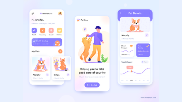
The designer keeps the layout crisp and clean with a contrasting white and lavender scheme. With the help of adorable illustrations, the intent of the application is unmistakable even without reading any words. This is a clear indication of designing prowess.
The dashboard directly informs the user about their pet’s upcoming appointments. Moreover, the easily navigable interface can help the owners book appointments for nutrition, grooming, health check-ups, and consultations.
After clicking on a particular pet, all the information one need shows up on your screen. This allows the user to keep track of the animal’s heath on a timeline.
2. Smart Home App
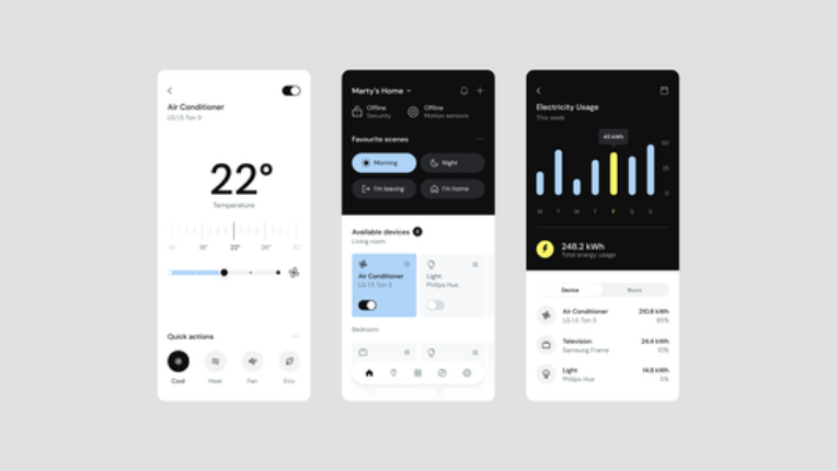
An app aiming to assist with controls for a smart home must have a straightforward interface that gives the users a painless experience. This concept design does precisely that. The colour scheme attracts attention to the devices switched on, letting the user know with just a glance.
With quick options for security at the top followed by one-click solutions, it’s easy for a consumer to navigate the app. Above all, there are well-segregated options for more detailed settings once a device is selected. The concept also has a section for electricity used, letting the users make small lifestyle changes to fit their budget by saving energy.
Remember, the design is functional and does a fabulous job of preventing the viewer from feeling overwhelmed by a large amount of poorly displayed information. However, the information available is no more than a click away. The designer has thus simplified the mobile dashboard UI by only keeping the necessities at the forefront.
3. Marketing Professional App
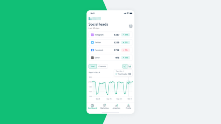
Social media is a powerful weapon for a business owner focusing on marketing. This dashboard helps track how well the advertising is being received in a very crisp way.
All major social media platform statistics for the month show up at the top, and a detailed graph for the leads is at the bottom. Such design mastery ensures you can use visual cues to get quick answers for data-based queries. There is also an option to change the type of chart. Small features like these complement the navigational experience for application users.
The dashboard has a dark mode as well, making it comfortable for the user to have a look at the numbers no matter their preference and time of day.
The page shows a marketing specialist the analysis of the advertising efforts comprehensibly to discern what works and what doesn’t.
Bonus Read:
4. Grocery Delivery App
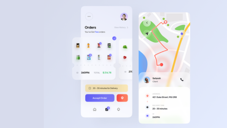
This dashboard is from the employee perspective of a grocery delivery service. With more and more services like this popping up as the world shifts to the digital sphere, companies need to provide easy-to-understand apps for their drivers and additional delivery agents. An uncomplicated experience in using the app will make the employees’ lives much easier on a professional note.
The dashboard effectively highlights how many orders the driver has to complete and images of the items required. Above all, the details and delivery time is stated distinctly, helping with the decision to accept or reject the order.
5. Weather App
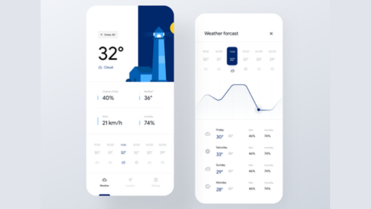
With an overall white aesthetic, the designer pulls attention to the more prominent, coloured elements, the current temperature and the illustration showcasing the time of day. This is the primary function of a weather app, expertly highlighted by the designer.
Everything one needs to know to go about their day without worrying about the weather is conveniently displayed. The current weather conditions, as well as predictions for the future hours, are shown with symbols even a kindergartener can recognise.
When clicked on, the user is led to a graph revealing the ups and downs of the temperature. Below that, the weather predictions for the upcoming days are depicted. All this data is well encompassed within the space provided, making this an effective dashboard.
6. Financial Assistant App
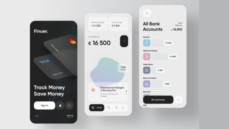
Financial assistant AIs are becoming more in demand as people find it hard to keep up with their bank account transactions and extra finances. This ingenious design is optimised with quality design for these requirements.
A clean interface helps the user keep track of how they are allocating and spending their capital. The screen highlights the total balance, and there are separate tabs for monthly budget and savings at the top. What’s more, the arrow leads to a breakdown of different banks where all the funds are stored in.
7. Fitness App
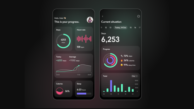
Considering our wide access to technology and software, exercising is almost incomplete if you don’t track your progress correctly. This mobile dashboard UI visualises your data in a minimalistic way, so you know just where you land in terms of your physical goals.
The app statistically displays your daily efforts towards exercise, and simultaneously, it provides a neat graph comparing the present day’s steps to the average.
The dashboard has a gorgeous, dark contrasting design, bringing the viewer’s eyes to the colourful graphical depictions. Examine how the designer takes advantage of the viewer’s eyes on the highlighted charts by using them to give condensed data about their progress.
A detailed progress chart is revealed when you click on a particular day. With varying colours for different activities, it’s easy to keep categorise your tracking metrics from alternative days.
8. Meditation App
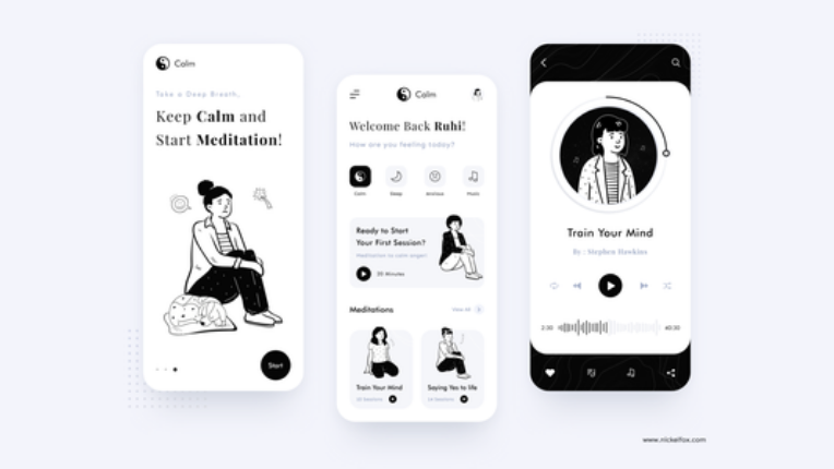
This design is for an app that helps with sleep, meditation, and relaxation. The essence of the yin and yang symbol is emphasised with a monochrome colour palette making it easy on the eyes and helping the user slip into a relaxed state naturally.
Observe how the dashboard offers recommendations based on how you feel. The lower half gives you quick and instant access to meditation courses you may have already started.
Also, the graphics are so simple but well thought out, evident in the chronological positioning of the features required. We can’t help but mention how minimalistic design empowers the app’s concept making it easily discernable.
9. Food Delivery App
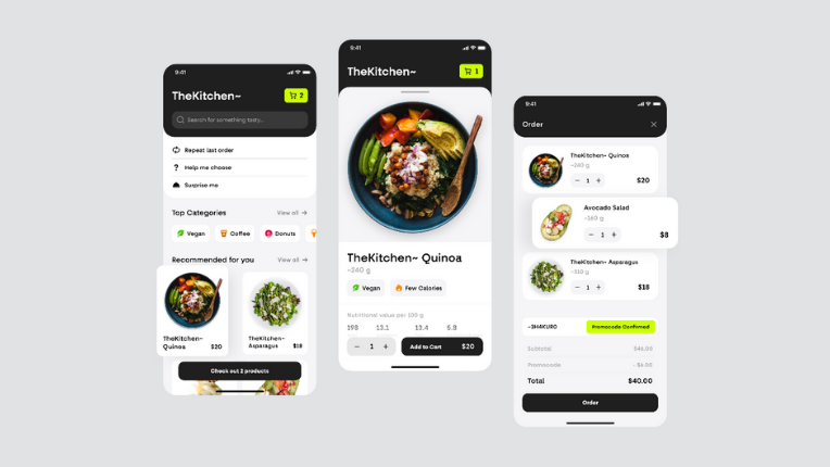
Food delivery apps have become an essential tool for all. With so many willing consumers, it’s crucial to have a convenient and neat user interface that keeps users hooked and motivated to make regular orders. This design concept keeps a primarily black and white scheme, drawing attention to the colourful food. Notice how the neon green highlights the number of items in your cart.
We’ve studied how the app makes it uncomplicated for the user to pick the perfect restaurant every time because of the way the designer has strategically placed the features that help choose a dish.
Moreover, the top categories and hand-picked recommendation segments make the decision easier. When a particular dish is clicked on, you are given all the details, including the nutritional value of the food you are looking at! This presented data makes for a quick decision on behalf of the consumer.
Bonus Read:
Treat
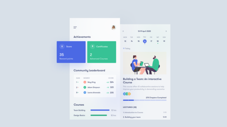
10. Educational Course App
In this era of online courses and education, it’s paramount that companies pay attention to how effectively their mobile dashboard UI comes across to their users.
This particular dashboard boasts a simple but practical way to showcase the user’s progress. Making sure to maintain focus on the blue and green elements, the designer achieves a minimalistic look by doing a fantastic job of guiding users in navigation.
The dashboard is packed with all a student would need to know to continue where they left off. Their efforts are enumerated and placed at the top, enabling the learners to monitor their progress for educational growth.
Furthermore, a community leader board helps them see how their friends are faring and gets them into a competitive spirit.
Lastly, there are pending courses at the bottom after one is finished surveying their progress in the app, urging the user to complete them to improve the statistics on the top.
11. COVID 19 Medical App
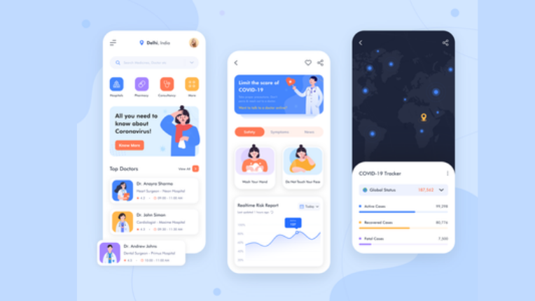
As the pandemic comes to a relative close, COVID-19 medical applications are less needed. However, that doesn’t take away the brilliance of this design which medical experts have followed over the globe.
Look at how this mobile dashboard UI reminds you of the safety measures to be taken and the manner of presentation regarding real-time risk reports; giving you vital information with just a glimpse.
The page is loaded with data and yet stays uncluttered. All credits to the stylistic manner the designer pieces the elements together. With self-explanatory illustrations, the viewer can determine what the text is about without having to carefully study it.
We love how the homepage has quick, valuable features for one to use to get medical help – whether it be doctors or medicine. The Coronavirus tracker is more so beneficial as it showcases the exact status of the surrounding cases, leaving it up to the user to figure out how safe it’s to go out.
Verdict
A dashboard is an integral part of any mobile application. It not only supports the user to understand their status or progress quickly but often urges them to make simplified decisions using key features, making it an essential tool for keeping the users active.