Choosing a suitable and fundamentally relevant logo is vital for any educational institute. Logos represent your values and your origins. A university logo should make an impression immediately. But what makes for aesthetically and graphically viable school logo ideas?
Firstly, the relevancy of the nuances and images used on the logo. You don’t want any unnecessary pictures, which can divert the attention from what you want to represent. Secondly, your logo should have symbolism. When people notice the subtle meanings in your logo, they’ll appreciate it more.
Thirdly, a logo should contain colours appropriate to the school’s branding. Remember, colours are an integral part of a school logo idea – helping you evoke emotions in your target audience. Therefore, colour theorists say that colours invoke a sense of feeling. That feeling should match with the imagery you would like to portray. For instance, an Ayurveda brand would use green and its shades to represent nature, health, and the earth.
Fourthly, a logo should be the right colour. Colours are an integral part of a school logo idea. Therefore, colour theorists say that colours invoke a sense of feeling. That feeling should match with the imagery you would like to portray. For instance, an Ayurveda brand would use greens or browns to represent nature, health and the earth.
9 Best School Logo Ideas
Let’s analyse the nine best school logos that have chosen their emblem with care and thought.
1. University of Hawai’i

The University of Hawai’i at Mānoa has a simplistic logo design. Their logo is just an olive green and white ‘H’. Nonetheless, here’s what makes it unique.
The ‘H’ has jagged edges with white accents, drawing attention to the spikes. Interestingly, those sharp points, along with the white triangles, represent the totem pole. Totem poles symbolise power and protection against evil forces. The imagery goes hand in hand with the University of Hawai’i sports team name ‘The Warriors’.
Additionally, the designs used in the logo are traditional Hawaiian Kapa patterns. They portray the characteristics of varied people who have banded together to gain wisdom and success. Another aspect of symbolism they included in the logo was the Hawaiian expression ‘Ha’. It means ‘the spirit of life passed from generation to generation.
While the ‘H’ stands for Hawai’i, it also represents the essential lesson of uniting and moving forward as one group of constant learners. Furthermore, it’s evidently well designed for the youth to experience the educational adventure they’re embarking upon. Even better, the logo is recognisable and can be used on different mediums such as sweatshirts, stationery, flags, etc.
The black outlines highlight all the design details. Thus making the logo stand proud and strong with its heritage and ideals.
2. New York University
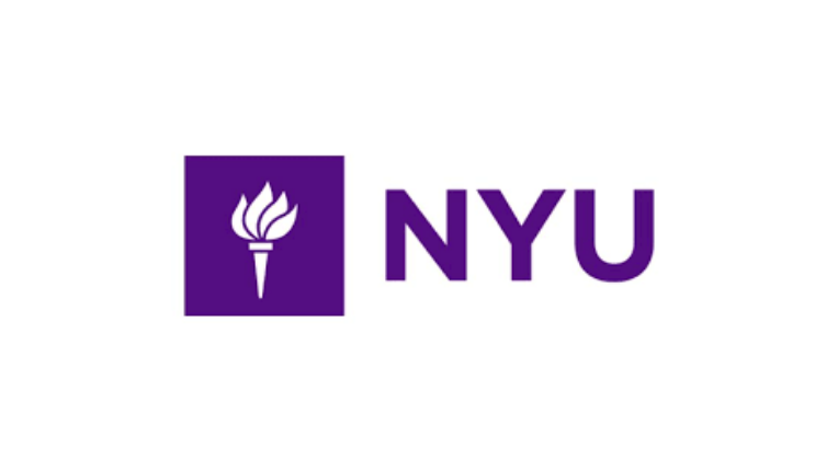
Next, let’s talk about New York University (NYU). The logo sports the iconic torch of Lady Liberty in negative space against a violet square. It is used to represent both knowledge and light. An additional meaning of the torch is the university’s commitment to New York itself.
Secondly, the man who designed the logo was a graphic design legend. Tom Geismer had a clear vision. He wanted the handheld torch to be bright against a dark background. The burning white torch cutting through the violet shadow signifies the substitution of ignorance with knowledge.
NYU’s logo was well planned as Geismer wanted it placed on a square so that he could easily incorporate it above entrances, thus making the institute’s buildings recognisable too. Plus, he picked the torch because it was already on NYU’s seal.
Overall, the logo has made its mark on history. It’s used on a plethora of university merchandise, and it captures the essence of NYU perfectly.
Did You Know:
3. Harvard University
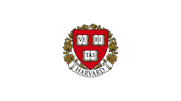
Harvard is one of the oldest education institutions globally, with a logo that is recognisable to almost all international students. This university’s logo is a crimson shield adorned with three open books. The books spell out the university’s motto ‘Veritas’, which means truth in Latin.
Above this, the emblem is framed by a striking wreath that expresses royalty. The school’s crimson image catches your eye while invoking a deep sense of power, passion and Christianity too. The university is rooted in Christian values. Their original motto was ‘Truth for the Church and Christ’. As they turned secular, they only kept the word ‘Veritas’.
Plus, the emblem is framed by a wreath. The school’s crimson image catches your eye while invoking a deep sense of power, passion and Christianity too. The university is rooted in Christian values. Their original motto was ‘Truth for the Church and Christ. As they turned secular, they only kept the word ‘Veritas’.
Further, of the three books depicted, one is face down. It portrays that there are limits to what you can be taught, and your reasoning should come in too. Secondly, ‘Veritas’ sprawled on the books symbolises the principles of learning and being a moral person for bettering society.
The emblem hasn’t been changed since 1843 because it showcases all of Harvard’s ethics. Not to forget, the school logo designers ensured the shield represents strength while the wreath demonstrates sophistication.
Harvard University’s clean logo flourishes with its meaning shining through as a classic. It aptly highlights the school’s promise of honouring truth in all fields. Moreover, it sends a clear and poignant message that the school believes in integrity, honour, and fine classiness.
4. Michigan State University
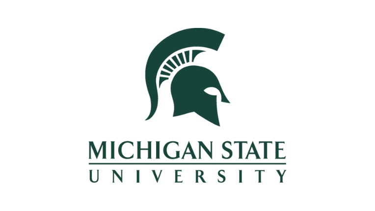
Michigan State University’s logo is a Spartan helmet. While it has many iterations, the forest green helmet is renowned. Originally the emblem was an image of the campus building on a seal. After which, they incorporated their school mascot, the Spartan.
Today, the logo is a stencilled helmet that sits in the centre of the seal.
The school wanted to depict their passion for agriculture by using a green colour. Agricultural Studies are even a part of their curriculum. At the same time, the white rings mean an open path to higher education.
They highlight their school’s values and motto ‘Spartans Will’ with the helmet. The fact being, the Spartans were hardworking warriors who won their battles with teamwork. They were strong-willed fighters that rarely gave up.
The school logo idea was to encourage students to succeed in life and fight their battles, similar to how relentlessly the Spartans did.
The font used is a custom made typeface, which sets them apart. To sum it up, MSU’s Spartan is used as a logo for their sports teams and their primary emblem. Owing to its mindful design traits, it’s memorable to many.
5. Emory University
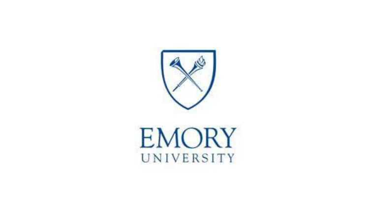
Coming to Atlanta, Georgia, we look at Emory. Emory University’s motto is ‘Cor prudential possidebit scientium’, which is Latin for ‘The wise heart seeks knowledge.
Both their coat of arms and seal depicts the motto with the ‘T’. A burning torch is crossed with a trumpet. They represent the pursuit of knowledge and the pronouncement of truth, respectively. The two being crossed represent the unity of those beliefs in Emory.
Moreover, the torch and horn have been placed on a shield. Presently, the logo has a minimalistic design style. The shield is white with a simple yet modern looking navy blue outline. To add on, the trumpet and torch are the same blues, guaranteeing there is no compromise on consistency in the graphic design process.
Emory is one of the many institutions to use blue in its logo. According to colour theory, blue invokes a sense of authority, dependency and success. Keep in mind that cool-toned colours are excellent choices for educational organisations.
Check Our Design Portfolio
.
6. Pennsylvania State University
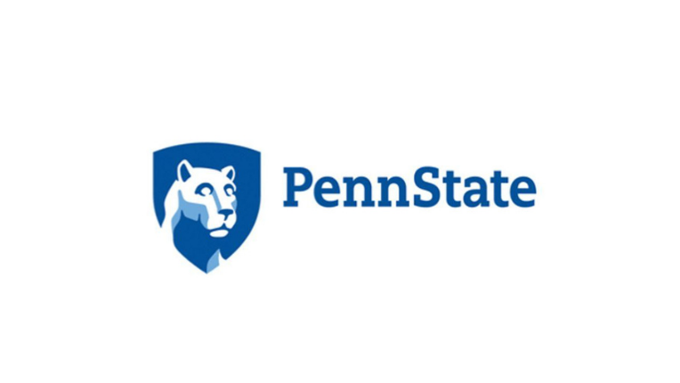
Right off the bat, you can see that Penn State’s logo is symbolic. Their emblem proudly brandishes the Nittany Lion. Even though the lion is regionally extinct in Pennsylvania, it lives on in their logo because of expert graphic designers working on their school logo.
Since several institutes had lions for mascots, Penn State wanted to make its logo stand out. They did not want it to be ferocious or clawed. Moreover, Penn State designed the current logo to be as marketable as possible.
Their goal was to be able to use it in their sports attire as well as for institutional purposes. Remember, they’re another educational institute that uses blue. Today’s logo has the lion drawn on a blue shield. The shield represents strength and protection, which goes hand in hand with the proud lion.
Their emblem is well designed because they ticked off all the required boxes while ideating and curating a school design logo. They also have a highly readable font (sans serif) to ensure viewers can recall the school logo in a moment.
Notice how the lion is drawn in white with pale blue accents highlighting the strong jaw. These intelligent design combinations have culminated into a powerful and renowned logo.
7. Universidad EIA

Yet another blue-toned university logo. The Colombian university has a well-thought-out and apt logo design combining design intricacies and visually descriptive elements. Their logo is an owl’s face alongside their initials and has their motto underneath.
The Greek goddess of wisdom, Athena, gives the owl its meaning of knowledge and erudition. After studying their logo, we concluded its relevancy is healthy for an educational institute. Further, their motto is ‘Ser, Sabery Server, which means knowing and serving. Examine how the owl represents both wisdom and observation, which are the two values that EIA holds.
The university wanted the owl’s eyes to portray the act of scrutinising truth objectively.
Study their emblem closely, and you’ll realise the modernity it carries. The owl is drawn in an easy-to-decode fashion, and their font is bold and clear. What’s best, resizing the logo is simple, and the school can easily repurpose it to fit stationery and other merchandise.
In a nutshell, the logo is fresh, modern and rich in value, thus making it a part of our list of the nine best school logo design ideas.
Bonus Read:
8. Brown University
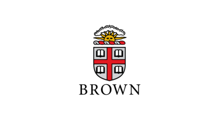
Brown University’s logo is more of a seal or crest. The crest displays a shield split into four by a red cross. Each of the four sections has an open book, and the motto ‘In Deo Seramus’ curves underneath the seal. Lastly, there is a sun poking through a cloud above the shield.
We see the use of a shield once again. The red cross in the middle represents the cross of St. George. Additionally, the cross itself symbolises chivalry and bravery. Notice how the four open books illustrate learning and knowledge for all. Next, the sun and its rays symbolise the light of knowledge shining through the cloud of ignorance.
One can’t deny how positively the logo sends forth a strong message. Such design mastery explains how Brown University is a place that harbours strong, trustworthy and intelligent students.
Above this, graphically, the logo is brilliant. While the logo is colourful, it isn’t an eyesore. The yellow sun compliments the red and white crest. We can’t forget how the grey shield highlights the open books and red cross with elegance.
All credits to expert school logo designers, Brown University has a logo that its students are proud of.
Did You Know: Rumour has it that Brown University’s motto was the inspiration behind USA’s national motto, ‘In God We Trust?’
Did You Know:
9. Johns Hopkins University
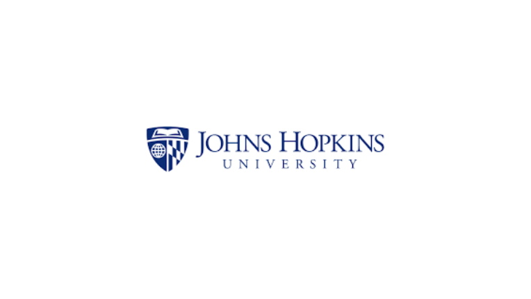
Last but certainly not least, we take a look at Johns Hopkins. We circle back to the shield and blues used in school logos. The university wanted to promote its motto, ‘Truth shall make you free’ (Veritas vos liberabit).
Try focusing on how the crest of Lord Baltimore is displayed as a homage to the Johns Hopkins community.
They did so by using blue. Colour theory psychologists believe that blue invokes a sense of responsibility, truth and transparency. To add diversity and infuse more design elements that contribute to the logo’s meaning, they divided the blue shield into three parts. The top of the shield holds an open book, which symbolises education for all, while the left half of the shield has a globe.
Remember, Johns Hopkins is globally renowned and wanted to promote its worldly views on wisdom and research. Thus, they chose the image of the globe on their logo.
All in all, the logo is another high-quality design that evokes all the right messages for students at an educational institution. We can easily deduce how truth and a constant expansion of knowledge are integral to the university.
Verdict
A school’s logo is the brand identity of that institution. They should be rife with symbolism and always send out a moral message. As an educational institute, you want to motivate your students to strive for better every day.
School logos are displayed on a plethora of items such as stationery, uniforms and schooling equipment. Thus, a quality designer can guide you in creating an impactful logo. If you know what you want to showcase and how you want to represent your educational brand, our graphic design masters at 55 Knots have your back.
Bonus Read: