Launching a fitness centre can be incredibly rewarding if you’re passionate about staying active. This facility provides a convenient space for people to exercise and attend various classes. It has also become a popular endeavour as more people prioritise fitness today.
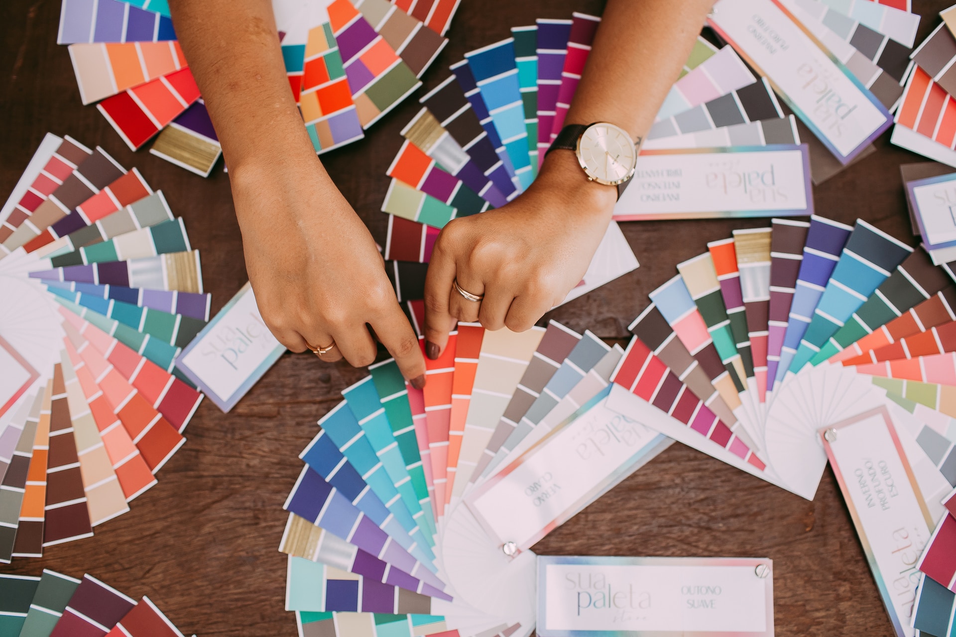
However, launching a successful gym goes beyond offering promising memberships and having designer brand logos. Your brand must also have the proper colour palette, which will help make an excellent first impression and reflect how people perceive your company. You must also make this decision right across all marketing platforms.
If you want to diversify your clientele and enjoy a successful business, let this article explain the significance of your colour choices. We’ll also dive into the meaning and use of each hue.
Why Does Your Gym Need Colour Palette Branding?
Your facility needs a distinct colour palette for its brand, as it’s the first thing people notice. The hues mainly influence consumers’ purchasing decisions. Your selected colours will also reflect your brand’s personality and must be memorable and recognisable to attract and retain customers.
When choosing colours for your branding, you must consider the mood you want to convey, whether humorous, traditional, functional, or professional. Once you determine your personality, you can select individual colours.
How to Select Your Brand’s Colours
Pick two or three colours that complement each other or are variations of the same hue. You can use complementary colours or a split-complementary palette. You can also use one colour in different tones, tints, and saturation for a monotone look.
8 Common Colours: Their Meanings and Uses
After explaining the significance of colour palette branding, let’s analyse eight colours, their meanings, and their uses.
1. Red
Red is a bold colour associated with love, strength, danger, determination, and passion. You can use it in branding to catch someone’s attention from afar and generate excitement. This attention-grabbing colour is a popular choice for brands in the food and car industries, like Coca-Cola, Kia, Honda, Toyota, and Audi.
2. Orange
People commonly link this happy secondary colour with creativity, playfulness, and vitality. Although it may not be as fierce as red, it can still stir emotions and motivate action. Orange is famous for food, healthcare, youth, and technology companies. Corporations catering to children, like Nickelodeon, use this hue to represent their fun brands.
3. Yellow
Yellow is a happy colour associated with sunshine that evokes positive energy and warmth. It’s an excellent option for branding if you want to create an optimistic and lighthearted connection with customers. Food and technology companies like Lays, Denny’s, Subway, and Sonic, use this colour in their branding to stimulate appetite.
4. Green
This restful colour connects people to nature, and they commonly associate it with health, wealth, and growth. Green is popular among food, finance, and holistic industries, with companies like Animal Planet, John Deere, and Roots using it in their branding.
5. Blue
Blue is attractive to consumers as it represents trust, responsibility, and dependability. Industries like travel, technology, finance, healthcare, and agriculture use blue in their branding to show confidence, success, and reliability.
6. Purple
This rare colour combines red’s energy and blue’s stability, often associated with royalty, power, and luxury. Although not as popular as blue in branding, finance and technology companies use it often.
7. Black
Although black can exude luxury and sophistication, others can see it as grim or dark. However, you can pair it with another colour to create a unique feeling.
8. White
White symbolises purity, innocence, and simplicity. Cleaning products, companies, nature, children, and healthcare brands use this colour for their brands.
Conclusion
Offering premium memberships and quality classes may help, but they’re not enough to create a thriving fitness centre. You can attract and retain more consumers by selecting the best colour palette branding and using them in designer brand logos.
If your gym needs designer brand logos in Australia, call 55 Knots! Our company provides dedicated creative resourcing to help businesses in the fitness industry thrive. Request a call now!

