Using logos to represent brands and businesses may seem like a modern human feature. Factually, humans have been using images to define, identify, and differentiate themselves from others. This has been done in the forms of emblems, family crests, etc.
Today, a company’s logo is perhaps its greatest treasure in terms of its displayable marketing assets. It communicates ownership when displayed on products. Above all, quality logos can alert potential clientele of your presence, the category of services or products you offer, and in some cases, your unique selling point.
Often, logos are designed in such a way that it depicts company values or products. A well-built brand logo should attract new customers through its colours and design scheme, making prospects intrigued to check out the company and its offerings.
Designing a distinguishable logo from rival brands or similar-looking emblems is also essential. This is mainly because similar products may be inspired to create logos based on parallel ideas. Remember, a well-known and easily identifiable logo does a tremendous task at establishing brand loyalty and growing brand recall rates.
Most Influential Luxury Brands Logo of All Time
Here’s a look at the 9 most influential luxury brand logos that have consistently led the way for other premium brands to follow.
1. Gucci
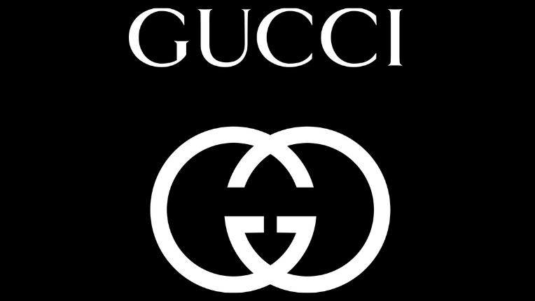
The Italian fashion house Gucci is inarguably the world’s most coveted luxury brand. The logo is so famous that its mere presence on products hikes up their value significantly. Gucci is a high-end fashion name that specialises in premium leather accessories and clothes – if you’re not exactly aware.
Speaking of the logo, the interlocking two Gs represent the founder’s name, Guccio Gucci. Gucci employs this letter mark in various ways, including as a fabric design or a bag or belt clasp. The initials ingeniously overlap in the centre, creating a distinctive pattern. Remember, this graphic technique is known as a monogram.
Owing to the symmetrical nature of the Gucci monogram, reversing the left half brings forth the right portion.
Another point to consider is how the Gucci emblem is frequently shown in gold as a tribute to the wealth and extravagance of the brand. Further on, the brand’s name is also spelt out prominently above the double-G mark, confirming the logo’s rearrangement and emphasising the brand’s prominence.
Considering the emblem has stuck around for 80+ years, it wouldn’t surprise the logo design industry if it lasted another 80. The unique double-G symbol will continue to be prominent as long as this prestigious Italian company holds the tag of supremacy in the luxury apparel business.
Bonus Read: Skim past these UX visual design elements to incorporate on your company website.
2. Louis Vuitton
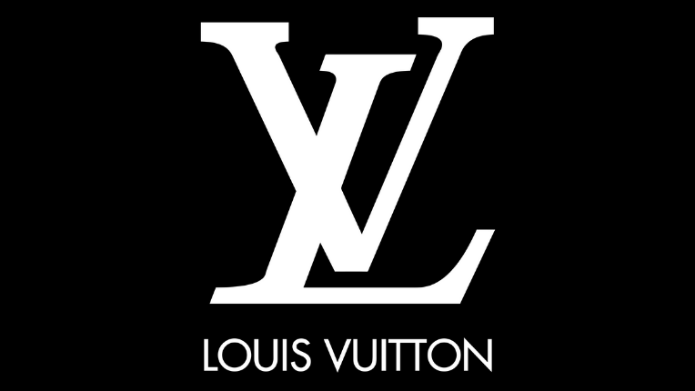
It is not possible to talk about luxury brands and brand logos without including Louis Vuitton, a majorly reputed and preferred worldwide fashion brand.
The LV monogram may be seen on almost all of the label’s products, including luxury bags and leather goods as well as ready-to-wear gear, shoes, jewellery, accessories, eyewear, and books. Although it originally started as a luggage business in Paris in 1854.
Their logo consists of an L and V monogram. This monogram is likely to be among the world’s most famous monograms. In 1896, Louis Vuitton’s son, Georges Vuitton, devised this monogram as an attempt to promote his luggage enterprise.
The logo designer devised a monogram with an italicised serif “L” positioned slightly to the left and with its base above the bottom of a capitalised “V”. The brand’s logo hasn’t altered much over the years. Still, in 1997, under the direction of designer Marc Jacobs, they chose to feature simply the monogram in commercials and omit the words entirely.
Moreover, the lettering has always been black on a white backdrop, but in recent years, they’ve experimented with a variety of hues, most prominently the brown monogram.
3. Coach
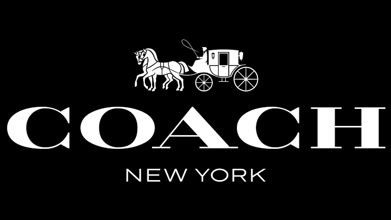
Coach, Inc., or Coach, is a world-renowned American corporation best associated with high-end leather purses, briefcases, watches, baggage, wallets, eyeglasses, footwear, and other accessories. The corporation, which began as a family-owned business in New York City in 1941, today employs over 12,000 people globally and has net revenues of $800 million as of 2009.
Coach has various logos, but they all follow the same basic style developed in 1962 by Bonnie Cashin, a well-known American artist and fashion designer.
This renowned logo has a complex horse-and-carriage picture filled in black ink. Two horses pull the carriage while the carriage-man sits atop the coach. This creative design is a nod to both the company’s and New York City’s past.
What is the purpose of the carriage from a design perspective? Because a coach was initially a large, typically closed, four-wheeled vehicle pulled by a team of two or more horses and steered by a coachman.
As a result, the carriage aspect works well with the logo and conveys a sense of grandeur, nobility, and elegance.
The typeface used to print the word “Coach” is a bespoke font created just for the brand. Furthermore, the script underneath it, which states the company’s founding year, is more straightforward and uses a classic black font.
4. Cartier
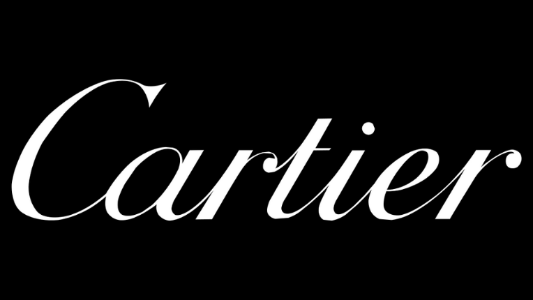
Cartier, or Societe Cartier, is a French luxury company known for its high-quality timepieces and jewellery. It was founded in 1847 in Paris, France, by the famed craftsman Louis-François Cartier, who took over his teacher Adolphe Picard’s workshop. The firm immediately gained a reputation for excellent craftsmanship and style.
The company name is scribbled in white on a black backdrop in the distinctive Cartier logo. Remember, the colour white represents purity, whereas black represents elegance and exquisiteness in brand emblems.
Above this, the initial insignia for the Cartier brand was developed by Pierre Cartier, the grandson of the company’s founder. Not to forget, the symbol was finished in 1900, but it took another decade for it to be patented. Such is the immaculate precision and detailing, legally and on a design note, that logos of luxury brands require.
Cartier’s full name is written in a beautiful script that is clear and straightforward. In their monochromatic style, the intertwined C letters speak for the brand’s aesthetic godliness, family loyalty, and beauty in pure and straightforward design components.
The Cartier logo uses an italic, handwritten typeface to represent the company’s name. Initially, it was employed in labels. You can’t type anything else with the typeface. However, you can download a vector graphic of the Cartier logo.
It’s worth noting that the monochromatic design adds to the overall royalty of the company image.
Bonus Read: Take these lethal home inspiration from 11 top-notch healthcare ads that succeeded in putting their message forth.
5. Giorgio Armani
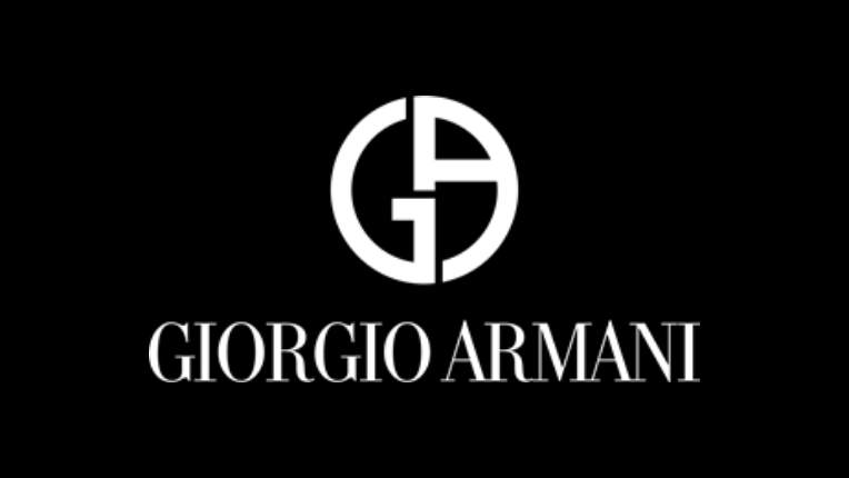
When it comes to luxury brands, Armani is one of the first names that comes to mind. Giorgio Armani, or simply Armani, is an internationally renowned Italian luxury apparel company. In the fashion business, it has a prominent position. It was created in 1975 by Giorgio Armani, an Italian fashion designer.
Armani is well-known for his designer suits and dresses worn on the red carpet. The company also makes watches, eyewear, jewellery, leather goods, and other accessories.
Giorgio Armani not only created new clothing styles but also made his emblem one of the most identifiable images in the world of fashion. His initials live on through his logo.
For both clothing design and unique style, harmony and the absence of unnecessary features are critical. Armani’s sophisticated style is defined by rigorous black and white tones with only a few grey flecks.
An eagle facing the right is showcased in the Emporio Armani emblem. And no! This isn’t your average eagle.
It features horizontal stripes with the letters “G” and “A” printed. Above all, the eagle is a traditional emblem of courage and power, proudly known as the “lord of the sky.” As a consequence, the logo’s output reflects the brand’s high quality, nobility, and positioning in the space of influential luxury brands.
Note: Didot LT is the Armani logo typeface. Adrian Frutiger designed the typeface, which is a neoclassical serif font.
Check Out Our Complete List Of Design Services
6. Burberry
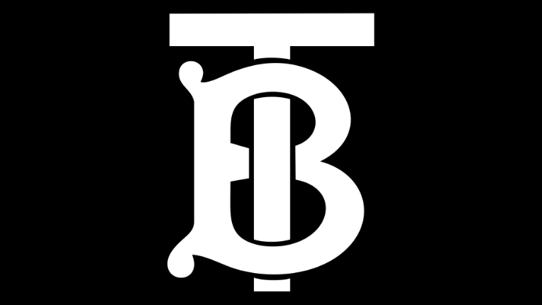
Burberry, an English fashion house founded in 1856, has gone through several financial cycles over its 100-year history. Initially, the firm specialised in outdoor clothing, but it later expanded into the high-fashion sector. Burberry’s logo, which was recently updated, has played a significant role in this endeavour.
In August 2018, graphic designer Peter Saville unveiled Burberry’s new logo and monogram.
Burberry’s logo, which included a red symbol over a wordmark, was first created in 1901. The insignia, which took up practically the whole space, depicted a horse rider with a shield and pike.
The new Burberry inscription in capital letters is written in a modern sans serif font similar to Dieter Hofrichter’s Urania Extra Bold typeface. The striking text is a sophisticated spin on the aged sans-serif, with bold clean lines and sharp cuts and curves.
The new Burberry logo design is simple and eye-catching, with the brand name in all capitals and a smaller “London England” beneath. Considering the brand equity built around the existing emblem, it’s a risky decision.
However, as the designer notes, the goal is to bring the brand into the digital age of the twenty-first century.
And, so far, the new digital style appears to be paying off, delivering Burberry the sales bump it demands.
7. Chanel
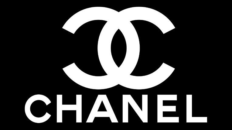
The world of fashion and perfumery has been revolutionised by Coco Chanel, the founder of Chanel.
The Chanel emblem, like Gucci’s, is simple yet effective. And, like Gucci, the Chanel sign and logo have a far longer history than most people realise. It’s made up of two bold interlaced “C”s, being mirror images of one another. The two interlocking Cs stand for the founder’s name.
The letter’s primary, bold forms suggest the commanding elegance of simplicity, which is consistent with Coco’s attitude of “less is more.”
The two overlapping C’s are still present and ‘with the times’ as ever, making it difficult to imagine the picture was initially released more than a century ago. Owing to such long-lasting design mastery, Chanel continues to represent the pinnacle of luxury products even now.
Chanel’s bespoke logotype is considered to be a riff on her handwriting. The word “Chanel” is placed in full caps beneath the logo, with forceful yet refined lines.
This font resembles a typical sans-serif typeface, such as ITC Blair’s Pro Bold, but with changed lines. Further on, the space between the letters is also broad, giving the brand an impression of clean supremacy.
8. Versace
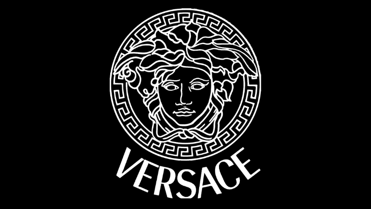
Versace, established in 1978 by Gianni Versace, is known for its creative and colourful apparel and accessories. Michael Jackson and Elton John from the music industry were among his renowned clientele.
Medusa, a Greek legendary creature, inspires Versace’s distinctive emblem. The boundary around it also stems from Greek mythology, and it is profoundly embedded in Greek culture.
Medusa was chosen as the emblem by founder Gianni Versace because, according to legends, she makes people fall in love with her with no way out.
The Medusa, Gianni believed, would have the same impact on anyone who donned his garments and accessories. Even better, the Medusa was created on the wreck’s floor, where the founder and his siblings used to play as youngsters.
Bonus Read: Here are 11 unique types of outdoor advertising solutions with real examples.
To convey classy purity and solidity, Versace used black and white colour schemes, although Gianni altered the wordmarks for the dynamic Medusa logo. Another addition is the colour gold, used by this luxury fashion company to represent riches, splendour, and monumental success.
While this fashion house has altered its logo five times in its 40-year history, the lethal beauty of Medusa has remained a constant.
Versace utilized the sans-serif fonts Sophi Sophi Regular and Radiant RR Bold. On the other hand, Radiant is now the brand’s official typeface.
Did You Know: The Radiant typeface was designed by Steve Jackman and Robert Middleton and released by Red Rooster Collection.
9. Jimmy Choo
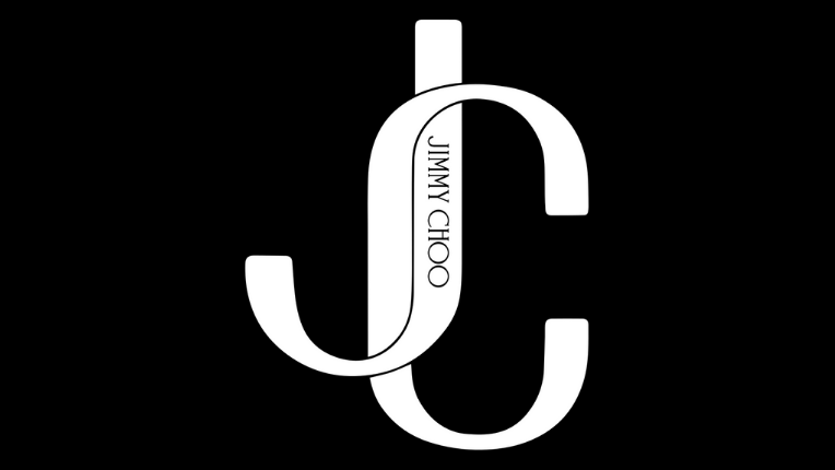
Jimmy Choo is a high-fashion firm based in the United Kingdom and specializes in luxury goods. While the fashion brand is respected for its women’s-shoe line, it also produces a wide range of other fashion goods such as purses, scarves, hats, perfumes, and more.
Their logo may appear basic at first glance, yet it has an intellectually thoughtful design. The Jimmy Choo emblem, like his shoes, embodies grace and a dash of style. Moreover, the letters of the Jimmy Choo logo come from delicate strokes that are anchored by little serifs.
The “J” bends up in a flowing manner in the logo, adding flare, and the O’s are entirely circular letters that are significantly broader than the others.
In the initial portion of the logo, the roundness of the double O’s is balanced by the thinness of the double M’s, making the two words identical in length. All of these logo design techniques contribute to the logo’s contemporary flair.
Verdict
A luxury brand’s logo holds immense value for the company. Simply put, it is what makes the brand recognisable and, over time, sky-rocket the product’s worth. The majority of high-end fashion labels feature a basic white and black logotype – often with a monogram that lends itself to being turned into a pattern for clothing or accessories.
Apart from their exceptional quality, consumers proudly wear these brands as a status symbol. While logos do not create brands, they are the most prominent part of a company.
Bonus Read: Have a look at 6 valuable tips for acquiring affordable and quality graphic design.