Choosing the correct font for a business card can be a mind-boggling process and is a critical part of the design. While ever-evolving technologies sway most industries, one object stands as faithful as ever – a classic old-school business card.
Suppose business owners think of each card as an opportunity to form a relationship with a probable investor. In that case, the reason for having a business card that stands out is pretty straightforward. Although most business cards don’t have what it takes to stick around in the real world and are thrown out more frequently than a business owner would like to imagine.
So how can we overcome this problem? It’s pretty easy if you understand fonts and the impact it develops on a brand and its image. Remember, having a unique business logo is only a part of the process.
The right font plays a massive role in a strong business card to ensure people actually look at your card. Most importantly, the font is what brings the win home.
Continue reading to learn more about the nine best fonts for impressive business cards in 2022. Rest assured, they are making waves in the business world.
Types of Fonts FOR YOUR BUSINESS CARD
There are three main categories of fonts to choose from when designing a business card. They are:
1. Serif Fonts
Engraved on historic buildings, gravestones, and other ancient architecture, serif fonts were originally carved as inscriptions. This age-old relation with history enables serif fonts to add a traditional and classic feel to a brand’s image.
Since the early days of the digital stage, serif fonts have found use in letterpress printing and are regularly used in books, newspapers, lengthy articles, and magazines. The common belief is that the stroke in the serif fonts gives it structure, thus increasing reading speed by helping the eye travel across the sentence.
Image Source: https://media.istockphoto.com/
2. Sans-serif Fonts
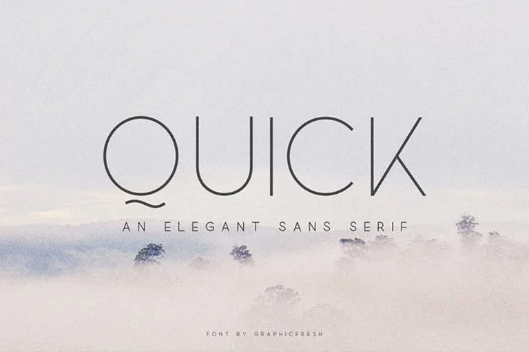
In typography, sans-serif translates to the words without serif, meaning the font doesn’t end with the standard decorative lines after each stroke. The sans-serif fonts also differ from serif fonts in terms of line width variation and are inclined towards the lesser side.
These easy-to-read sans-serif fonts work like a charm on printed products and never fail to deliver the message of minimalism and simplicity when used on contemporary business cards. Sans-serif fonts have proved their compatibility with digital text over the years, and they continue to work wonders on a low-resolution screen as well.
The intricate details of a serif font can cause problems on a low-end display making the sans-serif fonts a primary candidate for digital displays. Picking the wrong font for a business is a common branding mistake that can be avoided by consulting a graphic design expert.
Image Source: https://www.theme-junkie.com/
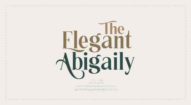
3. Script Fonts
Fonts, where the letters connect like a handwritten note and bring a human touch with the help of curved strokes, are known as script fonts. When paired with personal messages, headlines, invitations, and greeting cards, these fonts stand out.
The cursive scripts aid in creating a classic and furnished look, whereas the round fonts add an element of joy. While the scripted fonts work wonders for catching the eye, long messages are tough to read, especially at smaller font sizes. Anyone planning on using script fonts on a business card should implement them on a second-tier copy, blending them into a company motto or tagline.
Image Source: https://www.freefonts.io
9 Best Fonts For Impressive Business Cards In 2022
Now that we’re familiar with the three main types of fonts, let’s discover the nine best fonts to make your business cards stand out.
1. Helvetica
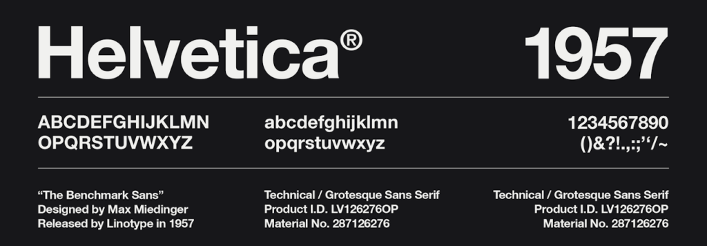
The appropriate font for a business card happens to be the most rudimentary one, and it’s pretty often. The simplicity of this font combined with its versatile features makes it the perfect choice for a plethora of industries.
The minimalistic design of this font gives it a clean and elegant look, also making it legible at various font sizes. This feature makes Helvetica a go-to option for multiple texts apart from business cards.
For instance, this 1957 sans-serif design is widely used in letterheads, logos, and body texts due to its sharp lines and directness. This font is also available in multiple variants such as Helvetica Inserat, Helvetica, Now, Helvetica, Neue, etc.
The font comprises tight spacing between the letters working in harmony to create the perfect text when printing long names or designations on business cards. To top it off, the minimalistic nature of Helvetica is the primary reason for this font never to look outdated.
Throughout its journey, various popular companies such as Panasonic, Lufthansa, and Jeep have used Helvetica in their prints.
Image Source: https://www.labelado.com/
2. Myriad Pro
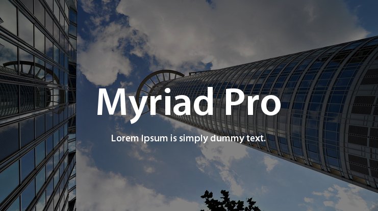
Anyone who has read an email or user manual from Apple is already acquainted with the font Myriad Pro. Apple religiously used this Adobe Original font from 2002 until 2017. Similar to Helvetica, the Myriad Pro falls in the sans-serif fonts category.
The simple thin strokes and welcoming letterforms give this font an airy yet firm look making it easy to read. This works best if designers plan to implement elements such as a logo onto the business cards. While the font is easy to read, it doesn’t carry enough weight to distract the reader from other facets of the business card.
The main attraction of this font is the rounded ends of the letters “Y” and “J,” which add a sense of creativity to any business card. Combined with a tight letter fit, the Myriad Pro enhances the style quotient of your card. That’s not all – the uppercase letters of the Myriad Pro font give your cards a professional feel by making them look neat and defined.
Image Source: https://www.cufonfonts.com/
3. Baskerville
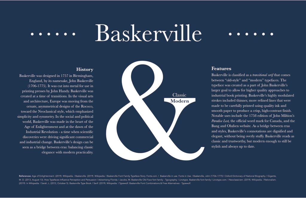
Baskerville is an archaic serif font that has been around for over two centuries. This elegant font was developed in 1757 in Birmingham, but even in 2022, it is widely used all over the globe.
Surprisingly, even though the font has the traditional texture of its historical past, it also boasts a few relatively modern features. These features, such as the vertical letter axis and tapered serifs, make this font coherent while adding a new-age touch to this rustic typeface.
Additionally, this renaissance font is designed by keeping thick curved lines as the primary element. These lines are made to stand out with the help of slightly daintier ones giving this typeface a delicate yet firm appeal.
If your business values are old-fashioned and a sense of grandeur is what you want to portray, Baskerville is the perfect choice for your business cards. This font will resonate with your values while uplifting the brand’s image and adding a sense of elegance.
Image Source: https://dmcwo.github.io/
4. Futura
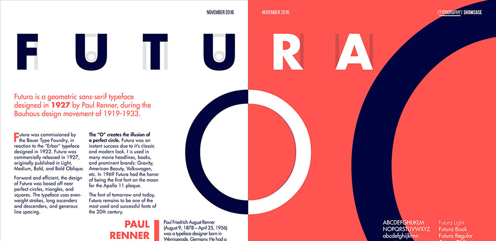
Futura is an infamous geometric font that is still doing the rounds even in 2022. This sans-serif font was launched in 1927 by creator Paul Renner, and it became a commercial success overnight.
This basic typeface combines geometric forms and boasts a flat appeal. Evenly matched strokes of equal width maintain uniformity across the font by removing contrast between the letters. The lowercase letters in Futura stand taller than the uppercase, giving this typeface a sleek look and distinguishing it from other geometric fonts.
This font is available in various weight styles and is compatible with multiple European languages and the Cyrillic alphabet.
Not to forget, the design for the Futura typeface was inspired by the circular shapes of the Bauhaus style.
However, this font tends to require more space between the lines due to the wide lettering and is ideal for short and simple business cards. Yet, the Futura font has got everything it takes to step up your business card game in 2022.
Image Source: https://www.designyourway.net/
5. Clarendon
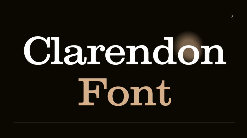
Clarendon has always been a classic in the typography industry since it was developed in 1845. It falls under the slab-serif category due to the brackets in the font, which give each letter a robust congruent presence.
This typeface has ornamental letters with tidy and elaborate curves, which can be seen in the uppercase letters “Q” and “R.” The bold nature of this typeface makes this font an ideal candidate for a printed page or a memo.
The Clarendon font commands a certain grace and ensures your card will be etched into your client’s memory. Apart from finding success on the business card front, the Clarendon typeface has also been used extensively in posters, wedding invitations, greeting cards, websites, and more.
Image Source: https://freefontsfamily.com/
6. Rockwell
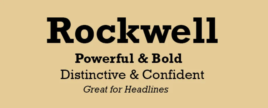
Rockwell is a symbolic yet easy-going font released by Monotype in 1934. This typeface consists of various styles and weights, ranging from robust bold to sleek italics. Regardless of how and where this font is used, Rockwell never ceases to lose its charm and always holds its definitive traits across various platforms.
Like other slab-serifs, the prominent geometric serifs in this font weigh the text down when showcased in various designs. In addition, circular accents on letters such as ‘O, ‘Q,’ and ‘P’ have a unique sense of symmetry, thus complementing the bold geometric shapes on a business card.
Implementing the Rockwell font will make any business card stand out. It gives the brand a sense of power and shows confidence in the brand owner. If you’re an entrepreneur working hard on socializing, these are the qualities you should be looking for when choosing a font for your business card.
7. Times New Roman
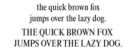
Times New Roman derives its inspiration from a century-old serif font called Plantin. This font is extensively used on Word documents. Moreover, most people have come across this classic font at least once in their lives.
If you’re looking to incorporate a few classic fonts in your next business card, you don’t want to miss out on Times New Roman. Agreed, it’s not as crisp as a sans-serif, but if you wish to impress a client and stay on the professional side, serif is a reliable choice.
This workhorse comes in all shapes and sizes and does wonders when used on print. The solid elongated design and generous spacing enable you to pinpoint important information such as emails, phone numbers, job titles, etc. – all while enhancing the crisp look for your business cards.
8. Riesling
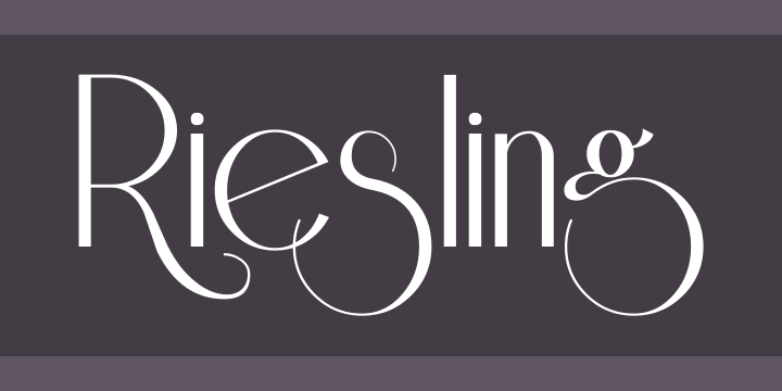
Are you in search of a quirky, catchy font to enhance your business card? This retro font has got exactly what you’ve been looking for. Designed by Bright Ideas, Riesling is named after a famous wine.
This font boasts a smooth and flowy texture making it suitable for all types of design projects. For instance, this font works exceedingly well in animated logos, office branding, magazines, advertisements, and, let’s not forget, business cards.
Riesling enhances the style of a business card by giving it an exaggerated yet delicate look due to the descender in the letters. In addition, this font has tight curves, which impart a playful touch. Also, the combination of thick and thin lines makes this a strong candidate for business cards.
Note: Riesling allows users to showcase their style while staying formal with this font.
9. Arial
Arial is the close cousin on the font Helvetica and was designed by two pioneers of the typography field, Robin Nicholas and Patricia Saunders. This font contains a plethora of styles and has the versatility to be incorporated in plenty of commercial documents and advertisements.
This modern font takes us back to the 19th century with its bold and rigid letters, making it appropriate for body texts. It is designed to be similar to Helvetica, and both these fonts share the same width for their letters.
The Arial font has many attributes that make it visually appealing for a simple yet sophisticated business card. The letters are clean and crisp, making this font legible in all sizes. It also comes in various weights and styles, enabling designers to add a classic look to this modern typeface.
VERDICT
Picking the correct font for your business card can be a long and arduous process. Choosing the right font can assist you in communicating your brand’s image easily. These fonts can also determine how casual or professional your brand’s presentation is. Further on, you can use this information to create a business card that stands out from the rest.
Still trying to figure out where to start from? Check out this article on innovative business logo concepts to guide you onto your feet.
Reach out to us at www.55knots.com.au so we can help you create a business card guaranteed to capture the attention of your customers and prospects.