An app logo is a visual identification of your brand and a silent ambassador of your business.
Famous app logos instantly remind users of the brand. A half-cut apple is synonymous with ‘’Apple Inc.’’, while the ‘’Swoosh’’ logo makes us remember ‘’Nike’’.
App logo designs visually communicate what the business has to offer, and app logo designers hold the expertise to create an impactful brand image using versatile design elements.
There are three fundamentals that an app design must embed. They are:
- Simplicity: Make it easy for the users to understand your logo.
- Uniqueness: Sends a message of exclusivity.
- Timelessness: An app logo must resemble the brand for years to come. In other words, you don’t have to change your logo every year because of its strong recognizability among users.
Designs of app logos leave a psychological impact with their size, colour, shape and symbols. For instance, they can generate positive emotions and send an implicit message of togetherness that makes a user click on the app. You can check our portfolio to understand how creative designs leave an everlasting impact.
Now, you are aware of what makes a pleasant app logo design. Let’s look at the world’s most famous app logos for inspiration to design a logo for your business.
World’s Famous App Logos that Inspire us Every Day
Here are 13 universally-known application logos that pop up in front of our eyes almost every day:
1. Instagram
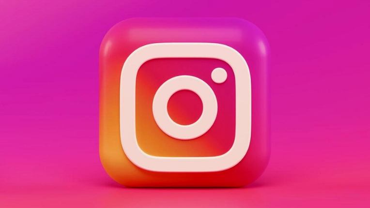
The Instagram app icon is one of the most recognisable logos across continents. It represents a polaroid camera with a colourful contrast of blue, pink, and yellow colours that creates a vibe of nostalgia and youthfulness, prompting users to share moments and memories.
Meanwhile, the thick white line on the camera blends with other vibrant colours to generate eye-catchy visual saliency while the dot on the camera stands for clicking a picture.
It’s a simple yet effective design conveying different messages. People prefer images with simple processing, images that are easy to understand. The more you see it, the more you like it.
All the warm colours in the app logo create a sense of excitement and energy. It feels like watching a sunset and capturing the precise moment.
Lastly, the overall logo is curvaceous. Curve designs are more approachable than simple square logos. It gives a friendly feel to the user.
2. Netflix
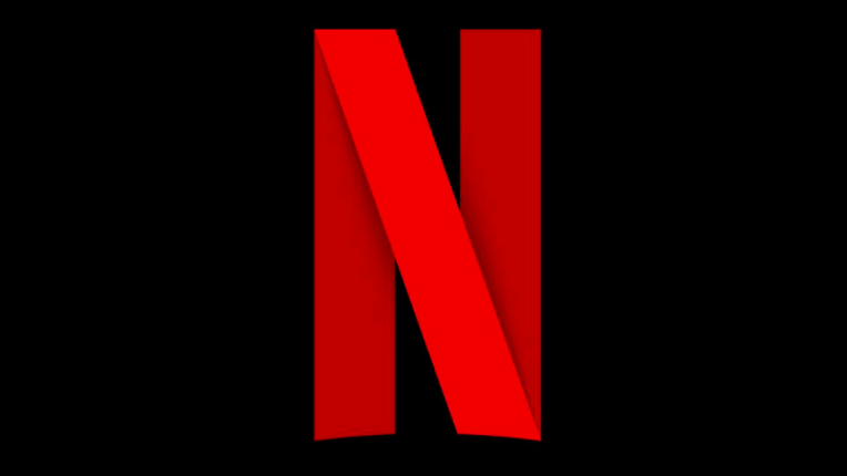
Netflix’s sans serif typeface logo is a brilliant design that sends the message of watching cinema at home.
The red colour ‘’N’’ reminds us of armchairs in the theatre while depicting the name of the brand ‘’Netflix’’. Red colour also symbolises passion, domination, energy, vigour, courage and love, which are the possible themes of Netflix content.
Black in the background reminisces us of the darkness of the cinema hall – which is amazing ideation on behalf of the designers who created this logo. Every element of this app is simple yet elegant and depicts a visual picture of Netflix.
The founders wanted people to know that with Netflix, they can watch movies in the comfort of their homes, and the logo successfully communicates the same to the viewers.
Although the company has changed its logo thrice, the letter ‘’N’’ and the colour ‘’Red’’ have been constant, representing timelessness.
In the end, the rectangular shape of the logo indicates safety, security, and trust among its subscribers. Not to forget, the logo incorporates simplicity to influence users psychologically.
3. Twitter
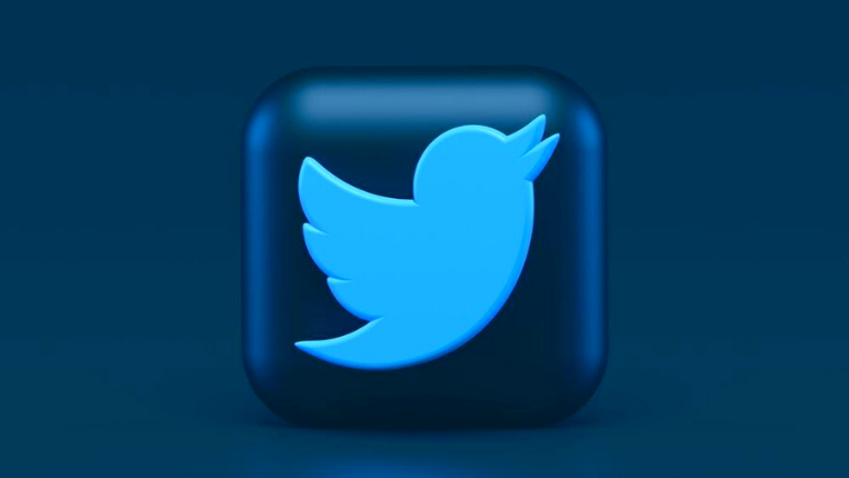
The Twitter bird symbolises freedom and limitless possibilities, closely resembling the company’s mission of providing a micro-blogging site devoid of any restriction on freedom of speech.
Moreover, the straightforward design is similar to the concise nature of tweets. The fluttering mountain bluebird sounds like ‘’Tweet’’, like the Brand’s name ‘’Twitter’’. Overall, the blue colour of the bird with a white background gives a warm and pleasant feeling of looking at the sky. Also, blue exudes joy and hope.
Founders bought Twitter’s first bird for $15 from the iStock website. The current logo was adopted in 2012, and each element of the bird is carefully crafted.
If you observe, the beak, wings, head, and chest are all uniform curves. It makes it easy to understand for the human eyes.
We can’t deny it’s an outstanding logo that is visually appealing and mirrors Twitter as a company in its essence.
4. TikTok
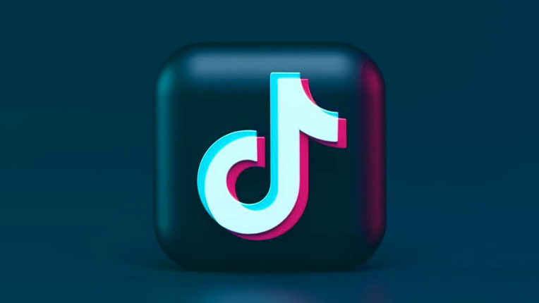
TikTok is one of the most famous app logos in contemporary times that enjoys immense popularity among youth.
The centre of the logo, which looks like the letter ‘’d’’, stands for a musical note and the app’s initial name, which was ‘’Douyin’’. Adding to it, the pink, blue, and white colour in the musical note against the black background signify a rock concert implying the app’s musical shorts. The warm colours’ aesthetics are hard to forget.
Logo designers have focused on creating a 3D-shaped symbol where neon colours overlap each other, feeling like musical vibrations. All in all, designers have chosen a minimalist icon that depicts an essential element of the app, i.e., the musical nature.
TikTok’s logo has undergone minor revisions since its launch in 2016, making it a versatile design. Users find it easy to understand, connect, and recognise instantly.
It simply has everything that a great logo consists of – simplicity, timelessness, and visuals that speak for the brand.
5. LinkedIn
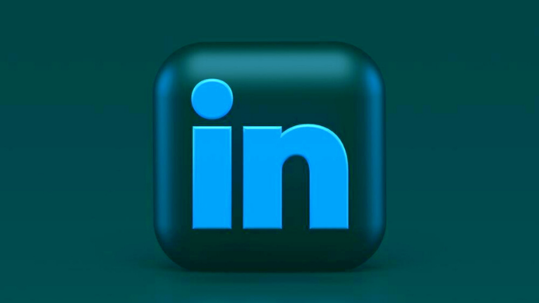
‘’in’’ is representative of the app’s name ‘’LinkedIn’’. The instant we see ‘’in’’, our brain remembers LinkedIn, and that’s the impact of effective logo design.
Blue is the most noticeable colour in the Linked logo. The colour implies authority, power, and professionalism. Above this, blue is symbolic of the networking power of the app.
Most social-networking app logos use blue, indicating trust and connection, and LinkedIn applies the same strategy.
Over the years, the logo has changed only twice, and after its acquisition by Microsoft, the colour tone became brighter. Now, the sign looks monochromatic and sophisticated.
The sans serif font face of the logo’s emblem gives it a modern and de-cluttered look. Instead of Linked and In, the logo says everything with two-letter ‘’in’’. Logo design experts have given it an immaculate finish showcasing the company’s motto of connecting professionals and promoting productivity.
Bonus Read: Learn about the secrets behind using a customised font for impressive business cards.
6. Facebook
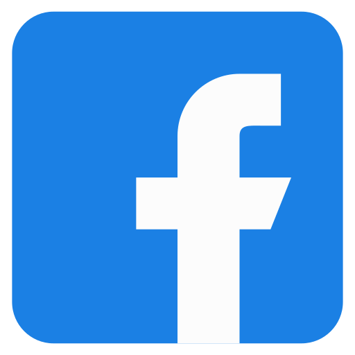
The most incredible things in the world are often the simplest ones, and the Facebook logo incorporates this saying succinctly in its icon.
It is believed that Facebook founder ‘’Mark Zuckerberg’’ had difficulty discerning red and green colours. Thus, the logo designer chose blue, as Mark can differentiate different shades of blue.
Whether the colour blindness story behind the logo is true or not is a debate for another time, but the design experts have executed a sound design using a few impressive graphic elements.
The logo’s small case letter ‘’f’’ illustrates the brand name, and the blue and white contrast reminds users of youthfulness, friendship, and purity. To sum up, the logo design has remained an ever-changing symbol of Facebook’s journey in connecting people across the globe.
7. YouTube
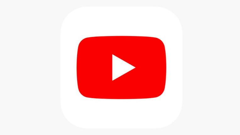
Graphic designers have taken creativity to another level with YouTube’s iconic modern logo. The play button inside the rectangular design effortlessly portrays that it’s a video-sharing platform.
Professional designers believe that the YouTube logo has been successful due to its straightforward colour combination. The red and white awake excitement. Also, the colour red represents a TV screen, and the white play button in the centre is indicative of the playing videos on TV.
The app’s name YouTube means that content generators are individuals like you, while Tube is an older name for television. Similarly, the app’s logo conveys the brand message of YouTube, a platform for everyone to become creators and watch videos.
Red colour has a powerful impact on the human brain. The colour of YouTube’s logo displays excellence in quality and leaves a striking effect on users, urging them to broadcast themselves.
Therefore, the YouTube logo is an ideal example of simplicity at its best.
Bonus Read: Create poignant YouTube thumbnails using our guide on the best fonts for YouTube.
8. Spotify
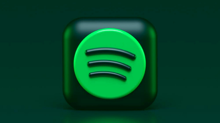
A look at the Spotify app logo is enough to communicate that it’s all about music. The app designers have used a unique shade of neon green to be distinct from their competitors.
You must notice that the app’s symbol is circular and indicates community and connectedness. It is now a trend among digital app designers to use curves and circles in the logo’s emblem because they stand for togetherness and present an optimistic vibe to the users.
Additionally, the three curves inside the circle describe sound waves or connectivity to the internet. From a designer’s perspective, it also corresponds to the forward-looking motto of the company.
Altogether the most memorable part of the logo is its colour and the three waves. Designers understand that a quirky shade of green is hardly visible every day, and embedding it in the logo makes it noticeable.
Spotify is popular among music lovers, and a part of the credit goes to the logo design that makes anyone click immediately to discover what’s inside.
9. Amazon Shopping App
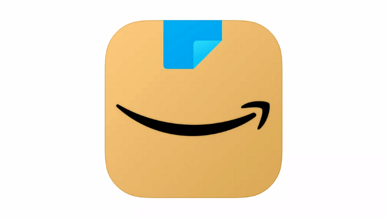
If an app logo can make you smile with its design, it is Amazon’s shopping app.
Design experts have carefully crafted every tiny detail in Amazon’s app logo. Though the smile might look like saying, “happy shopping”, it’s actually the company’s signature smile specifying that everything from A to Z is available in the app. Even better, they try to explain the customer’s joy at accessing and purchasing from such a hassle-free marketplace.
The brown colour reminds users of the Amazon package, and the blue colour points to the tape. Moreover, the meaning is clear; happiness arrives the moment you see the Amazon package on your doorstep.
The use of soft colours in the design leaves users with anticipation and excitement. We can easily comprehend all the elements of Amazon’s app logo, which is a sign of one of the best app logo designers.
1o. Uber
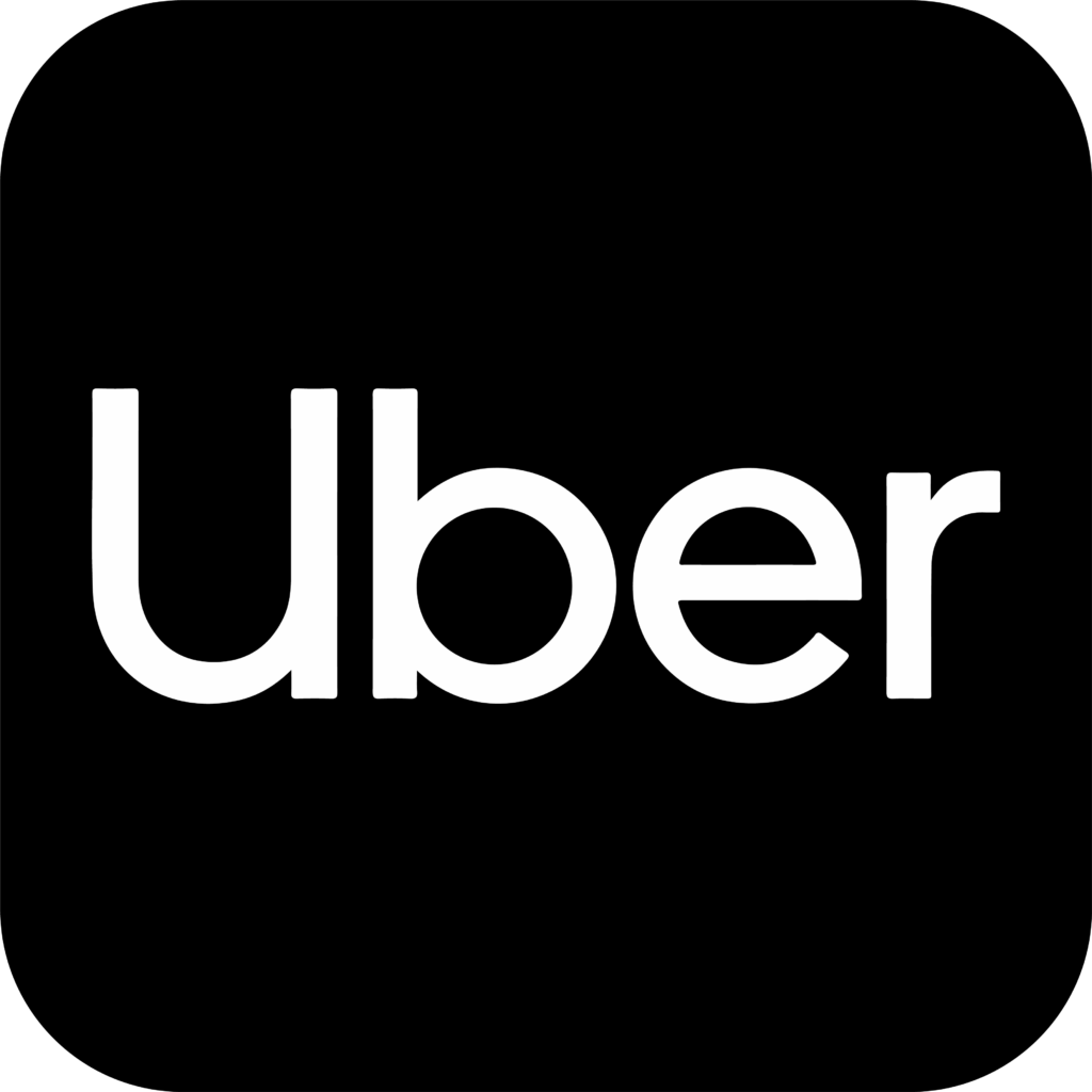
Uber’s monochromatic design is elegant and comprehensive. It uses a customised sans serif font face called ‘’Uber Move’’ and looks classy to the riders.
Further, the black colour signifies authority, power and exclusivity. There are not many design elements at play in this logo, but it gives a feeling of security and safety to users.
Uber’s motto has been ‘’Move the way you want’’, and the company’s new app logo mirrors its mission and symbolises growth.
More and more companies are adopting plain and elementary designs for their app logos to create a visual identity of being approachable to the customers.
Bonus Read: Read more to discover about influential luxury brand logos with effective designs.
11. Tinder
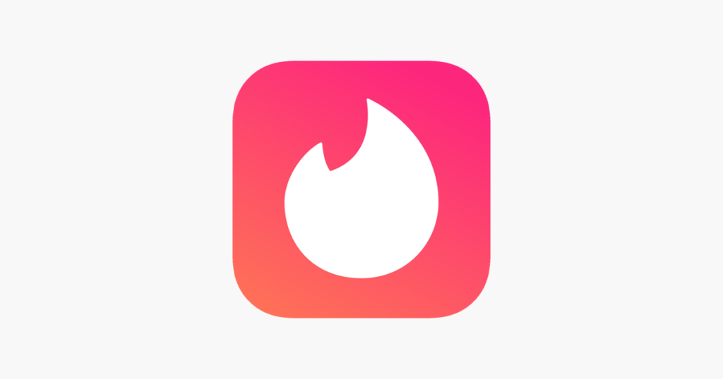
Tinder’s phenomenal app logo needs no introduction. It’s an excellent design that incorporates hues of pink, orange, and white colour palettes to make it pleasing to the eyes.
On the other hand, the flame is identical to a burning passion for a lover. The app designers wanted to remind the users of the word ‘’hot’’, which we use to describe someone good-looking. Doesn’t it entirely resemble the company’s slogan ‘’Swipe Right’’? Hence, swipe right for attractive dates.
Tinder means a material for lightning fire, and the bright colour variance in the logo design simply conveys the same that tinder will light your fire by finding that ideal partner.
Start your free trial with 55knots to ignite passion through your logo designs.
12. PayPal
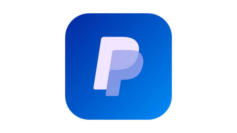
There are two key themes in the PayPal logo. The company’s approach toward mobile-friendly payments and its people-centric business model. It envisions making money transfer hassle-free by connecting everyone through the app.
Interestingly, the blue colour in the logo fuses, characterising the reliability of the app and its approach to adopting modern technology.
The overlapping monogram of double ‘’P’’ exemplifies the company’s name while it also means people to people. App logo designers have used graphic techniques to ensure its easily visible across all gadgets and in all sizes.
PayPal wants to allude to users by making its logo look effortless while integrating the vision of its business. PayPal’s becoming aggressive in tackling its competitors through an easy app interface and payment options across continents – which is evident in its logo itself.
App designers know the marketing impact of an app logo. Therefore, simplicity is the core principle to attracting users.
13. Evernote
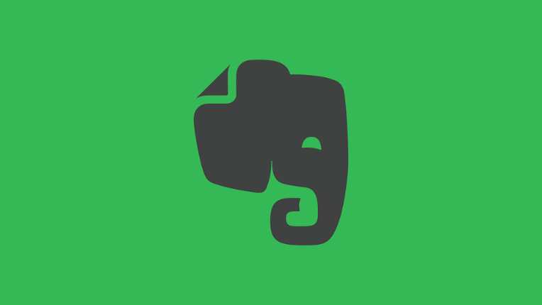
Looking at the Evernote app logo, it’s hard to guess what is it about because the emblem is a green elephant on a white background. At first glance, users might think of a gaming app, but it’s the mystery behind the logo that makes us click on the app.
Design experts have used concise techniques to hide app details in the logo. The neon green colour awakens creativity and excitement, while the elephant personifies memory.
Evernote is a note-taking app that allows users to create compact notes inside notebooks. Consequently, the brand identifies itself with the elephant’s memory and creativity.
That’s not it. If you notice the elephant’s ear, it is slightly folded in a corner, quite similar to how you fold a corner of the book page to help you recall where you left reading.
Considering every element: the Evernote app logo is a clever design that communicates the brand’s message of promoting personal growth through organised notes and enhanced productivity.
It’s an idiosyncratic example of an educational app logo with a playful design.
Bonus Read: Need more inspiration? Check out these modern interior design logos to spark innovation.
Verdict
As designers suggest, keep it simple to make it great. Henceforth, famous app logos adopt easy-to-understand designs for their apps and easy-to-access app features to build customer trust. Remember that the app logo brings customers, but it’s the app’s interface and services that help retain them.
At 55knots, we use state-of-the-art UI designs to build aesthetic app logos. Book a free demo with us to know more.