9 MOST FUNNY DESIGN FAILS IN THE HISTORY OF GRAPHIC DESIGN
Graphic design is a core element for any small or big business. It creates an identity for your brand while giving it an image the public can identify with. Graphic designing is a skill wherein the designer has to see through the eyes of the people, the brand, and their own too. Look at it as using human psychology to entice and target more customers.
In today’s digitally driven world, design is everything. As a result of the larger audience bases and more niche target groups being available, advertising is getting succinct too.
The better the graphic design, the more your target audience recognizes you. After all, visual aids are processed by the brain faster than words.
9 Most Funny Graphic Design Fails
While graphic design can take your brand to the next level, a terrible design can quickly tank your images and graphical elements.
Some graphic designers can be oblivious to the brief, and their blunders are hilarious. With no intention to demean any fellow graphic designer, let’s check out a few of those fails.
1. Click Bricks
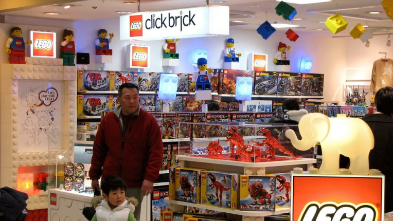
The LEGO Click Bricks store is a franchise store of a toy company in Japan.
The LEGO logo itself is iconic and instantly recognisable, but the words ‘click bricks’ aren’t as much. Unfortunately, the store used a font different from the logo and caused quite a funny blunder. The word ‘click’ looks quite a bit like an inappropriate word when the C and L are placed close together.
Remember that graphic designers use a typography tool called kerning while they work. It’s supportive of the modification of the spacing between two letters. As evident, the word ‘click’ in the LEGO store sign had little space between the C and L and made them look like the letter ‘d’. We can’t help but mention to those who yet can’t see the error; it reads dick.
Kerning is a necessity for graphic design as it makes the words written easy to read and clearer to comprehend. Though this failure occurred due to the close proximity of one letter to another, letters spaced far apart can also confuse.
An excellent and talented graphic designer is sure to make their work as understandable as possible. Not to mention, kerning is a nuance that isn’t thought of by most. Many don’t realise just how important these seemingly trivial factors are in graphic design. The mind tends to notice patterns in everything.
Stay free from such catastrophic marketing fails, and get in touch with us today.
2. Gentle Giants Dog Food
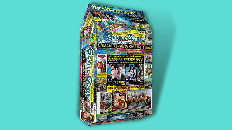
Gentle Giants is a dog and cat food company with a somewhat chaotic sense of design. From their in-store cans and packets of food to their website, all their products are messy in marketing appearance.
Although the company is making exceptional attempts at maintaining the health of animals and are highly spoken of, their packaging promotes otherwise.
Look carefully. Their packets are plastered with excessive unwanted and unnecessary information, tiny, almost illegible writing, a collage of hard-too-decipher pictures, and a multitude of fonts. Everything is muddled up together to the point of confusion about what is the product actually about.
Sadly, the colours clash with other elements of the design and the different fonts make it look like a children’s arts and craft project. Due to all the hotchpotch they’ve allowed onto the template; the brand has erred.
A company’s image should be clear and to the point. It should be easy to glance at once to know the meaning it intends to radiate and connect with the target audience. An overload of information and overlap of the images strains a customer’s eyes. If your potential customer dislikes or doesn’t realise what you’re trying to sell (packaging included), they’re unlikely to try and understand your product and spend any more of their time browsing your brand.
Therefore, as a designer, make sure you keep your layouts clean, neat, and uniform.
Bonus Read: Ever heard of emotional design? You’ll be taken aback by what it brings to your marketing plans
3. Where Milan
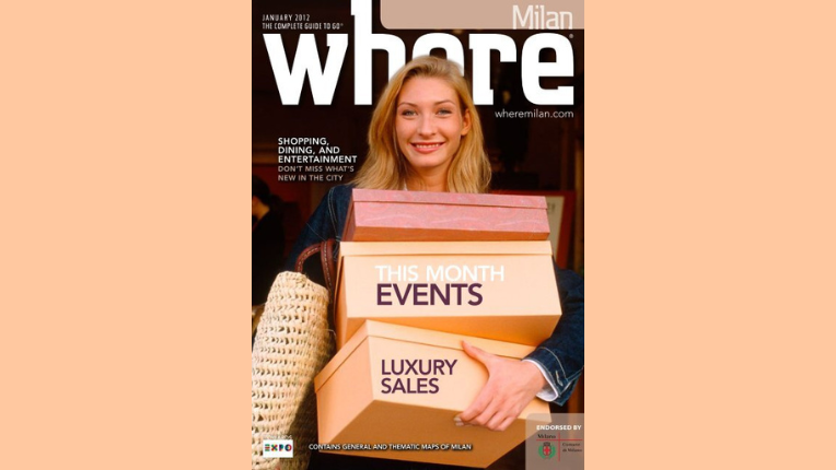
Where Milan is a tourist magazine, famously known as a city guide for Milan. They kickstarted in 2010 and yet cover the most stunning and captivating places in town. Owing to their dedication to uncovering such locations, these sites adorn their cover page. However, sometimes things go awry. In the magazine’s case, the January 2012 issue caused just that, a problem. Albeit a hilarious one.
When building a magazine, each person involved has an important job. The photographer has to pick the perfect image, the writer has to select apt words, and the editor has to make sure the content is crisp with a high degree of relevancy. But the art directors/designers are the ones to pull it all together.
Where Milan placed their cover page’s model precisely in front of the lower half of the first “e” from “Where”. By covering up part of the letter, the rounded font of the “e” looks like an “o”. Unfortunately, this changes the word and its meaning drastically.
The new and quite the derogatory term didn’t pair well with the brand’s luxury tonality or the woman standing in the front. While it is a funny mistake, the graphic designer could’ve saved the brand from momentary nationwide embarrassment by placing the model’s image slightly lower, revealing the whole letter.
4. Take the Sh*t!
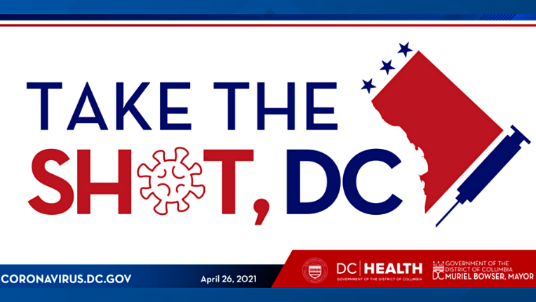
At the beginning of 2021, governmental organisations worldwide were urging people to get vaccinated. Countries and their politicians were pumping out slogan after slogan to encourage their people. The USA did the same.
In April, the Washington D.C. District of Health broadcasted a graphical creation that consisted of the phrase “Take The Shot DC” written in all caps. Alas, they decided to replace the “o” of ‘shot’ with a sketch of the COVID-19 bacteria.
At a glance, the bacteria particle looked like an asterisk and turned the word shot into an expletive. Whether a mild or extreme abusive term, you can’t create room for such misjudgement when you’re among the governing authorities in a state like Washington, D.C.
The aftermath was a hoot as the public took to Twitter and other social media platforms to poke fun at the silly mistake of some in-house governmental designer. The District was, unfortunately, the butt of several jokes.
As a graphic designer, one must be sure that the poetic licenses they take don’t alter the meaning of what they’re trying to portray. A little more attention to detail would have made all the difference.
Do you realise how dangerous a design misinterpretation can be for your business?
5. Kids Are Weird
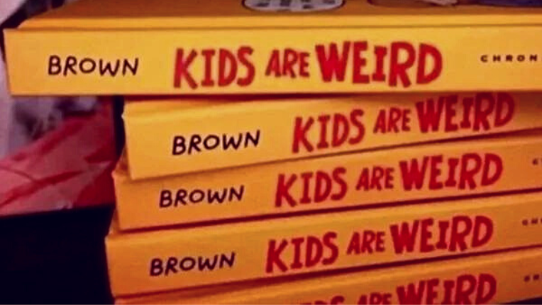
In 2014, Jeffery Brown published a comic book describing how kids were odd and gave tips on dealing with them. The book has numerous high ratings and praises, but that’s not half the reason why it went viral.
Graphic design is used in most places; book covers as well. Sometimes, a graphic designer may make an error while working with half-hearted mindfulness. For instance, the spine of Jeffrey’s book says the words “Brown Kids Are Weird”.
Do you see what went racially wrong there?
The “Brown”, of course, stands for the author and then comes the title. Regrettably, the placement turns what the author is trying to preach on its head. Even though the fonts and colours are varied to distinguish between the title and author, it still reads like a demeaning phrase.
The graphic designers should know better and should have seen how the placement of those words could have been misconstrued from the get-go.
As a budding or established brand owner, the last thing you want is to market yourself as a proud advocate of racism.
Bonus Read: Design is everywhere! Scroll through our list of 11 excellent clothing design ideas that never go out of trend.
6. Venn Values
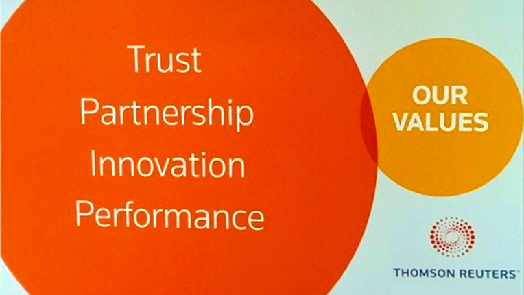
The Thomson Reuters company, in 2014, caused a rib-tickling slip-up. To promote their company’s core values, they put out a simple diagram.
Fact is their graphic designers did a fantastic job; the words were crisp, and to the point, the colours matched the logo, and the concept was spot on. Overall, their creation led to the formation of a great advertisement, except for the fact that they missed out on how exactly a Venn diagram functions. It was an extremely basic mathematical error revolving around the representation of the coinciding circles.
The image showed two circles, one with the words ‘trust, partnership, innovation and performance’ and the second with ‘our values’. They wanted to highlight how these key elements overlap with their company’s morals. Sadly, the two circles of the Venn diagram barely met. The picture seemed to say that the core functions of the first circle were lacking from Reuters’ business values. Isn’t that scarring for a brand to market when highlighting its values?
The faux pas was caused by a lack of forethought from the graphic design team.
Check Our Portfolio – we don’t intend to present such hiccups.
7. My Favorite Color is…..?
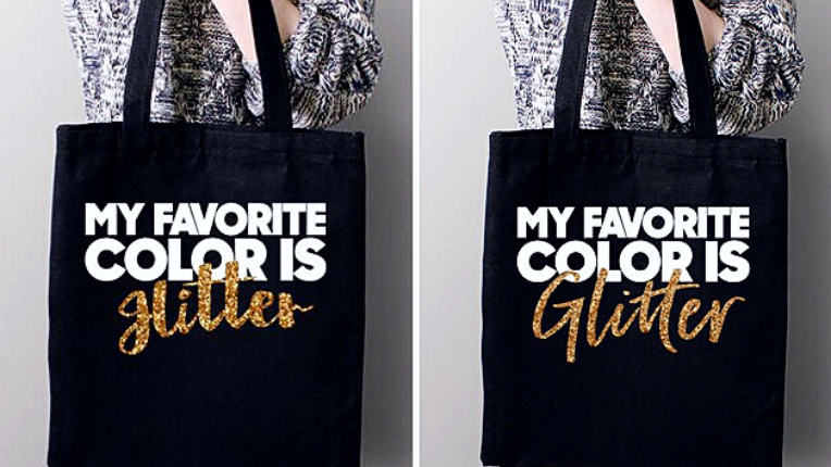
Belle Chic, an online clothing and accessories store, hit a snafu in 2017. They designed a tote bag that was supposed to read, “My favourite colour is glitter.” The font for the word “glitter” was different because that was what they wanted to highlight.
It’s alright to have different fonts on a design as long as they complement each other while still being readable. However, in Belle Chic’s case, the cursive font made “glitter” look like the word “Hitler.” Now Hitler is undoubtedly not a colour nor a term you want to be associated with. Many customers were enraged at the blunder, reducing prospect-to-buyer conversions and drastically affecting sales.
However, things stabilised when Belle Chic issued an apology statement immediately.
They realised their mistake and changed the font to make it clearer while still retaining their original design.
Not to forget, font choice is an integral part of the designer’s job. It helps tie everything together and make your image look cohesive.
Graphic designers should be cautious when it comes to cursive fonts. The letters bleed into one another and sometimes look similar to other alphabets. Moreover, fonts ought to match the aesthetic of the product or service, and there cannot be any compromise on them being legible.
8. Café, Bar, and Cycles
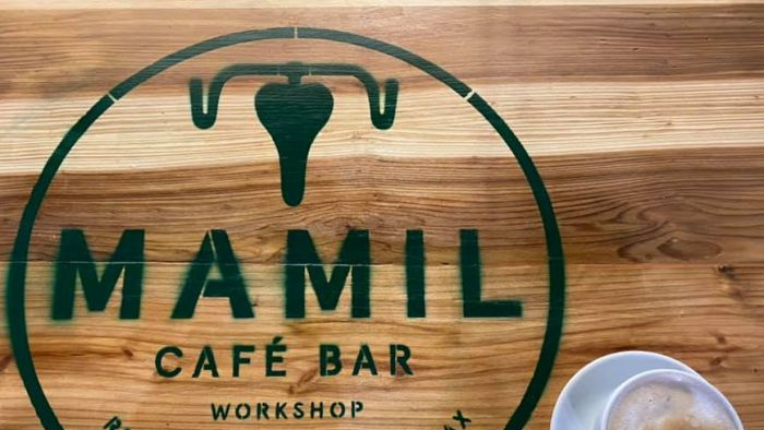
Mamil Café Bar and Cycle Workshop is located in Britain. The bicycle-themed cafe has a bike seat and two handlebars as its logo. Funnily enough, they don’t look like that at first sight. A cursory glance can make the logo look an awful lot like an image we’ve seen in Biology classes.
The bike seat looks like a diagram of the uterus, and the handlebars add the look of fallopian tubes.
Though the cafe is an excellent place with reviews galore, the logo makes you think otherwise. We’re sure their logo made younger customers giggle like twelve-year-olds at least once.
Nevertheless, a logo is a critical aspect for all brands. One that is ill-thought of is not recommended. Never forget – brand emblems are vital when considering how customers remember your brand and associate with your marketing moves. They start to relate experiences they’ve had with the colours and shapes of your logo as long as they have enough exposure to it.
Bonus Read: Treat yourself to what design aspects have made these 9 luxury brand logos highly influential in the branding space.
9. Office of Government Commerce
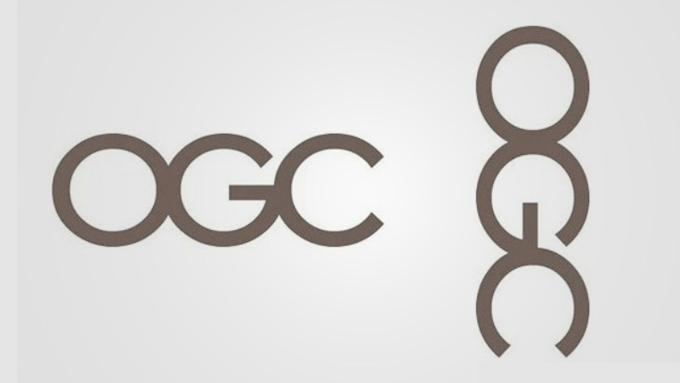
The British Office of Government Commerce was established in 2000. Their logo is a simple and understandable OGC. The ‘o’, the ‘g’, and the ‘c’ are all discernible from each other and yet cohesive.
At the same time, typography and designing a logo have to be pre-planned to a T. Taking a look at the bigger picture is a must. A designer should realise that logos are going to be placed everywhere. They will be located on company papers, stationery, billboards, plaques, etc. Consequently, such symbols fit onto these media by being turned or flipped, intending to diversify their arsenal of marketing tools.
The OGC logo faced that exact problem. When flipped by 90 degrees, the three-lettered starts to resemble a man. A man who looks like he’s in a curious situation. The new inappropriate image doesn’t bode well for governmental offices.
Representations of sexual desire on a governmental logo? That’s surely not why the designers were hired in the first place.
Graphic designers must use every ounce of foresight as they work. Keep in mind that a consistent and recognisable logo differentiates between a good and a great graphic design.
Verdict
The clarity and attractiveness of your brand’s graphic elements decide the visibility your brand gets. It creates a powerful impression on others and makes you instantly identifiable.
For example, today, we know that a McDonald’s ad is due to the iconic ‘M’ logo. The coca-cola ‘c’, the Amazon arrow, and the Disney font are classic premium design instances that resonate with the masses. They are all unforgettable and invoke a strong sense of feeling within. That is the goal.
Top-quality graphic design gives your venture a polished and distinguished look. Make a checklist of things you want and don’t want to construe to your target audience. Learn from the funny graphic design fails of other organizations, and let’s collaborate to build your identity the right way!
Bonus Read: We’ve created a list of the coolest and catchiest food design examples for you to read through.