A logo is a broad term that encapsulates both logotypes and logomarks. The terminologies can confuse you, but they represent two distinct aspects of what we commonly mean by a logo.
Remember, a logo is an essential branding entity. It must convey the brand’s message, resonate with its products and services, and attract viewers at the same time.
Logotype Vs Logomark: Basic Differences
Firstly, a logotype is a logo that revolves around the name of a company, an institution, or an organisation. On the contrary, a logomark deals with representing a symbolic image or object.
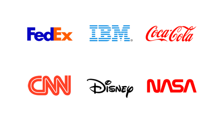
Secondly, logotypes are graphically designed texts that portray the brand name. They are also called letter marks or word marks, given their association with words. For instance, Coca-Cola, Visa, Google, Yahoo, Samsung, etc.
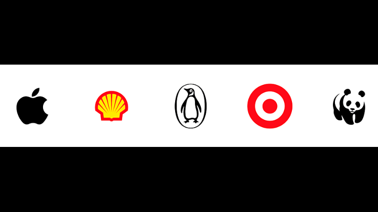
On the other hand, you have logomarks that use pictorial characters or emblems to display the company. They are also called pictorial or graphical logos. A plethora of examples are found; a few of them include Twitter, Apple, Channel, Target, etc.
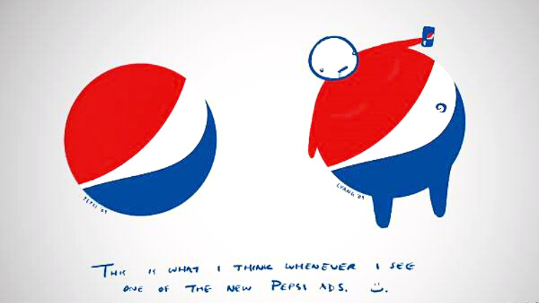
These are the two fundamental differences that distinguish logotype from logomark. You must have noticed another version of logos, which combines logotype and logomark. For example, Pepsi or Meta uses both the symbol and text for marketing purposes.
Among the above categories, all the types are utilised as per their location or medium of interaction. Brands, nowadays, are using more than one logo on multiple mediums. You can use a logotype (textual emblem) as the letterhead of an official email.
In contrast, logomarks (pictorial symbols) may be posted on your mobile website. Apart from these two, a combination of both can be displayed on a billboard or posters.
When contacting a graphic designing agency, you must ensure that your designers provide you with ample options. In case you are wondering who to contact, 55Knots has a team of graphic design experts ready to help you.
The aforementioned pointers must give a clear idea concerning the two categories of a logo. Further on, you will encounter each type with its features, pros and cons, and most significantly, when to choose which of the two sub-categories of logos.
What Is A Logotype?
A logotype is generally associated with traditional marketing strategies. This sort of logo deals with a company’s name, initial, signatures, and monograms. It’s worth noting that logotypes constitute both numbers and texts.
Logotypes aim to promote the company’s name, recognition, and goodwill. Its old techniques of branding compose formal approaches. Moreover, regular users of logotypes are often conservative businesses, organisations, or institutions that prefer textual or numerical logo representations.
This type of graphic design is popular in print media. For example, business cards, brochures, banners, pamphlets, etc.
Don’t make the mistake of thinking that logotypes can be easily created. Graphic designers undergo meticulous planning and consideration before reaching a final motif. Expert designers are mindful of the exact colour texture, lettering, font style, size, and length. Any wrong step can fail the entire process.
Even better, bridging the bridge between your brand’s visual and verbal branding game is another essential factor in the whole branding shebang.
Colours also have a crucial role to play. Their different shades present different meanings to the viewers and customers. For instance, black, steel grey, and bold letters suggest a resilient and steady brand or organisation.
Keep in mind, the standard brand colour tones can vary based on whether they’re associated with law firms, elite educational organisations, medical practitioners, traditional tailoring showrooms, etc.
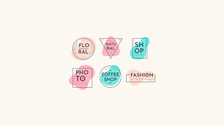
On another note, pastel or matte colours and loopy lettering hints at the industry that promises you a memorable time, successful catering of search intent, and indulging entertainment. Companies in the field of floral businesses, beauty salons, spa parlours, clothing boutiques, and fancy cafés fall under this category.
In certain circumstances, geometrical shapes give birth to logotypes. Abstract letter forms accompany them to deliver a particular effect. In the case of corporate firms, Pantone colours with white spacing are used around the logo.
The most important feature of a logotype is typography. An effective first impression of a company depends upon the appropriate application of typography. Only expert designers can accomplish such designs.
All in all, logotypes are not simply a brand personality but establish a strong association with the company.
Here are some advantages and disadvantages of logotypes in branding:
Pros & Cons Of Using Logotype
Pros
- Logotypes are visually significant for your customers as they’ll instantly remember you from the logo.
- It’s traditional and classic, lending a sophisticated touch.
- Allows you to play with words that promise effective publicity.
- Plenty of scope to promote your brand’s visual imagery.
- It provides ample information about the company and creates literary awareness.
- You will never get confused between brands.
Cons
- It’s an effective starting point though it will stagnate your branding later if not complemented with visual cues.
- Doesn’t provide enough room to play with creativity.
- Typography trends change over time, and your lettering will seem old.
Where To Use Logotypes?
Here are four ways your logotype can improve your brand’s marketing capabilities:
- Logotypes are best suited for brands that want to disclose some information about them. Institutions like law firms, medical centres, government institutions, and education organisations prefer these symbolic icons.
- Secondly, if your company is new and you want to create awareness, the logotype should be your starting point. Its exceptional measures will help you spread the word. Your expert designer will recommend you the same.
- Thirdly, a logotype is your resource that will enable you to include a tagline or a slogan in your brand name. It renders added exposure to your company. Also, the right typography makes connecting with target audiences and creating associations with your typical service simpler.
- Fourthly, the lettermark logo variant supports brands that have a historical or traditional background. Formal companies often opt for such marketing strategies. It helps them carry forward their reputation.
Bonus Read: Here are nine modern retro designs to tickle your creative brain cells.
What Is A Logomark?
Logomark deals in icons that make a statement for your company. It’s the trendiest marketing strategy that presents a concept or idea by using the strength of purely graphical representations. Pictorial emblems have the potential to alter brand perceptions only if the designer handles them correctly.
It’s essential to note that a logomark is challenging to create without knowledge of colour palettes and associated branding elements. It demands rigorous brainstorming and ideating new concepts and styles, which will lend your company a new face.
A graphic designer has to be cautious of your brand’s specialities as much as other company logos. Remember, no two logomarks can be the same.
Logotypes have the support of language and typography, while only visual communication assists logomarks. They are more abstract than logotypes, given they don’t have to sit next to the company title.
For instance, consider Apple’s logo, the silver apple with a missing bite. The company uses their ‘fruit of knowledge’ in multiple ways – from advertising to packaging.
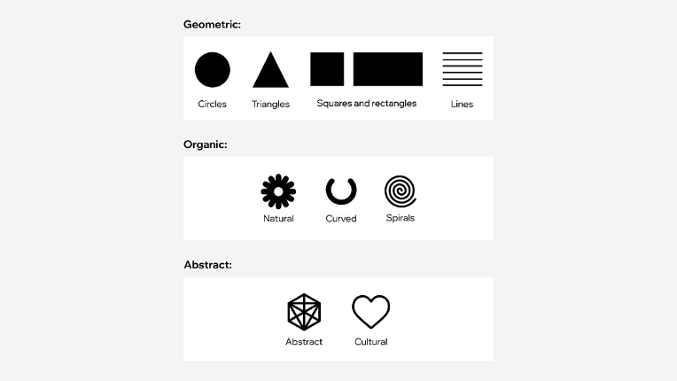
Nonetheless, designers must pay attention to various shapes and sizes to convey varied meanings. A circle signifies a playful, mischievous, and casual tone. On the other hand, squares denote steadiness, stability, and confidence.
Expert graphic designers manipulate abstract shapes to pose something meaningful. Likewise, colours contribute to myriad tonalities and textures.
Many companies use popular images to express their brand presence. For instance, the penguin is the icon of Penguin Random House. Thus, you can understand how logomarks embody your business vocation.

One of the notable advantages of logomarks is their visibility in most minute spaces. Such a logo across a brochure speaks volumes. It marks its terrain and thus is a reasonable option for advertising when you cannot afford a huge billboard.
Brand owners must note that designing logomarks costs higher when compared with logotypes. It renders significant growth to your brand development, where budget is a major factor.
Here is a list of advantages and disadvantages of using logomarks:
Pros & Cons Of Using Logomark
Pros
- Logomarks allow you to tailor your icons and make them unique.
- Permit scope for unlimited creativity.
- An image is worth millions of words.
- You can fit an icon on any medium.
- Suitable for conveying brand speciality.
Cons
- Not suitable for a startup because it slows down their brand growth.
- Only an expert designer can fully execute a logomark to achieve higher conversion rates.
- Always a possibility of being similar to other icons.
Where To Use Logomarks?
Here are four ways logomarks can extend your brand’s marketing arsenal:
- Logomarks are best suited for companies who choose their logos to be animals, natural objects, or any popular figure. For instance, Shell’s shell, Jaguar’s jaguar, WWF’s panda, MGM’s lion, and more.
- Companies often tend to rebrand for the sake of marketing. In that case, logomarks are the best option to approach.
- If your brand delivers any particular service or sells a product that expects an explanation, logomark logos will do the needful.
- Fourthly, a logomark enables you to create a variation of popular icons or emblems for your company.
Combination of Logomark and Logotype: A Short Note
Upcoming trends combine pictorial logos and textual marks into a new third kind. It creates a logo that has a stronger pronouncement than logomark or logotype separately. In a nutshell, it lends advantages of both worlds to your branding game.
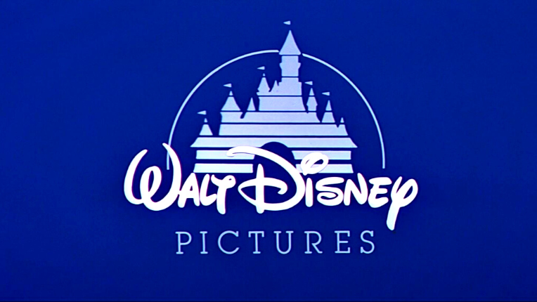
Famous companies like Disney, Pepsi, Starbucks, Dove, NBC, and Pizza Hut exhibit a combination of titles and icons. This third kind improves marketing impact as it boosts brand recognition.
Bonus Read: Expect to be inspired by beautiful and innovative coffee fonts for logos and labels.
Verdict
Brands use their logos to convey their objectives and message to the world. You will have millions of logos to choose from. Yet you must pick a suitable logo that fits your brand criteria and depicts your brand’s intention.
The company logo is its prized asset. It should function in sync with the brand’s priorities. Remember, logotypes and logomarks can be combined and manipulated according to your branding demands. Ask your design professionals about the possible alternatives that match your idea.
55knots is an ace in the graphic design industry. Explore their work here.