A design is never too old. It evolves, re-emerges and fuses with contemporary modern design to evoke inspiration for the designer and nostalgia for the viewer.
Retro design usually refers to the design aesthetics of the 1960s and afterwards that set the trend for bright colours, geometric shapes and graphic patterns. However, designers revisit the vintage styles to create modern retro designs, and vintage art has been evolving since medieval times.
Modern retro designs utilise design features of the past and bring back the nostalgia of the good old days in modern ways. Even if you did not live through the 50s era, you still relate to the rustic retro styles when incorporated into present-time designs.
From wedding invitations to business cards and interiors to website layouts, modern retro designs are in use everywhere to attract customers because we humans love to reminisce about the beautiful things of the past.
Modern retro designs are an eclectic mix of classic and contemporary art that embraces kaleidoscopic design features, colours, shapes and styles. You may look at our design portfolio for an impactful representation of your brand using modern design composition with quaint styles.
We’ve curated a list of inspiring modern retro designs that use design elements of the past to create illustrations of the present.
Creative Modern Retro Design Ideas to Inspire The Designer in You
Let’s look at nine modern retro designs that blend the legacy of the by-gone era with the reigning voguish culture of the 21st century.
1. Modern Baroque Design
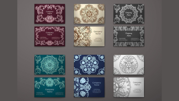
Baroque is an elegant ornamental design style that flourished in Europe in the 17th century. The design characterises grandeur, richness, drama and passionate emotions. The style tends to combine various medieval art forms and blurs the distinction between them, creating an extravagant and formal look.
Modern Baroque designs are intricate and luxurious and use a highly ornamental typeface with French-inspired frames and layouts, like packaging designs for luxury jewellery brands.
Baroque was one of the prominent designs in medieval European architecture with pompous facades. For example, the Palace of Versailles in France is a living example of the Baroque style. Its decorative style appeals to the visual senses. Also, you can find traces of Baroque in paintings, music and dressing styles of the Medieval Europeans.
The Baroque ornamentation with fantasy figures and twisted columns produces intensity and curiosity in the viewer. Graphic artists use Baroque flair in their art for exciting design projects using lush floral and rosette motif patterns and dazzling colours.
The flamboyant features of Baroque are suitable for formal designs like wedding invitations or lavish business cards. The beauty of this design creates a dramatic retro atmosphere when fused with modern graphics.
2. Steampunk
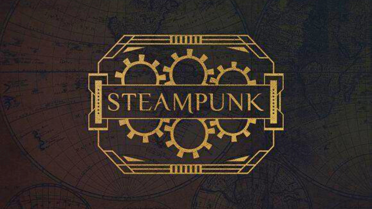
Steampunk is an elegant combination of Victorian design with industrialism elements and mainly features classic machinery inventions of the 20th century with futuristic ideals. In other words, steampunk depicts industrial innovations of the past and sci-fi cultural references of the future. Thus, it is also known as retrofuturism.
Science fiction author K.W. Jeter coined the term steampunk in 1980 to describe a fictional world where steam drove technological advancements and not electricity. Since then, the steampunk cultural movement started gaining popularity.
Graphic designers display an ideal futuristic world in their steampunk art with images of steam engines, gears, copper and aircraft.
Modern steampunk art often mixes digital art with traditional Victorian designs to create a vision of an imaginary world for the viewers.
Steampunk’s modern retro design can give a hipster look to cafes, drinking bars, gyms and their logos and banner designs. It’s a befitting design if you want to amaze your audience with futuristic yet retro art styles and make them curious about your brand.
Steampunk graphic design can be used everywhere, from print designs and cards to funky graphic t-shirts. You can talk to our design team to create a beautiful steampunk style for a timeless image of your brand.
3. Bauhaus Graphics
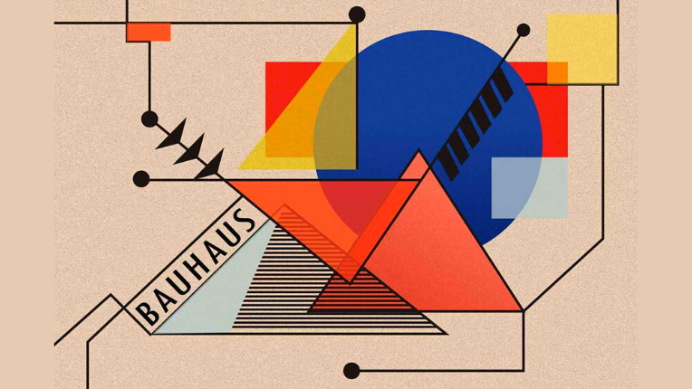
Modern retro designs that embrace minimalism and unconventional shape forms draw inspiration from Bauhaus art, whose principle is ‘’function over visual’’. It uses minimal elements and mainly focuses on shape, psychology, colour theory and visual hierarchy of the design.
The Bauhaus movement of the 1920s started when German architect Walter Gropius founded the Bauhaus art school in Germany with the motto ‘’form follows function’’.
The art school was a hub for unique aesthetics combining fine arts and crafts to create a design relationship between simple shapes and colours that harmoniously balance each other.
Bauhaus’s design emphasises minimalism, geometric shapes and new technology for art styles. You can find grid layouts, functional shapes for decor and simple colour schemes unique to Bauhaus designs.
Modern designs are incomplete without the blend of Bauhaus, and these designs have a significant impact on marketing, digital branding and packaging. As the design emanates bluntness and characterises sharp corners and edges, it heavily focuses on utility over visual appeal.
Due to Bauhaus’s versatile design features, it works across a variety of design projects, from social media to interior decor and book covers to logos.
Bauhaus art does serve the cause of design function, but it never ceases to astonish us with its abstract fusion of various art styles that look simple yet effective.
4. Art Nouveau
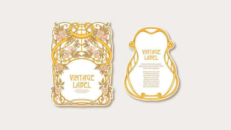
Art nouveau designs are known for asymmetrical shapes, curves, and motifs that resemble natural forms like stems and blossoms of plants.
The design features rich decorative patterns and sombre colours, looking vintage in style and trying to escape the medieval European design patterns. Casa Batllo in Barcelona by Antoni Gaudi is a fitting monument showcasing the rich art nouveau architecture.
The prevalence of the feminine touch and exquisite style in art nouveau designs have made it a suitable choice for brands targeting female customers for products related to jewellery, female clothing and perfumes. Also, art nouveau-inspired furniture and layouts for invitation cards are trending, with designers intermixing old art forms with contemporary motifs to create unique styles.
Although the art nouveau movement has its roots in the early 20th century, the design itself never gets old. It’s used as a modern retro theme in elegant packaging and poster designs with retro typography, among other graphic design projects.
5. Art Deco
Art deco is a bold design with symmetry and aerodynamic curves filled with metallic colours like gold and chrome. The design dates back to the 1920s when advertising gained popularity and brands focused on luxuriant aesthetics.
If you are a fan of the roaring twenties and the film Great Gatsby, art deco might be your style as the film vividly depicts art deco in various forms with flapper dresses, long cigarette holders and the use of clean lines in the film’s poster.
The design is a pastiche of various art influences brought together to embrace bold ideas and optimistic modernism. It draws attention to abstract concepts and rectilinear geometry and evokes curious emotions with intricate lines of art that seem familiar yet far.
Today, art deco is a classic trend in every medium, from architectural skylines to graphics. Designers add a touch of fun and traditional feelings with art deco style in packaging, website designs, posters and flyers, and almost every design area.
You can use art deco for any of your designs if you are looking for a less decorative and minimalist ornate layout for your project.
The art deco influence has evolved, and its presence is everywhere in design. The future holds a bright outlook for art deco design style.
Bonus Read: Learn what emotional designs are and why they matter in marketing.
6. Memphis Style
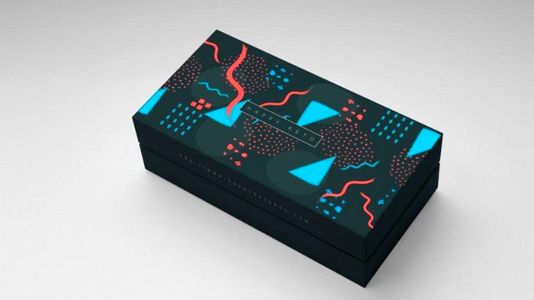
Graphic designers have brought the Memphis style into fashion with polka dots, squiggly lines, scattered shapes and brash patterns.
It was said that Bob Dylan’s song ‘’Stuck inside of mobile with the Memphis blues again’’ was playing during the inaugural board meeting called by Italian designer Ettore Sottsass with a team of designers. Hence, the design team was named the Memphis group, which led to the foundation of the Memphis design style.
Memphis is the redefining look of the 80s that disrupted the status quo with its explosive geometry and multitude of colours. Its spirit is one of joy and liberation, resonating with youth and appealing to everyone.
The design can be daunting to work with as it blurs the line between retro and modern designs. Designers succinctly display the beauty of Memphis by employing miniature chaotic shapes and flat colours. You can choose Memphis composition with modernist graphic art for your next graphic design project and introduce your audience to something unique and distinctive through the design.
Bonus Read: Recognise essential design elements to grow your business.
7. Pop Art
Think of street art and wall illustration, and subconsciously pop art design might pop into your mind. The pop counterculture of the 60s represents irony and combines what’s not typically brought together in designs.
The pop-art design was symbolic of American popular culture iconography, and in the present time, it uses basic elements like machine-driven graphics and repetition to stand out.
It’s hard to define pop art design in words because of its unpredictable nature. Its style was once associated with living the American dream and was used in advertising with American suburban images on posters and mass media in the era of pop culture.
You can throw in some bold colours and imitate classic pop artworks or use vintage superheroes to create a perfect pop art design for your project.
Graphic designers convey powerful impressions through dynamic pop art and halftone designs. They believe it appeals to common people via its depiction of ordinary things in an exciting way that evokes familiarity in the viewer’s conscious mind.
Bonus Read: Use modern retro designs for effective outdoor advertising of your brand.
8. Sixties Psychedelic Design
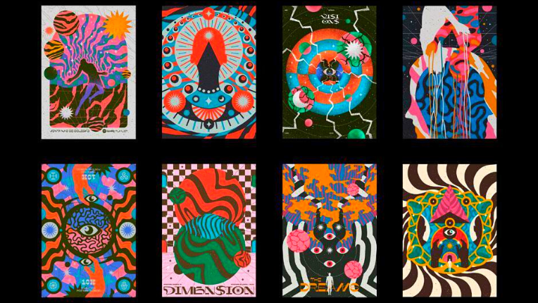
The word psychedelic means soul manifesting. This design emerged from the hippie communities of San Francisco and the psychedelia music of the 60s. Its intense colour combination, free-flowing shapes and lines with bombastic imagery are simply eye-grabbing.
Psychedelic designs first appeared on rock concert posters and were slowly adapted into advertising and mass production designs. The style form is also influenced by the visual perception of the world of people high on popular drugs such as LSD.
The design creates an illusion with wiggling lines and wobbling objects that appear to be melting into each other. Psychologically the design amplifies emotions to an overwhelming degree and leaves a hypnotising effect with various geometrical loops in its style.
Further, the psychedelic design brings about the experience of a drug trip without actually going to one. It’s confusing and delirious, but every feature has meaning and makes sense if you stare long enough.
Psychedelic designs are weird but trendy due to their vivid colours, surreal imagery and twisting shapes juxtaposing each other with odd typography patterns that look like a cacophony of visual noises.
Businesses who wish to create a specific image can use psychedelic modern retro design for their brochures, posters, advertising and web space design to create a freshness that makes customers pay attention.
Overall, psychedelic isn’t for the faint-hearted, and the design demand is to be felt with its rebellious nature representing the ideal of freedom and love.
Bonus Read: Learn how colour psychology affects graphic design.
9. Grunge Design
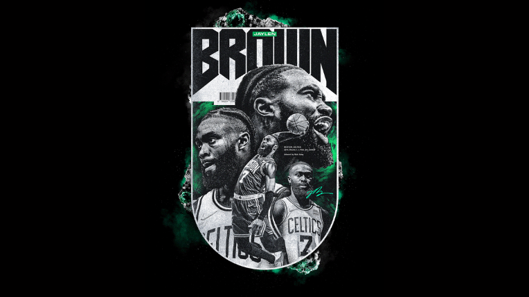
Grunge design might remind you of rock and metal music with its dark shades, industrial imagery and disorganised art form spaced unequivocally.
It’s radical and tends to break the rules of design etiquette. There is a misconception that grunge is all about dirty colours and gritty patterns associated with power and masculinity, but grunge in modern form is more about uniqueness and imperfection.
The 90s retro design was the era of the grunge effect, breaking societal norms and trending among hip-hop lovers from movie posters, music covers, and comics to magazines. Grunge is a visual enigma.
Designers use grunge sparingly as the style seems to have a community of its own. Grunge still has influences in graffiti and sports posters.
The grunge design has no rules, and artists can use their creativity to create a personal grunge design that speaks for their brand and fuses retro pop with vibrant graphic patterns.
Verdict
Design repeats itself after a certain time, and retro design is here to stay, always making a comeback in the form of inspiration for modern designers.
Modern retro designs cater to the millennial adults who witnessed the retro era in their childhood and now present a chance for modern generations to live the past through designs. It does not only serve the purpose of nostalgia marketing but brings new curious customers to businesses.
55knots is a one-stop solution for all kinds of design needs. Start your free trial for designs that speak for your brand and resonate with your audience.