Successful restaurant owners know that delicious food isn’t the only key to running a prosperous business. The food industry is a crowded space with a plethora of competitors striving to be the best. It’s also quite a challenge for new restaurant owners to develop quirky ideas which attract customers through curating delectable menus.
Due to the flooded market, there’s a high chance of a similar restaurant already serving the same platter. The only way to convert a one-time client into a loyal customer is by providing them with a memorable experience.
This can be achieved by consulting professional graphic designers to revamp your brand by creating a logo resonating with your company’s work. Additionally, by curating personalized branding strategies for a restaurant, the team of designers can help business owners push their brand to a prominent spot in the digital stage.
Most Amazing Restaurant Logos
Designing an iconic logo can help the restaurant increase customer awareness and boost its brand recognition. Let’s evaluate nine eye-catching and well-thought-out restaurant logos that brought hospitality professionals fame and a constant medium of attracting customers.
#1. McDonald’s
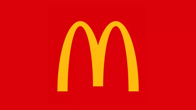
Everyone saw this one coming from a mile. It’s nearly impossible to speak about the most amazing restaurant logos and skip the infamous golden arches. Mcdonald’s is a fast-food chain dominating the restaurant industry since its inception.
What started as a modest burger joint is now one of the most easily recognized brands globally. While this chain can be found in almost every country, it isn’t just the quick service and cheap food that the brand is known for. The primary element which makes McDonald’s recognizable as a brand is its gleaming yellow logo with its golden arches.
Moreover, this iconic logo’s yellow arches are designed to symbolize balance and security. It instills stability in a consumer’s mind, making the restaurant a place to unwind and enjoy a burger after a demanding day at work.
This minimalistic design is combined with colour psychology to attract the attention of consumers. The red colour in the logo is meant to stimulate hunger and appetite, while yellow has the highest visibility during the day. Also, the two colours in combination broadcast swiftness and agility.
The McDonald’s logo has stood the test of time and continues to stand tall even today. This unique logo combines history, modesty, and colour therapy to drive customers towards the brand when their hunger pangs strike.
#2. Starbucks
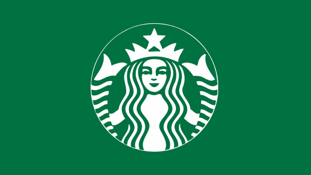
Starbucks has evolved from being just a coffeehouse in the past to a full-fledged eatery serving a multitude of sweet and savoury baked goods for the consumers to chomp on. What’s less spoken about is how Starbucks’ emblem has played a massive role in the success of this brand.
The Starbucks emblem is a twin-tailed mermaid, and this intricate design has become a fundamental part of coffee culture. The design successfully manages to capture the interest of passers-by and onlookers.
The latest Starbucks logo is a simple and refined version of its predecessors and doesn’t boast double outer rings anymore. Various brand merchandise such as t-shirts, coffee mugs, signage, websites, and other promotional items have the Starbucks logo printed on them, further adding to the brand’s visibility potential.
The Starbucks logo is essentially a circle that signifies eternity. A ring doesn’t have a start and endpoint, which translates to the never-ending movement of the restaurant in the consumer’s mind. Even better, the green and white colour schemes dominate the emblem and are the brand’s signature colours.
Green identifies with nature, healing, protection, and wealth. Since the company’s primary raw material is a plant, going green has proven to be a successful decision for the brand. Additionally, Starbucks wants recognition as a socially responsible company as it has been sourcing its coffee from local farmers, making the green in the emblem resonate with the brand’s actions.
By consulting a graphic design agency and discussing your logo design brief, you too can own a restaurant capable of competing with Starbucks.
#3. Domino’s
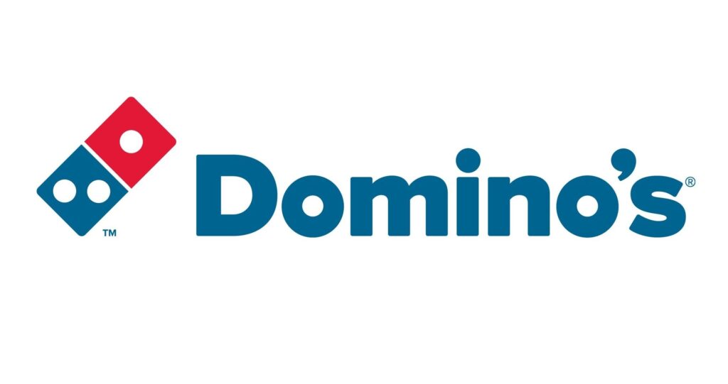
When talking about amazing restaurant logos, one has to include one of the most identified pizza chains out there. Domino’s started in a small Michigan town in the 1960s, and while the brand has stuck with its characteristic blue and red tones, its logo has been subjected to various changes over the years.
The original Domino’s logo has two major characteristics. The distinctive colours of the emblem grab the customer’s attention, while the three dots signify the first three outlets of the world-renowned pizza restaurant.
The rounded edges of the logo give it a modern appeal, and the font is legible and complements the overall design. What’s more, the high contrast colour scheme is easily spotted by consumers driving by and also represents the American flag’s colours. The two colours work in harmony to arouse a fitting emotion worthy of the brand.
Over the years, Domino’s has changed its logo multiple times, bringing immense success to the brand. The last change in the logo resulted in removing the second Domino and splitting the first one to showcase the blue. In fact, the emblem is now placed next to the brand’s name.
The emblem is so well known now that a glimpse of the red and blue Domino is sufficient for consumers to recognize the restaurant.
#4. Chipotle
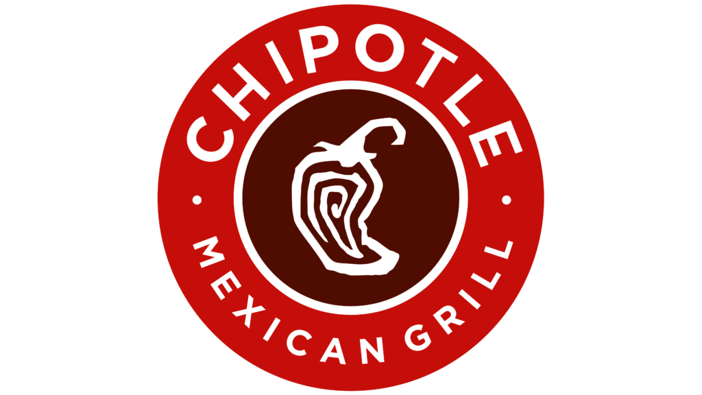
Chipotle is a Mexican restaurant that stepped into the food industry in 1993. The restaurant donned a dull and lax emblem that didn’t complement its food style and service in its early stages. As years passed, the company has worked on growing its label design to harmonize with the restaurant’s delectable service.
Now, Chipotle has one of the most fierce, contemporary, and spicy logos not only in the restaurant industry but also in the design world. The primary principle of the brand is organic and earthy food, and the emblem works towards symbolizing these traits of the restaurant.
The logo’s simplicity makes it work for Chipotle, and by maintaining a humble graphic emblem, the brand ensures no distractions from its message. Furthermore, the eye-catching elements work in tandem with the font, which is a characteristic shared by highly notable restaurants.
By implementing red as the primary colour, the main element of the brand, the pepper, is highlighted as the symbol. In addition, the colour is a visual representation of passion and energy, working as a stimulating visual catalyzer by increasing a customer’s appetite.
The other colour in the logo is white, representing safety and purity. Both these elements align with the principles of simplicity and cleanliness as a fast-food restaurant.
#5. Burger King
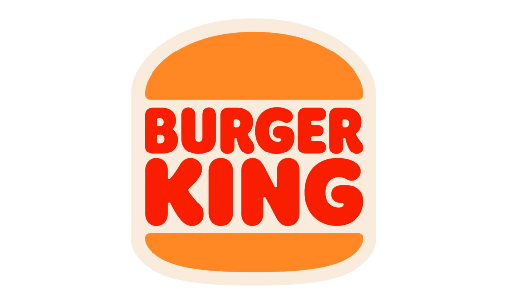
Burger King also finds a spot on our list of the 9 most amazing restaurant logos owing to their signature grilling style and classic logo. Akin to other fast-food restaurants, Burger King incorporates the idea of colour psychology in their emblem by using colours such as red and yellow.
The logo incorporates elements from its 1969 version but highlights the burger as its primary aspect. The new design also boasts polished lines, bold colours, and a three-dimensional depth giving it a professional and captivating appeal.
By changing its design, Burger King accomplished their goal of establishing its status as an efficient and professional restaurant, thereby scrubbing the social idea of the brand being a second-rate eatery.
Burger King has implemented high-quality design when creating the new identity for their brand. The restaurant appeals to the consumer’s appetite by implementing a cheeseburger in its emblem. Above this, the font is a unique sans serif type and incorporates rounded letters giving it a modern look.
The bold red font is used to remind consumers of a beef patty and, when combined with the font, provides the logo with a pleasurable aura. The blue circle is a sign of Burger King’s presence over the globe and is perceived as a welcoming emblem. Overall, the logo incites confidence and promotes instant dietary cravings within the customer.
#6. Subway
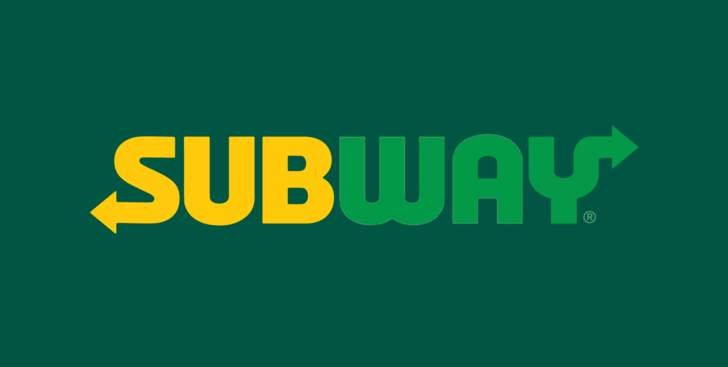
Contrary to popular belief, McDonald’s isn’t leading the board when it comes to having the most outlets. Surprisingly, Subway leads the carts, making them a high-competition player in the restaurant space. Let’s take a detailed look at the Subway logo and discover what makes it perfect.
The logo is designed by keeping the foundations of the restaurant in mind. Throughout the years, the symbol has maintained the two arrows, which signify the swift service provided by the restaurant and the various food options a customer has at the outlet.
Unlike most restaurant chains going with the primary colours red, blue, and yellow, Subway chooses a slightly unconventional colour combination that favours their visibility. The colour green represents the freshness of the food served by the restaurant, and yellow is synonymous with readiness.
What’s more, the Subway emblem uses the negative spaces wisely to form a small ‘s’ in the gaps and incorporates a robust sans serif font in uppercase. By switching the colours between the two syllables, Subway has created a logo rooted in its history and has shown that they’re a brand with an outlook towards a greener and healthier future.
#7. Arby’s
Arby’s was founded in 1964 and has grown to become a well-known restaurant chain across the globe. While they’re much smaller compared to their rival brands McDonald’s and Burger King, Arby’s has managed to get a big slice of the restaurant industry due to their mouth-watering sandwiches.
The brand sports a unique logo – a red cowboy hat with the company name sandwiched between the two elements of the hat. This emblem stands out from competitor logos and promotes the restaurant’s brand recognition even in a crowded market. While the restaurant is also known for its assorted breakfast menu and curly fries, customers know they’re in the vicinity of a delectable sandwich when their eye meets the Arby’s hat.
The primary element of the logo is the cowboy hat reflecting the old-timey wild-west essence of the restaurant. This has grown into a notable emblem for the fast-food chain. Arby’s also uses a similar colour palette as brands in the restaurant industry. By using red as the main component, the brand stays true to the highly emotional atmosphere of the wild-west.
Keeping a minimalistic design has worked wonders for Arby’s and increased brand awareness amongst the consumers. Nowadays, the red cowboy hat is enough to recognize the restaurant, and this strong brand identity continues to play a massive role in their achievements.
#8. Chick-Fil-A
The Chick-Fil-A emblem consisting of a red beak and the name written in a scripted font is an authentic symbol of the initial chicken sandwich. This iconic logo can be recognized by consumers globally and plays a significant role in a restaurant’s brand awareness game.
The symbol consists of a handwritten cursive font displaying the restaurant’s name, and the curves on the typeface give this logo a chirpy and bubbly appeal. By consulting professional designers, the brand was able to add graphic elements to the logo in the form of an abstract chicken which soon became the face of the restaurant.
This minimalist logo has proven to be successful for the company as it adequately showcases the restaurant’s main ingredient while reassuring customers about the quality and service of the food chain.
#9. KFC
KFC uses a logo design featuring the cheerful face of Colonel Sanders, donning a red and white apron and his signature beard with the name KFC printed on the trapeze. While the original logo has undergone several changes, a fundamental shift from using the full title to the acronym KFC drove the brand to success.
Today, the KFC emblem is an approachable design conveying the message of good old-fashioned Kentucky hospitality. This design syncs perfectly with KFC as a brand while capturing the key characteristics the restaurant wants to highlight to its customers.
The KFC logo plays a high-contribution role in spreading brand awareness like wildfire and promotes the brand’s digital marketing efforts. Lastly, The Colonel is always the centre of attention in any KFC advertisement, and this emblem recognition has driven the company to create products and apparel for their consumers.
VERDICT
For anyone stepping into the restaurant industry or starting a business in any other field, having a high-quality and neatly designed logo representing the company’s ideals will go a long way in growing the brand.
The various ways these restaurants use their emblem to attract customers and grow the brand is a testimonial to the value-added by a crisp logo design and how it helps build a company.
Thinking of starting your own business? Reach out to us at 55Knots and get a dedicated design team for all your graphic needs.