TOP 11 MOST SUCCESSFUL REBRANDED LOGOS OF ALL TIME
Consumer choices evolve, and brands adapt to changes by rebranding themselves to stay relevant with the growing technology, design trends, and customer diversity.
With the colossal rise of social media users and online brands, it has become necessary for businesses to redesign logos and look presentable online and on traditional advertising channels. Brands are leveraging the power of digital media to expose their logos to customers and remain recognisable.
Rebranded logos can be a game changer in bringing new customers and satisfying old and existing ones. Imagine how it feels when you look at the colourful logo of Instagram or the minimalist logo of McDonald’s. Our brain instantly wanders to reels and tasty hamburgers; and that’s the strength of a logo.
To rebrand a logo is to change the design elements of the existing logo. An effective logo is essential for a brand’s growth. The colour, shape, versatility and uniqueness determine how the audience relates to the logo.
Almost every famous brand like Google, Facebook, and Microsoft has rebranded its logos to suit the design taste of evolving consumers. We present to you the 11 most successful logo rebrands of all time.
11 Most Innovative Rebranded Logos of All Time
These 11 buzzy rebranded logos prove how brands remain memorable by adapting modern graphic designs suitable to changing customer behaviours and mindsets.
1. GOOGLE
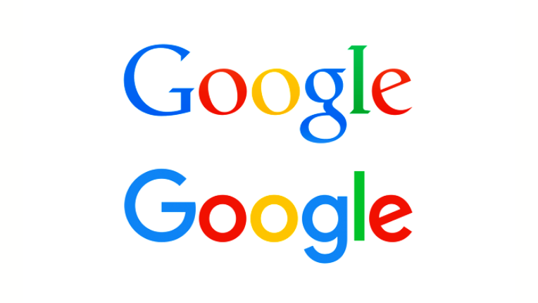
Google redesigned its logo in 2015. The rebranded logo is a perfect example of how brands retain their core component of the logo design and bring subtle changes for a modern look without losing their originality.
The Google logo is a typographical design with four primary colours associated with the brand since its inception. You can see the colours yellow, red, blue, and green in every logo design of a google product. The colour pallet has become a powerful symbol of Google.
Thus, the company experiments with every rebrand using the same colour pattern to remain timeless yet fresh for users.
If you look at Google’s old logo, it was a serif-typeface font type. The design team at Google focused on creating a unique logotype suitable across various devices, like phones, computers, or smartwatches.
The new typeface is a custom-made geometrical, sans-serif typeface, which is known as product-sans and is a creation of designers at Google.
Also, the colours in the redesign may have lost their shine. But they’re yet brighter than before and more elegant due to their overall minimalist look. Along with the logo, Google introduced a single letter symbol of ”G” for the app logo, and the letter combines all the primary logo colours.
Google’s evolving brand logo is simplified and shows how small changes are enough for a successful rebranded logo to adopt modern design elements.
2. STARBUCKS
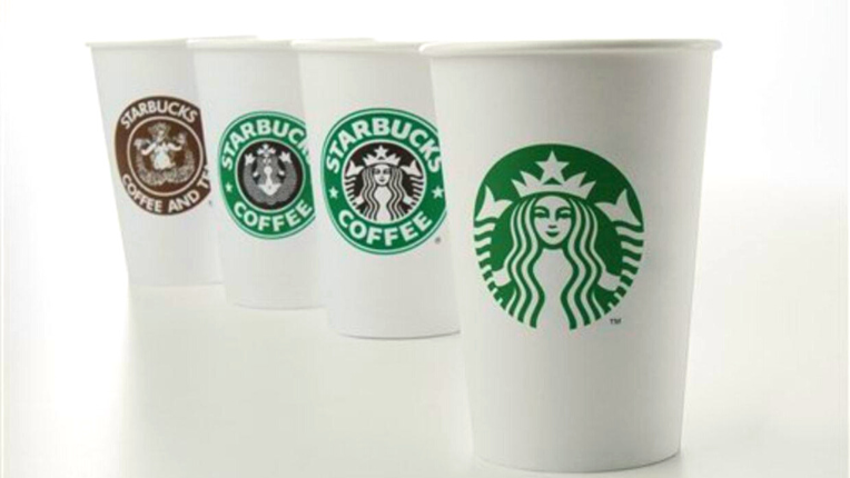
The new Starbucks logo is simple yet effective. The company has stuck to its roots and retained ‘’Siren’’ as the face of Starbucks in its rebranded logo.
Further, the company removed its Starbucks coffee wordmark from the old logo and made simple alterations to transform the old logo into an effective and voguish design masterclass.
Starbucks customers relate deeply to the siren logo, and the company is succinctly marketing itself with the siren. So, the next time we look at anything green and siren-looking, we will think of Starbucks coffee.
This most recent rebranded logo is easily one of the most recognisable icons in the world. Starbucks customers associate the siren emblem with the authenticity of the brand. Hence, the company made the siren simple and relatable. The design complies with the minimalist logo trends that most companies are adopting in their logo.
If you look at the initial logo of the company from 1971, the brand has constantly rebranded the logo to simplify it throughout the years. The siren got a new makeover, and the latest redesign is adjustable to packaging, Starbucks cup sizes, and digital media.
Starbucks’ logo evolution is an inspiring design story of how brands build popularity with succinct rebranding over time.
3. DUNKIN DONUTS
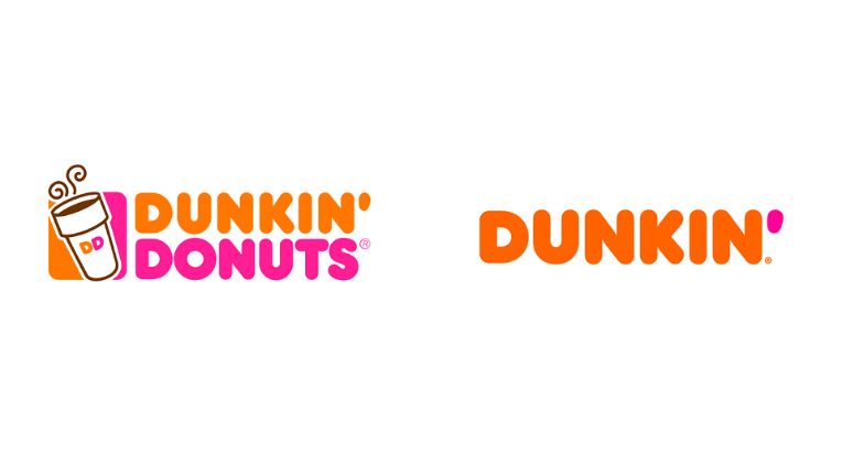
The Dunkin Donuts logo was the company’s name and symbolic of their core product ‘’Donuts’’. However, the brand does not rely only on doughnuts for its revenue. They are also known for their coffee and other fast-food items like bagels and sandwiches.
As the company expanded, they realised that their logo represented them as more of doughnut sellers rather than a fast-food chain. The company was lagging with competitors like Starbucks, and the bakery image was not symbolic of the company’s vision while curtailing its expansion projects.
Therefore, Dunkin Donuts rebranded its logo design, changed the font and revamped its name to Dunkin to show that they are not just a doughnut chain but a comprehensive fast-food brand with tasty coffee options.
From a graphic designer’s perspective, they smartly rebranded the Dunkin logo by dropping doughnuts from their name and retaining the company’s symbolic orange and pink colours.
When customers look at the new logo, they certainly notice the name change and still recognise the brand due to the logo’s colours.
The colour theory is an essential element of a logo design, and Dunkin aptly applied it in their rebranded logo to completely renovate their brand identity.
Bonus Read: Take inspiration from these fantastic restaurant logos for your next food design project.
4. MASTERCARD
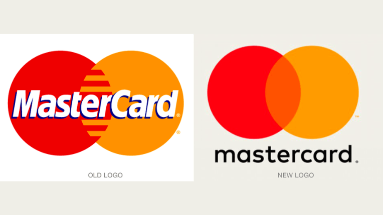
Mastercard is one of the easily recognisable logos in the financial industry with its simple colour and interlocking circle design.
Over the years, they have rebranded as a straightforward and less chaotic logo. The circles have become slimmer, the Mastercard name is dropped lower, and the stripe pattern between the rings is also removed. They want to do away with the brand’s name in the logo because today, the emphasis is on digital payment methods rather than card payments.
The design team of Mastercard carried out research before rebranding and found that the most well-known element of their logo is the circle that represents unity and trust. Another logo trait was the vibrant colour combination of red and yellow that symbolises joy and friendliness.
Logo designers have done a flawless job optimising the rebranded logo across the digital landscape and remaining relevant to the customer. The circles in the logo can now stand on their own and represent Mastercard values.
You can know more about the brand history of Mastercard to understand how the brand has constantly rebranded itself and built a strong recognition with its iconic logo design.
If you want to rebrand your logo to be more suitable for the digital space and flexible across various media channels, meet our design mates, a crew that serves all your design needs.
5. PFIZER
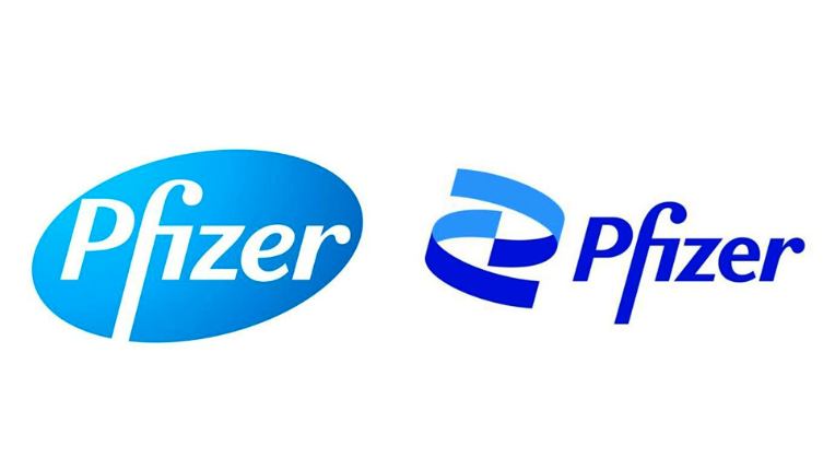
Pfizer made a major brand identity overhaul with its new rebranded logo. The new logo features a double helix structure inspired by DNA, a dual-tone blue colour pallet and a noto sans typeface that provides a neat finishing touch to the logo redesign.
The company changed its logo after 70 years in 2021 to mark the shift from a drug manufacturing commerce brand to a research-based drug-creating company.
Pfizer collaborated with German biotech company BioNTech to create the Pfizer COVID vaccine. The logo rebranding marks a new era in the brand’s history as it wants to prevent diseases and not just cure them.
Each design element is carefully crafted. For example, the upward DNA structure represents the company’s focus on contributing to the growth of science. The pill structure in the previous logo is unlocked to reveal the core of Pfizer’s value, which is research-driven drug creation. Also, the dual colours show Pfizer’s commitment to science and patients.
It’s a classic example of how rebranded logos can change a brand’s perception to show the company’s progressive vision. For Pfizer, the logo is characteristic of its world-shaping scientific mission and not just a pharmaceutical company.
Bonus Read: Looking for a logo to put forward the right message? Visit these inspiring school design logos.
6. GO DADDY
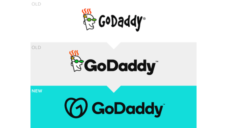
Except for its name in the logo, GoDaddy introduced a 180-degree change in its rebranded logo. The new logo redesign has replaced the daddy mascot and features an interlocking heart made of the letters ‘G’ and ‘O’. Therefore, the logo is named ‘GO’.
The web hosting company wants to emphasise an entrepreneurial spirit through its new redesign accompanied by the brand’s name Go daddy in sans serif typeface. Also, the recoiled heart represents the mindset of a small business entrepreneur who wants to break the barriers and build a successful business.
Go Daddy never had a strong logo image in the market, and its new logo is a step toward building an emotional connection with its customers.
Well, the daddy mascot is gone, but the new entangled heart shape in turquoise colour evokes calm emotions. The brand also revamped its website to match the logo redesign and is in line with Go Daddy’s ambition to compete with website-building brands like WordPress and Wix.
7. PREMIER LEAGUE
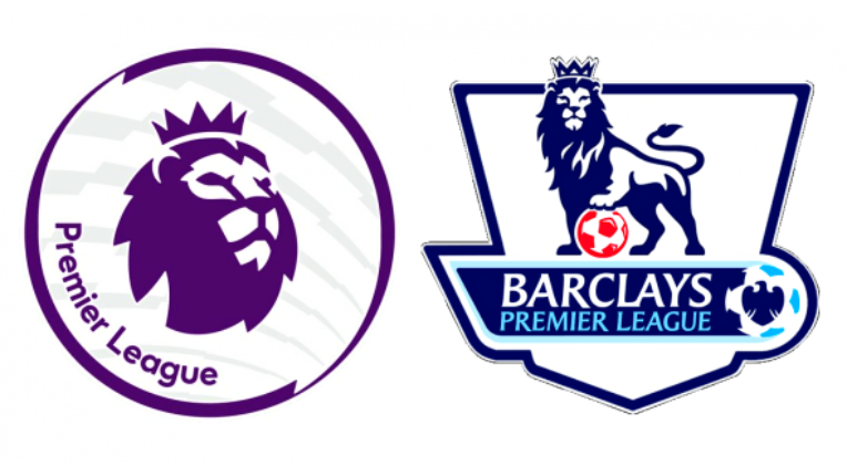
The Premier League redesigned its new logo after ending its title sponsorship with Barclays.
The logo designers have removed the lion’s body and retained the lion’s head iconography in the rebranded logo for simplicity. Clearly, the design has a modern look and is made for flexible adaptation to digital media.
When you look at the Lion, it oozes confidence and nobility. The 3-D look of the design makes it more appealing to the audience, and the sans serif Radikal font matches the weight of the lion in the overall design.
Although there was an outcry among a few fans regarding the logo change, the brand had to refresh its image after the end of their title sponsorship. The retaining of the lion was a crucial move to ensure fans feel connected to the logo and it transitions to the digital media smoothly.
8. BURGER KING
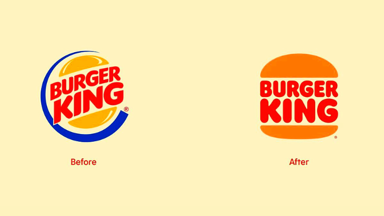
Burger King is going the retro way with its rebranded logo, which is a flat design that emulates the old Burger King logo of the 1970s.
The design renders the brand name Burger King in a font called ‘Flame’ between two buns giving the design a classic minimalist look.
Also, the unique colour pallet of yellow and red is inspired by the Burger King menu that seeks to serve taste and quality to the customers.
Designers at Burger King focused on matching the brand aspiration of serving food with no preservatives, colours or artificial flavours through the new design. As the rebranded logo is simple without filters, it’s just like the burgers the company aspires to provide its customers.
9. PEUGEOT
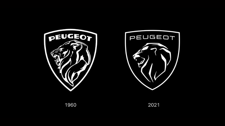
The French automobile marque Peugeot adopted a minimalist and classy redesigned logo to mark its entry into the electric car sector.
Its lion iconography in the logo is similar to the brand’s 1960s logo. However, this time it’s more redefined and simpler, catering to the new design trends and customers.
Graphic designers have tried to emphasise the brand’s new philosophy of living in the moment through the logo. The logo’s streamlined and qualitative look indicates Peugeot’s upward shift in the market with their new line of cars and lifestyle products.
The lion’s modern motif shines brightly like the company’s 210-year history, and the new custom-made Peugeot font is symbolic of the company’s mission to move forward and focus on reducing its carbon footprint.
It’s a simple and timeless logo rebrand in sync with the changing technology and environmental needs.
Bonus Read: Understand the influence of logo design with these 11 breathtaking luxury brand logos.
10. AIRBNB
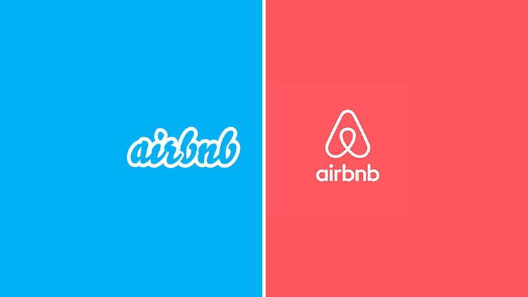
When Airbnb was born in 2007, the founders didn’t have time to focus on aesthetics. Now, the brand has built a recognisable base in the world. They also thought of rebranding their logo.
The rebranded logo of Airbnb is entirely different from the old logo and has the name ‘belo.’ The logo designers choose a coral pink heart shape to represent the feeling of belonging and not just staying at a hotel.
Given that most tech companies use blue in their logo to depict trust. Airbnb is endeavouring to be different with its warm colour that leaves an adorable and fuzzy feeling in the customer’s consciousness.
Airbnb is embracing the digital space by going simple and an adaptable logo design, which can be moulded into any shape to create a charming look.
Bonus Read: Follow these tips to improve your company’s logo design.
11. MAILCHIMP
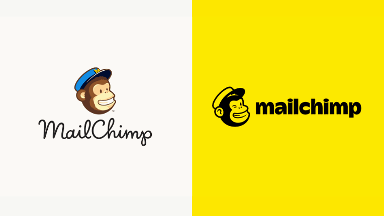
Mailchimp has a new look with its redesigned playful monkey into a winking monkey known as Freddie. The company adopted a new cavendish yellow colour scheme, cooper light sans-serif typeface and colourful illustrations.
Logo designers have put effort into making a quirky and eccentric look using motion graphics. For instance, if you click on the redesigned logo on the Mailchimp website, Freddie winks at you. It’s a brilliant and clever way to grab the audience’s attention.
The brand aims to build a new image, reach out to smaller businesses and encourage creativity among its users. With Mailchimp revisiting its vision and strategy, a brand image was needed, and nothing could’ve been more suitable than retaining Freddie in a simple yet playful look.
Note: Access incredible motion graphic designs for your project with our free trial.
Verdict
Brand wars are moving to digital spaces. Now, companies have only eight seconds to grab a potential customer’s attention, and that’s why most rebranded logos are simple, aesthetical and adaptable. The focus is on colour psychology and emotional design metrics to evoke trust in consumers.
Connect with our captain today and start your rebranding journey with 55knots and its innovative graphic design services.