Patterns are everywhere around us. The sky, earth, green fields, oceans, and almost every natural element follow a pattern design, whether fractal or not.
In simple words, a pattern is a set of arrangements of different lines, colours and shapes in which a design repeats itself at regular intervals and creates an order in viewers’ consciousness.
Graphic designers use patterns to create a strong brand identity. After all, pattern designs communicate the value of a brand.
When a design element is repeated in a pattern using precise spacing, our brain can easily recognise such composition, which leaves a sense of satisfaction in our cognitive mind.
A remarkable pattern design must incorporate itself into a brand’s logo, colours, and style. For example, feminine brands selling items like cosmetics, clothing, and designer bags can suitably use floral patterns for their products to enhance the brand’s image. Similar pattern designs for a restaurant menu card might look odd and push customers away.
Thus, patterns aren’t just about the visual appeal but more about representing the brand’s product and style.
Learn more about the importance of design in brand building and marketing with us.
Essential Elements in a Pattern Design
Before we study the coolest design patterns for your project, let’s have a look at the elements that constitute a pattern design.
1. Motifs: These are a particular shape or design often repeated predictably in a pattern. For instance, repetition of a square or heart shapes in a pattern design.
2. Colour Palette: It’s the combination of colours in pattern designs. Always choose shades similar to the logo and brand or based on your audience. To attract youth to your brand, use bright colours that resonate with the product.
Young people tend to make a subconscious judgement on how they perceive colour in a design pattern. However, if your project focuses on brand-conscious customers, a more classic monochromatic colour is befitting.
3. Spacing: Successive distance and repetition in a pattern design is spacing. Our brain feels harmonious when things are in order. It also dislikes chaos. Spacing in a pattern design is crucial to create an impact on the viewer.
Hence, for a pattern design layout, spacing should be such that it’s easy to find patterns. Even better, it should invoke the viewer’s imagination of the product.
Now that you know what’s crucial for pattern designs, it’s time to explore some trendy pattern designs for your project.
11 Coolest Pattern Design for Your Project Ideas
Patterns evolve with time, and so do graphic pattern designs. Here is our coolest collection of the latest pattern designs.
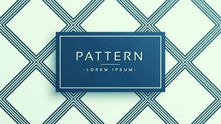
1. Geometric Patterns
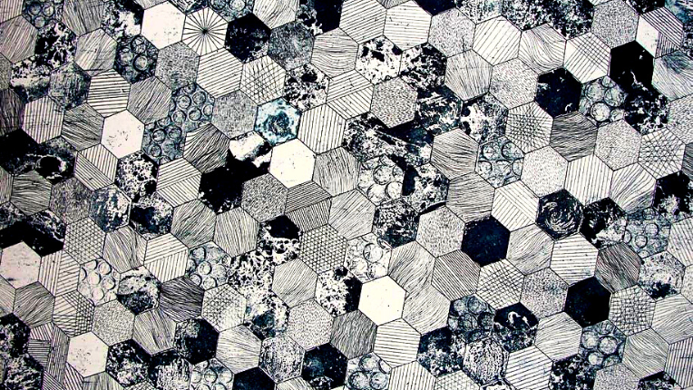
The most versatile and eclectic pattern style from the entire pattern family is geometric pattern design. They can incorporate any brand or style within them.
Geometric designs are an assemblage of various shapes like circles, squares, rhombus, triangles, ovals or other geometrical shapes. Designers use these shapes to create repetition in a pattern.
Geometrical Shapes: These are open or closed structures with definite shapes made up of lines, curves, and points with perfect edges that make them unique from one another.
You can create funky styles with geometric patterns. Whether it’s product packaging, website designing, clothing, travel brochure, journals, or digital products, geometric patterns can go with anything and everything.
Further, the geometric pattern style carries the brand’s identity with its shape. Therefore, to illustrate, squares and rectangles represent stability and authority, whereas circles create a sense of community.
Our world evolves on geometric shapes, and our brain creates an instant connection with them due to familiarity. It’s no wonder that ancient architecture fundamentally represents geometric patterns.
The challenging aspect of a geometric pattern is finding the correct shape and colour palette that strongly resembles your brand. Hiring the right designer can help brands curate apt patterns for resilient branding.
One of the best examples is Google’s Pixel feature drop campaign, a beautiful visual display of geometric patterns.
2. Typography Patterns
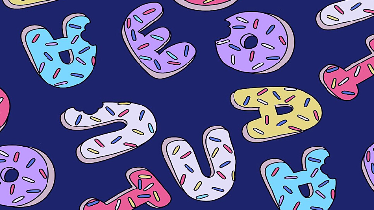
Typography patterns use an aesthetic arrangement of letters to create pleasing pattern designs. It’s an integral part of graphic design.
These pattern styles have a multitude of functions. They create groovy looks for clothing and go well with birthday card patterns, book covers, and children’s related brand items.
In typographical patterns, the typeface selection, icon, letter hierarchy, and repetition consistency are crucial for creating an impactful brand identity.
Graphic designers create an illusion using typeface, and that’s why these patterns are popular across brands. To give you an example: 3D letters are ideal for pattern designs to display a bold image of the product and leave a sense of curiosity in the viewer.
Typographical pattern designs help customers predict and imagine their expectations of what a brand has to offer.
Also, the lettering should fit the context. For colourful graphic T-shirts, the letter designs need to be modern and asymmetrical, and for invitation cards, the hierarchical order of letters can create delightful patterns.
3. Boho Patterns
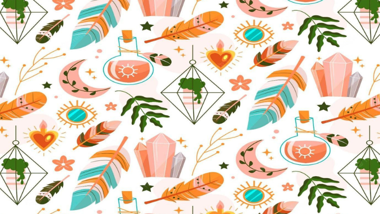
The bohemian patterns are known for depicting natural features like trees, leaves, forests, beaches, and earthly shades.
It originated in France as a counterculture movement called Bohemians after the French revolution. The style is similar to hippies and represents an unconventional lifestyle, breaking away from rigid social norms.
The boho style is also called ‘’Boho Chic’’ and reminds you of visiting Bali or Fiji, seeming to be associated with tropical lands.
These patterns are pertinent for fabric designs, organic product lines, beautiful aesthetics, and hippie projects. Though the Boho style might be similar to hippies, the pattern design tends to be co-related with a free lifestyle, unbound by society.
What’s more, you can use Boho patterns to portray the brand as stylish, authentic and closely related to the fashion-loving youth.
In earlier times, the term Bohemian was used to describe artists, writers and creative professionals. Therefore, Boho patterns are synonymous with creativity, and a little tweak in the original Boho design can do wonders for your project.
4. Watercolour Patterns
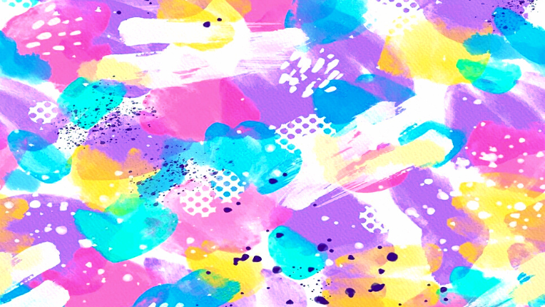
Watercolour patterns require attention and precision in the making. They are visibly appealing and eye-catching with their boldness.
This pattern style adds a natural touch to the design and is most suitable for food outlets, packaging, and background designs. The bright colours, when used appropriately, can elicit hunger, passion, and happiness in the customer.
Many food chains use watercolour patterns and create a contrast between red and yellow textures to build brand recognition.
Not just that, even makeup, gifts, and stationery brands have a knack for using watercolour patterns to convey the brand’s message as naturally as possible.
Watercolour patterns should be consistent with the brand’s packaging and marketing to implicitly ensure that customers see them when they access your service.
One of the best things about watercolour patterns is they are highly flexible. Graphic designers create watercolour images for watercolour patterns to make the design adaptable across various platforms.
Bonus Read: Learn the key principles of branding and successfully brand your project with an excellent pattern design.
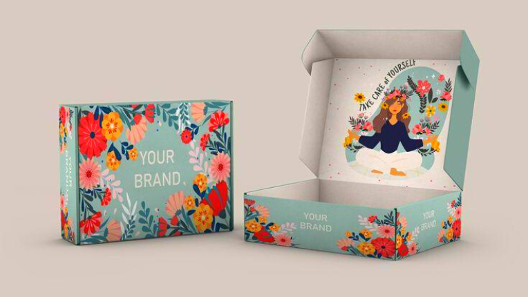
5. Floral Patterns
Pattern designs might come and go and evolve, but floral patterns have been in fashion since olden times. The reasons are:
First, flowers are appealing. Second, different flowers have various meanings. Rose stands for love, Jasmine is for purity, whereas sunflower symbolises loyalty. If you notice, these meanings are common branding themes or messages.
Floral patterns are usually seen on clothing prints, beauty products packaging, wedding cards, and sometimes in interior designs. The idea is to make the viewer feel relaxing and fresh about the brand.
Also, floral motifs create a sense of authenticity like the flower itself. They are easily accessible for designers. You can use small flowers for a minimalistic feel and colourful flowers to offer positive emotions.
Brands also incorporate floral designs with typographical patterns or other shapes to narrate a visual story to the viewer. Moreover, floral patterns are universally recognisable and help brands connect with all types of consumers.
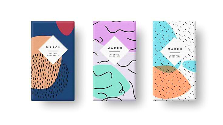
6. Abstract Pattern
A famous saying goes as, ‘’There is order in chaos’’, which pretty much sums up the idea behind an abstract pattern.
Abstract patterns are arrangements of different shapes and visuals that are distinct from reality. The repetition at times is hard to figure out, but there’s an underlying order in the overall randomness of the pattern.
It’s easy to apply on various digital media platforms and is used as clothing prints, phone cover designs, packaging, etc. The abstract pattern can make the viewer curious about the brand.
Abstraction is a departure from realness, but these patterns can make your pattern design stand out if used in the proper context.
Remember that abstract patterns are usually heavy with design and do not leave space for other elements. It’s necessary to balance an abstract layout pattern with simple or minimal backgrounds.
To better understand the abstract style, you can see the Pepsi logo, which looks like a sphere shape and uses the American flag colours. The logo’s abstractness is that it doesn’t depict a drink that is the primary product of Pepsi.
7. Vintage Pattern
Vintage patterns are classic designs inspired by the 70s and 80s eras. They characterise a brand’s classic-themed approach.
Usually, geometric shapes, Scandinavian floral art and earthly colours like blue, orange and green showcase vintage pattern designs.
Suppose you are working on curating an exquisite brand image for a selected audience. A vintage pattern design sounds like a good idea for an authentic identity.
Graphic experts use vintage patterns to create a genuine persona of the brand. People are inclined to associate vintage with originality because of the uniqueness and old touch of the pattern design.
Many brands bank on the idea of being vintage to sell products. Especially clothing, perfume, and jewellery brands. Even dark chocolates in vintage packaging are simply alluring to eat.
Meet our design experts at 55knots, who have classic experience with vintage patterns that speak for the brand.
8. Character Patterns
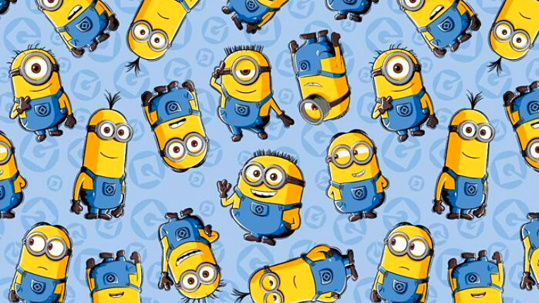
Character patterns add a playful touch to the design. They are well-known for children’s product packaging or wallpapers. That doesn’t mean characters aren’t flexible. Graphic designers create characters that act as mascots for branding.
Even better, character patterns resonate with a brand’s image. A funny character illustrates innocence, while wise characters spread awareness about a particular product.
The unique way to use a character pattern is to let that character represent the brand’s message. Whether it’s an animated person or cute animals, character patterns are sure to attract viewers.
Often, character patterns can overshadow a brand’s logo and design, so it’s imperative to interfuse the pattern with the overall idea of a project.
Characters are a powerful way of branding. For example, Mickey Mouse takes us back to the Disney memories and Tony the Tiger is symbolic of Kellogg’s flakes.
9. Minimalist Pattern
Minimalist patterns have a unique temptation. As minimalists believe in the concept of ‘’less is more’’. This pattern style says a lot about your project in a simple ornamental way.
An easy, straightforward pattern qualifies as a minimalistic design. Sometimes it can be as plain as repetitive lines, circles or dotted patterns. They emphasise using design trends to focus on embodying the brand’s mission.
Another benefit of a minimalist pattern is that it presents a subtle order in the spacing of motifs without much effort and gives a relaxing and de-cluttered feel to the observer.
When it comes to using a minimalist pattern, they look great on website designs, exotic packaging, business cards, and interior wall-print designs. Also, they effortlessly harmonise with the brand’s logo and font style, making it easy to use in any graphic design.
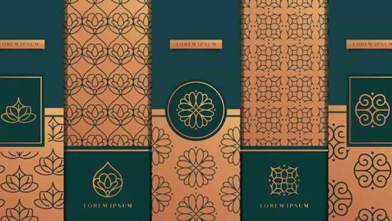
10. Art-Deco Pattern
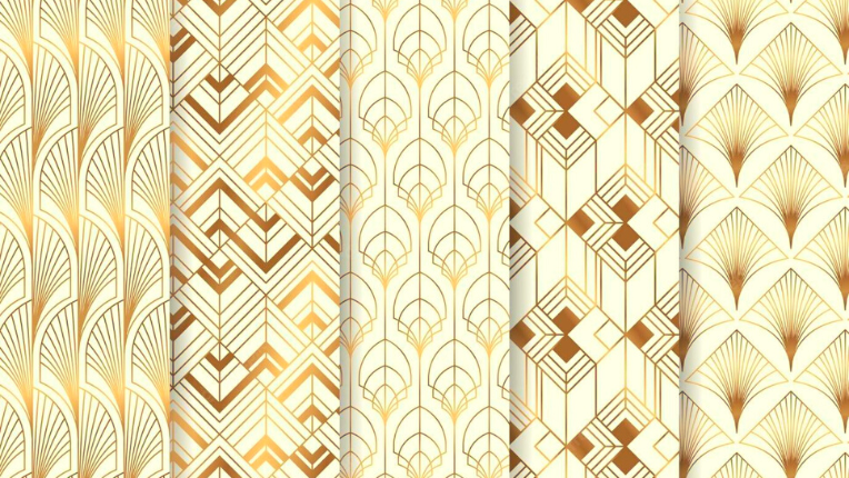
An Art Deco pattern reflects symmetry, planarity, and uniform replication of design elements throughout the pattern layout.
Believed to have first appeared in European architecture, Art Deco styles are heavily influenced by geometric shapes, Arabic motifs, and several civilisations from Japan, India, Egypt, Persia, China and other ancient art forms.
Today, graphic experts combine Art Deco patterns with the modern genre of aesthetics and display a range of cool pattern designs applicable for luxury brands, customised cards, extravagant menu cards and structural patterns for buildings.
Art Deco patterns also exhibit bold and striking colours like deep yellow, dark green, and other bright hues of colours, along with softer beige or creamy shades to enhance the overall pattern of the design.
Sleek and clean Art Deco patterns are a good fit for your next project to leave behind a classic visual of your brand.
11. Folk-Art Pattern
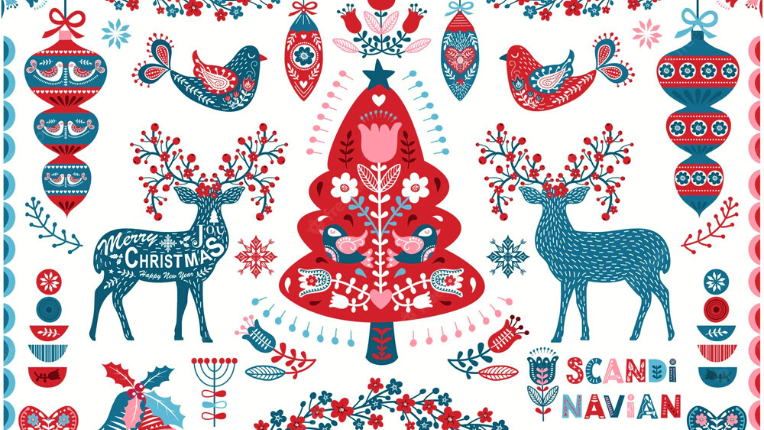
From Asia to Europe and America to Africa, folk art patterns can render any folk art into effective pattern design.
Generally, folk patterns express the richness of culture through traditional art shapes and repetition. For instance, historical objects, cave designs, and sometimes dance or folk artists are shown in pattern styles.
They are used for a purpose, either to show a brand’s tradition or the legacy of a brand.
You can use folk art patterns for festive cards or add decorative elements to a pattern design. They beautifully tell a tale of community, family and togetherness with nature.
Verdict
Pattern designs are visual clues of a brand. A cool pattern design should reverberate with your project, and the colours and spacing must tell a tacit story of the brand.
Patterns must also easily blend with the brand and ensure uniformity in the overall design. Graphic design experts believe that simple patterns that generate curiosity can quickly draw customers and leave a pleasant influence on the viewer.
We, at 55knots, believe in the vision of representing a brand’s mission using cutting-edge graphic designs. Start your free trial today for a unique design itinerary for your project.